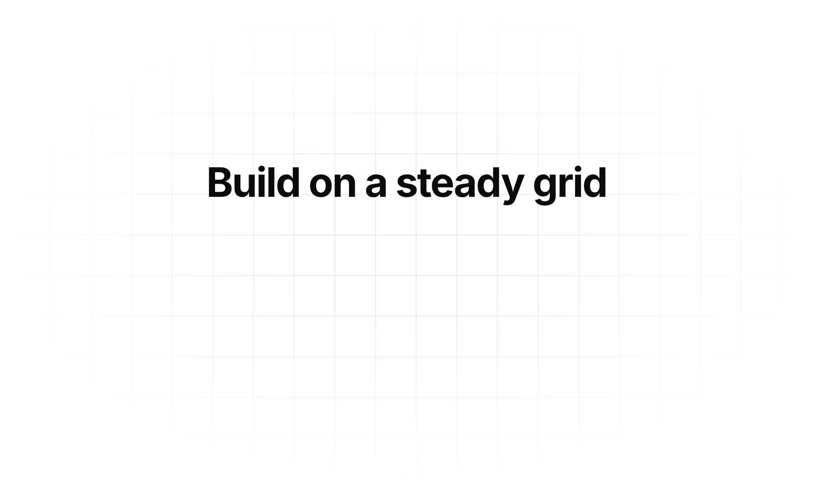
Usage
import { GridBackground } from "@/registry/components/grid-background/grid-background";

<GridBackground>Label</GridBackground>
Props
| Name | Type | Default | Description |
|---|---|---|---|
| children | ReactNode | Content rendered above the grid | |
| size | number | 48 | Cell size in px |
| color | string | rgba(0,0,0,.07) | Line color; dark mode defaults to rgba(255,255,255,.07) |
| speed | number | 3 | Seconds per cell; 0 keeps the grid still |
| direction | "up" | "down" | "left" | "right" | "diagonal" | "diagonal" | Drift direction; diagonal runs from top right to bottom left |
| reveal | boolean | true | Uncover the grid with a circle growing from the center when it first comes into view |
| fade | number | 70 | Radius of the edge fade, in % of the distance to the corners |
| className | string | Extra class on the container – give it a height or let the content size it |
When to use
- Hero sections and feature headers that need a quiet, technical backdrop - Empty states or panels that feel too flat on a plain background
When not to use
Behind data tables (competes with lines).