Block
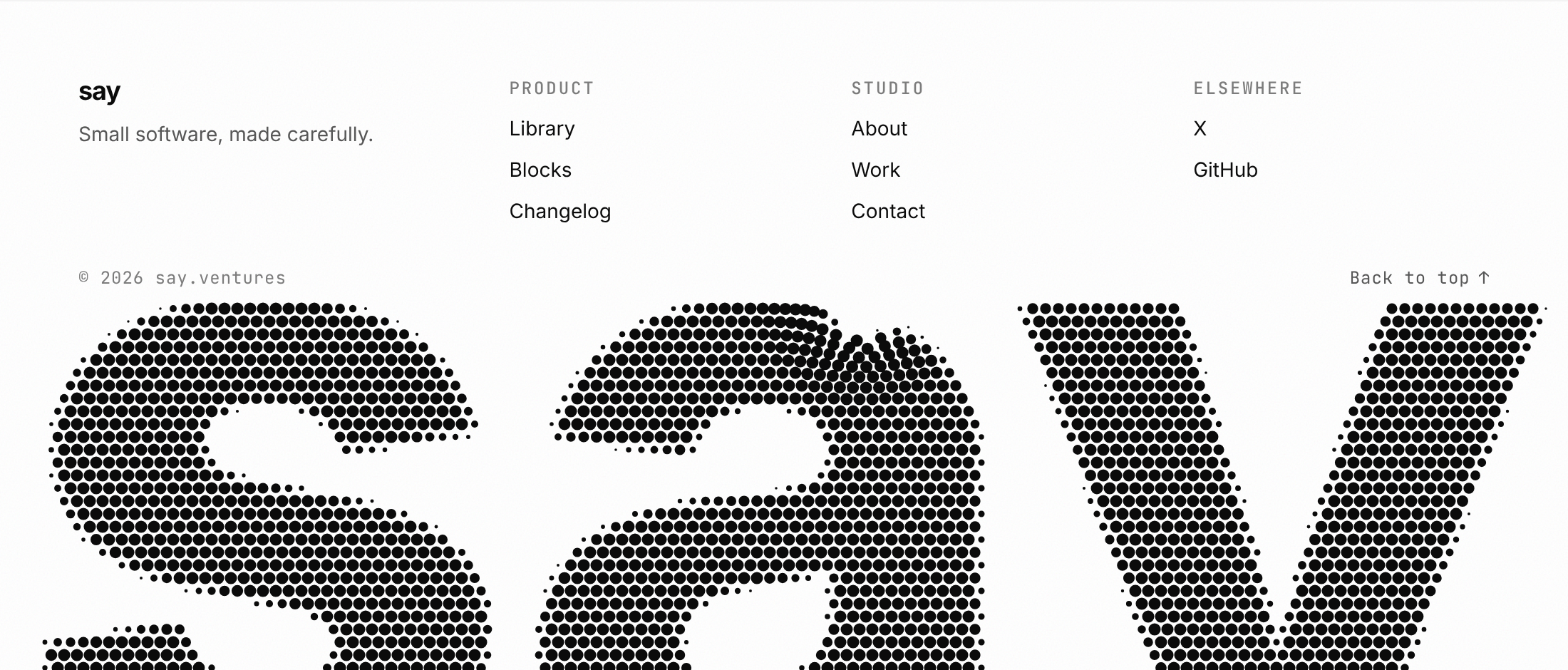
Halftone footer
A site footer that ends on the brand word as a halftone dot screen cropped by the bottom edge, with dots that part around the pointer and ripple on click.
79 components, 29 blocks, 113 saved repos, 91 bookmarks — logged as they land.
A site footer that ends on the brand word as a halftone dot screen cropped by the bottom edge, with dots that part around the pointer and ripple on click.
Agent skills for native-quality mobile app screens, studied against top-grossing apps.
A separate macOS VM for computer-use agents, viewed and driven from the terminal.
ai CLI: text, image, video and audio generation for any agent through AI Gateway.
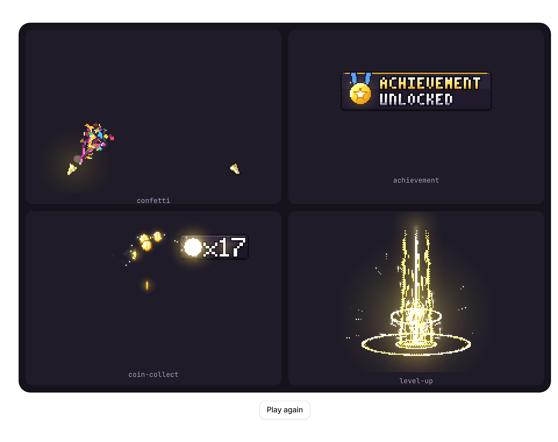
Pixel art reward and feedback effects played on a crisp, transparent canvas: confetti, achievement toast, coin collect, level up, quest complete, combo counter, crit and damage numbers, countdown, heart lost, health bar hit, exclamation. Each one is code (no sprite images); replay it by changing trigger, recolor it with palette, change its words with text.
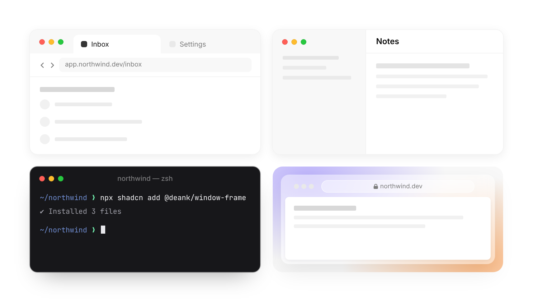
Desktop window chrome for product shots and illustrations: a browser (address, back/forward, tabs), an app window (centred title, toolbar), an app with a full-height sidebar, a dark terminal and a frosted glass browser. Comes with skeleton bars and terminal lines for faking UI inside it. Follows the theme.
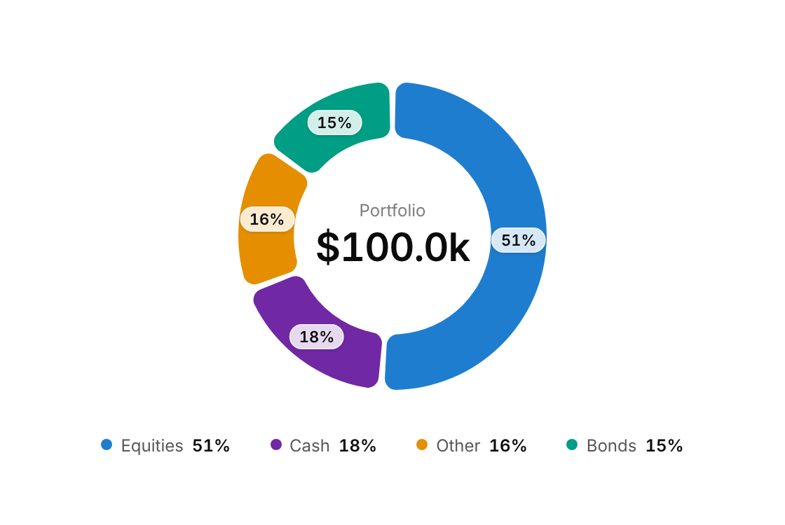
A ring of rounded, gapped slices with a centred total, percentage pills and a legend; hovering or focusing a slice lifts it out and shows its value in the centre.
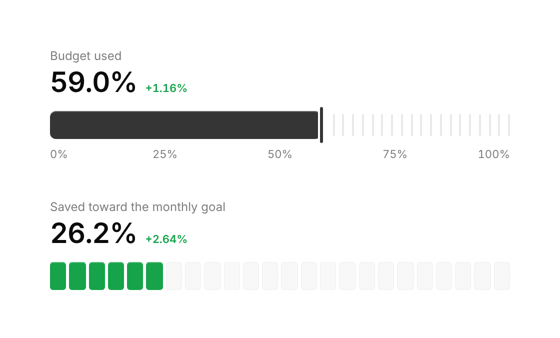
A horizontal progress meter drawn as thin ticks: a solid bar with an end marker, or discrete cells that light up, with an optional headline value, delta and scale.
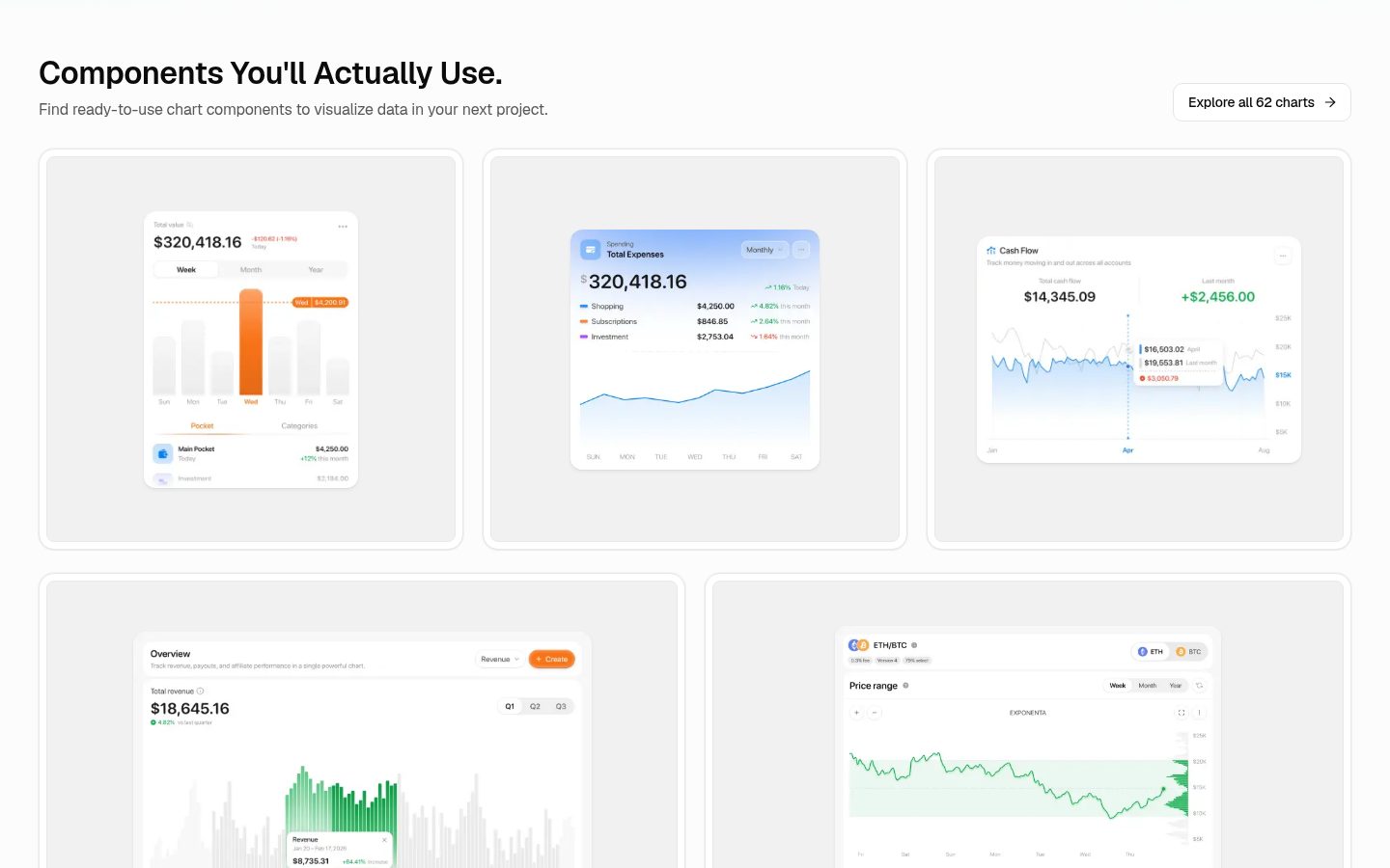
62 free dashboard chart cards (finance and analytics): Figma file plus React, TypeScript and Tailwind v4 code for the shadcn CLI.
docs ready for contributors
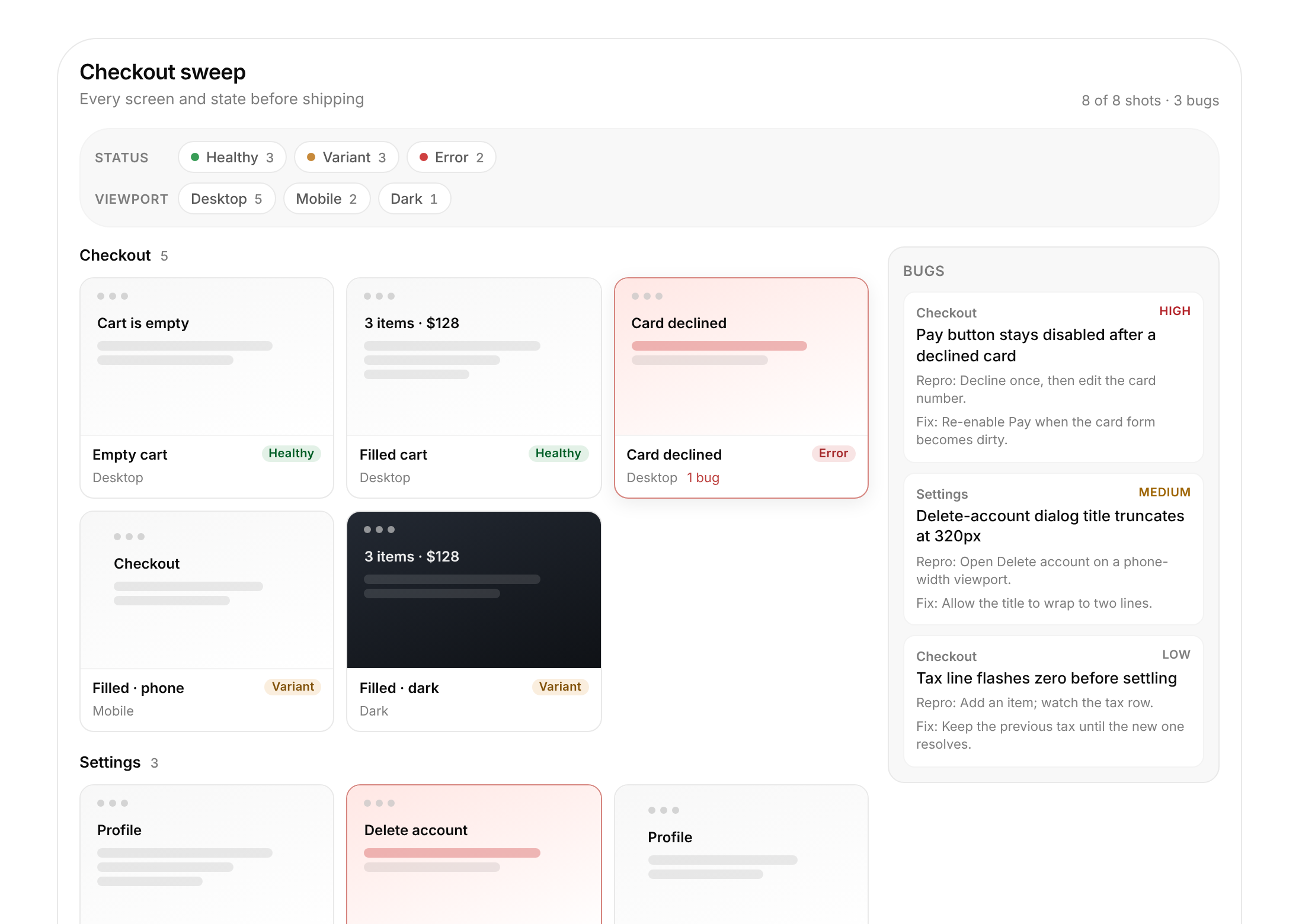
A gallery of screen/state screenshot cards grouped by screen, filterable by status and viewport, with a detail lightbox and a bug list beside it — the UI that ui-sweep writes into a Ref.
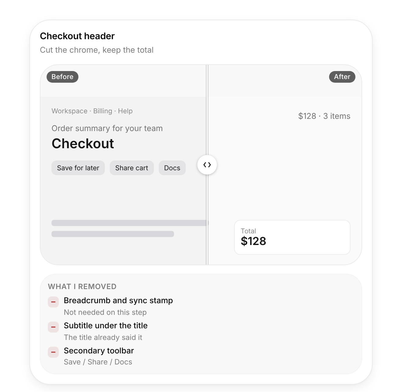
A before/after compare card with a slider or toggle, plus a short list of what was removed — for the "remove first" design pass.
MCP server that lets a coding agent search and read documentation for APIs, libraries and services without dumping huge pages into context.
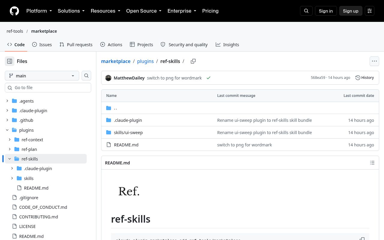
Ref's agent plugin marketplace. The part I care about is ui-sweep: a skill that boots a feature in a sandbox, screenshots every screen and state, and reports bugs with fix proposals.
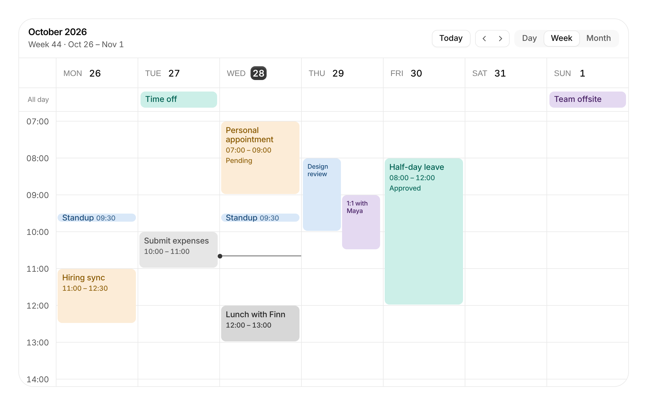
A day, week and month calendar for real schedules: overlapping events sit side by side, drag on empty space to create, drag an event to move it across days, drag its bottom edge to resize, an all-day lane, a live now-line and a details popover. Event colours come from the chart series, so they follow the accent and dark mode.
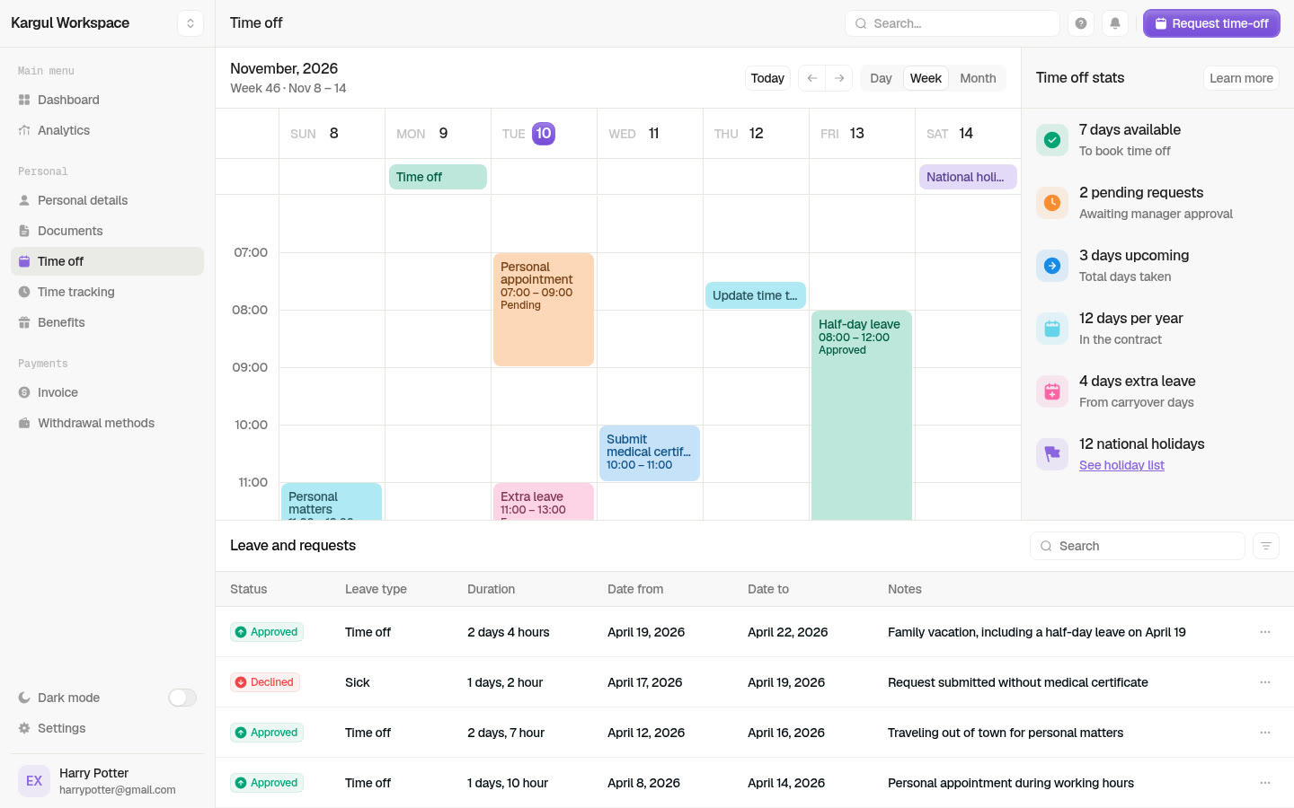
A design prototype of a people-ops workspace ("Kargul Workspace") built from a Figma calendar dashboard: a week / day / month calendar where I can drag to create, move and resize events, overlapping events laid out side by side, an all-day lane with holidays and a now-line; a tim
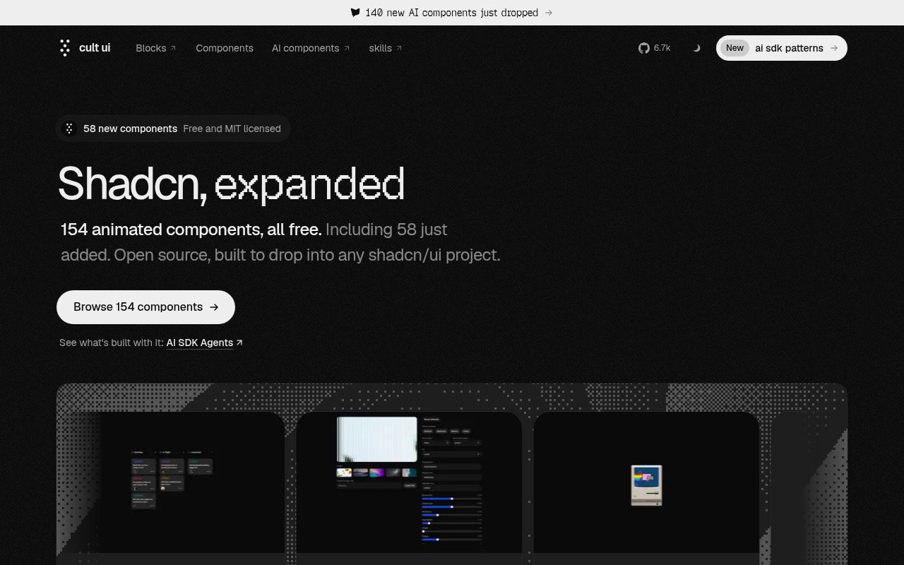
150+ animated shadcn components.
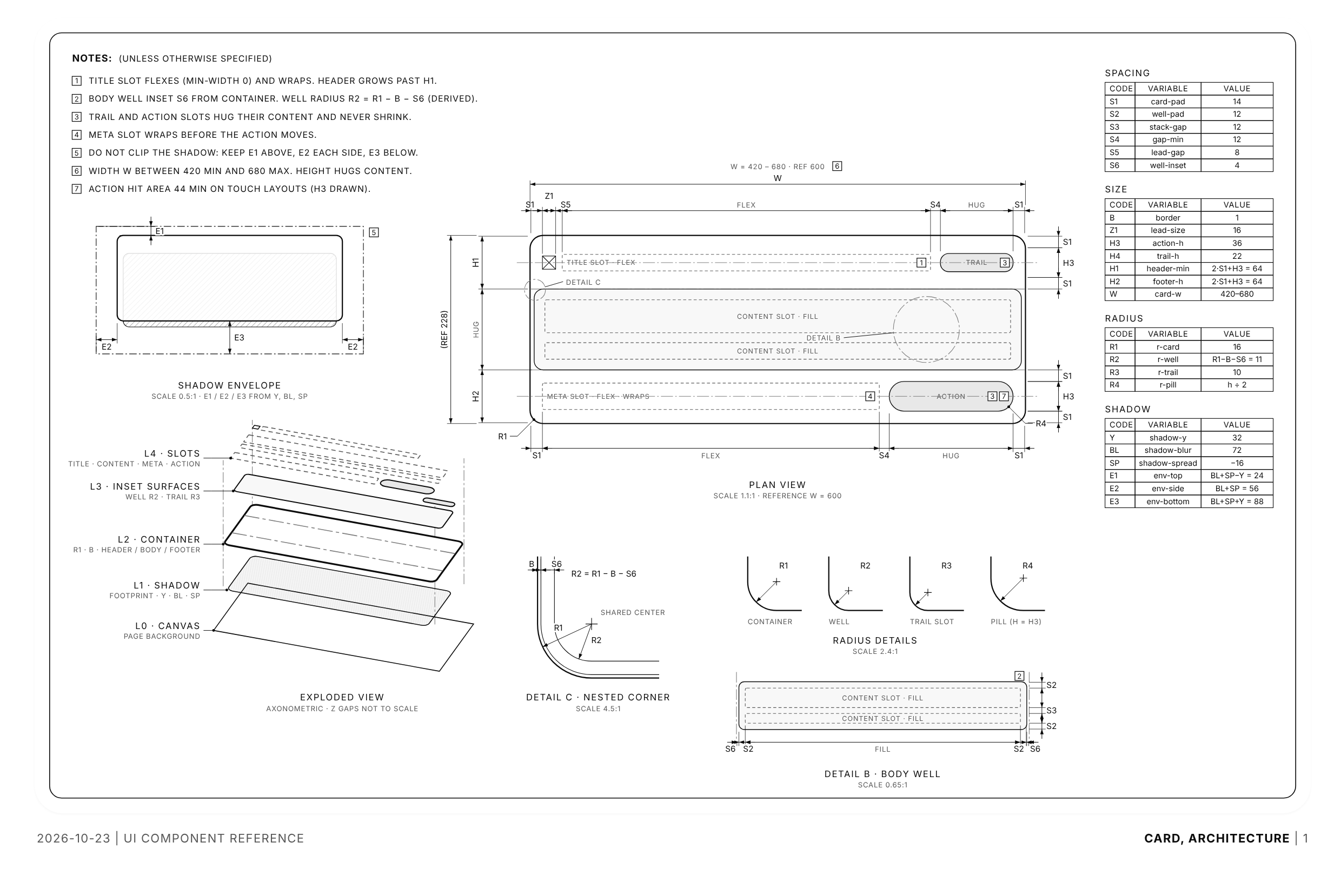
An Apple-style dimensional drawing of a UI component: one monochrome sheet with a plan view, exploded layers, detail circles, radius and corner details, and variable tables (S1, R2 = R1 − B − S6). Comes with a finished card sheet and the SVG kit to draw my own. Follows the theme.
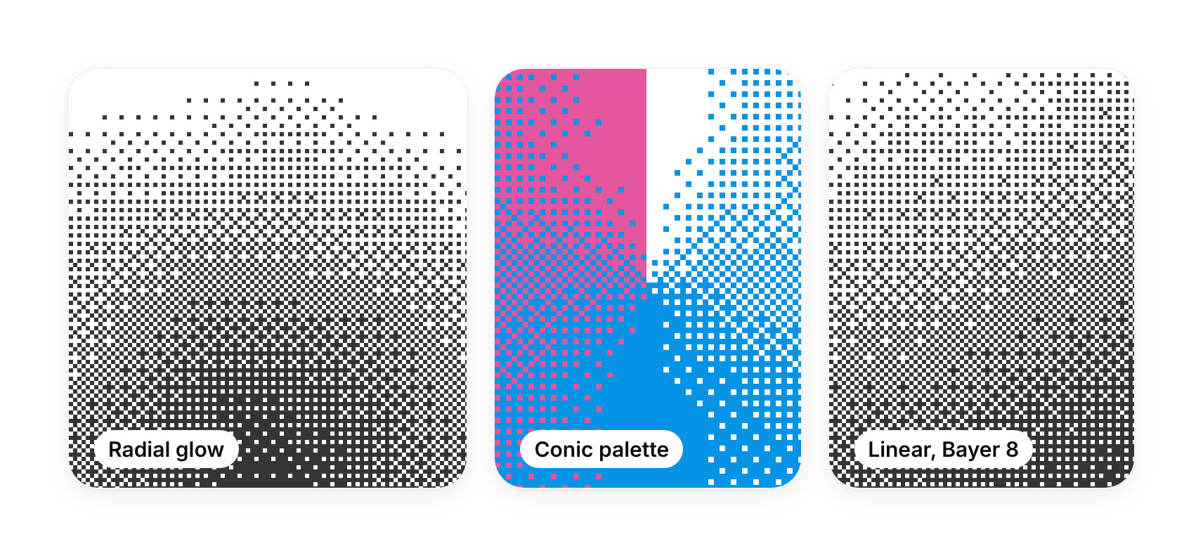
A gradient drawn as ordered dither dots on a WebGL canvas: linear, radial or conic, paper to ink or through a palette, with a slow noise drift. Ink and paper follow my accent and background tokens. Ships the dithercn shader engine, so any GLSL tone field can be dithered the same way.
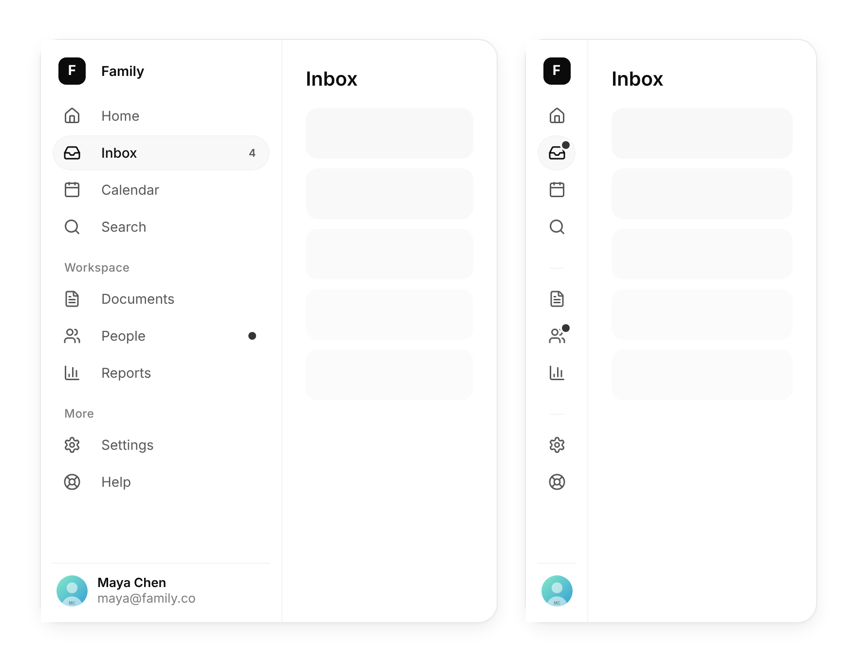
The left-hand navigation of a desktop app: grouped items with icons and badges, a pill that glides to the active page, and a collapse button (or ⌘B) that folds it into an icon rail where every icon shows its label in a tooltip.
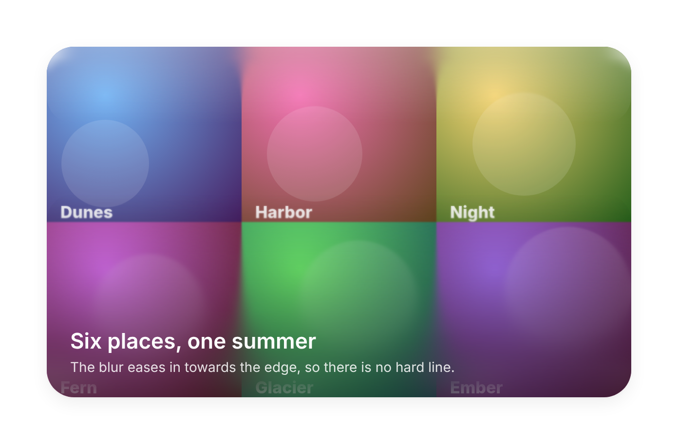
A blur that eases in towards one edge of its parent, with no hard line: the soft frosted fade under headers, toolbars, image captions and scroll edges. Stacked backdrop-filter layers, optional tint, no JavaScript at runtime.
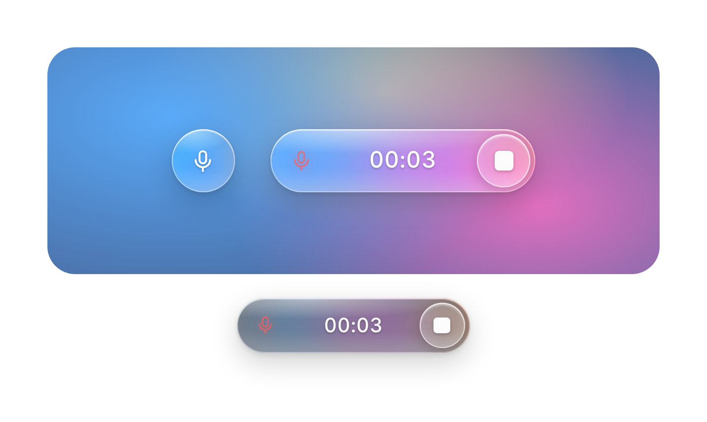
A liquid-glass voice button for AI apps: tap the mic and it stretches into a pill with a running timer, a stop bubble and a colour glow inside the glass that swells with your voice. Opens the microphone and records the audio itself.
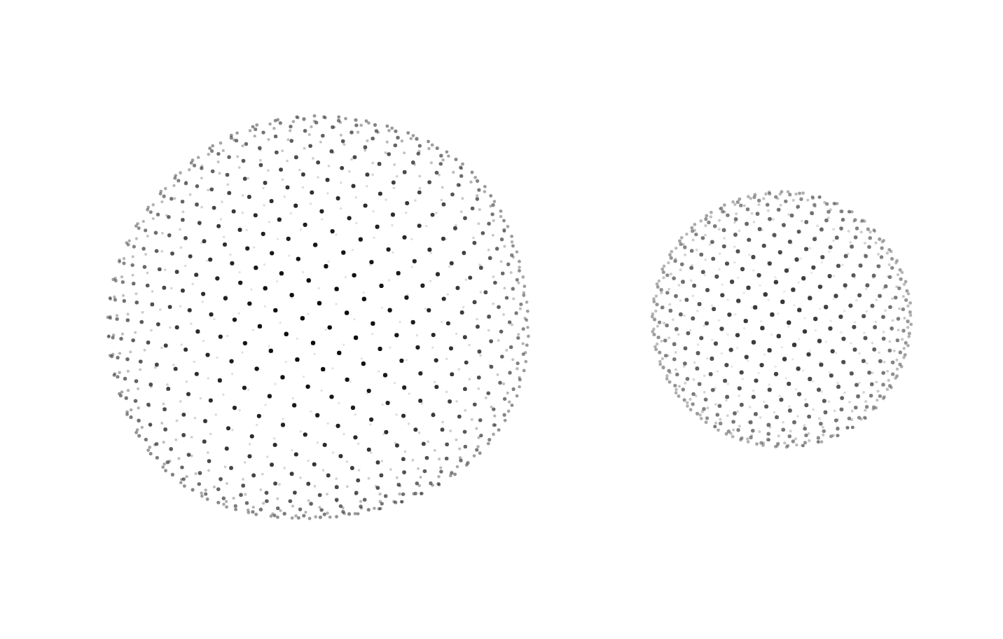
A ball of evenly spread dots, lit by depth, that turns slowly while its surface breathes in waves, or spins and can be flung. The pointer presses a soft dent into the front face. 2D canvas, no WebGL, follows the theme.
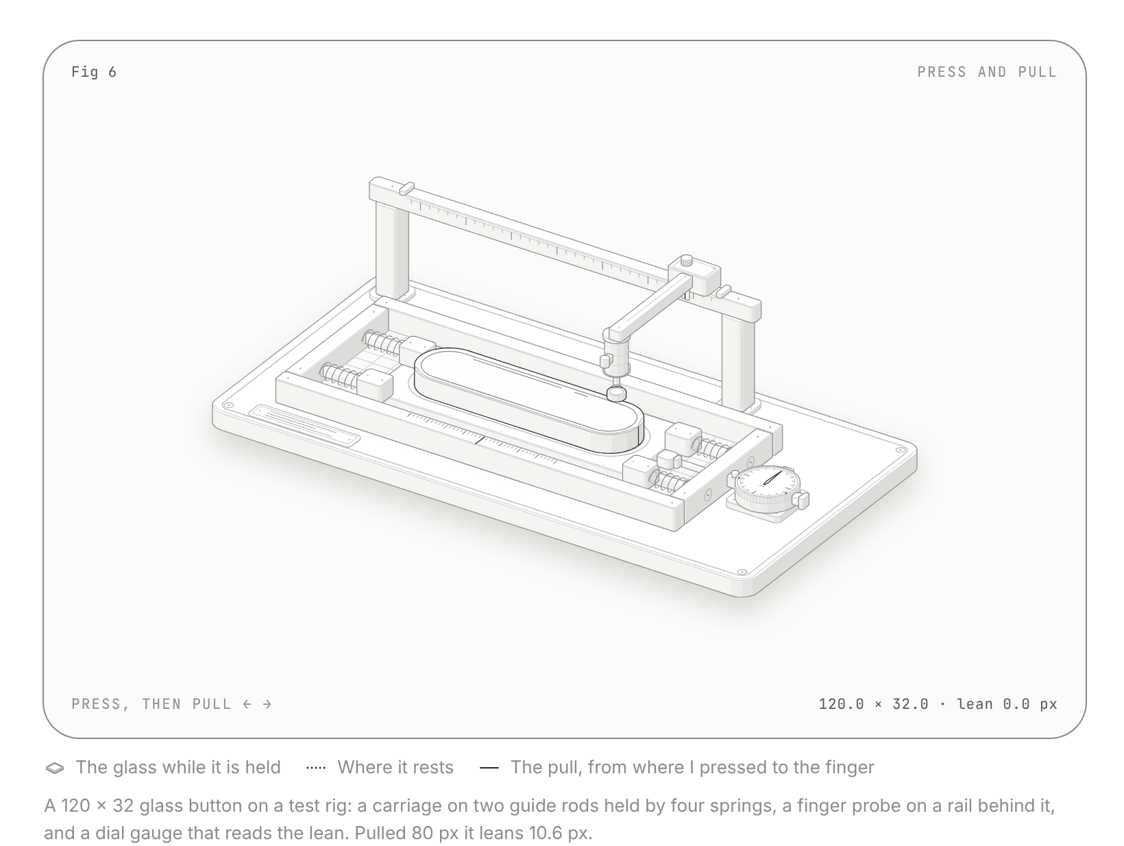
Solid, shaded isometric drawings of small machines that explain an idea by working, in a plate with a figure number, title, hint, live readout and legend. Comes with a press-and-pull test rig and the kit to draw your own. Zero dependencies, light and dark.
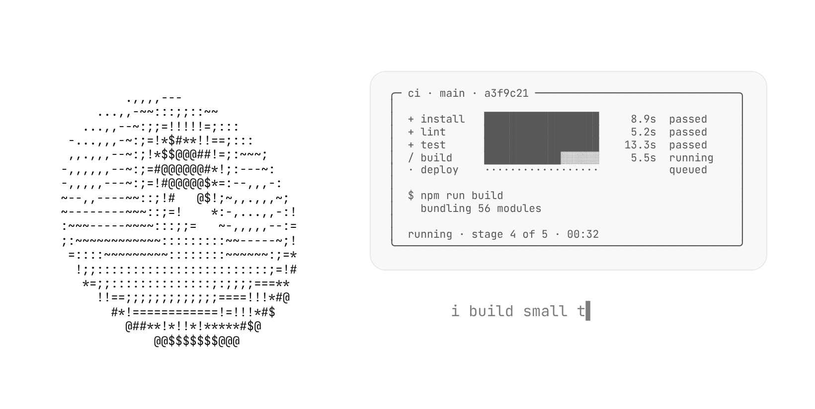
Animated text-mode pictures for quiet, terminal-style pages: a spinning donut, twelve spinners, progress bars, a CI pipeline, a boot log, a 404, a loading skeleton, sparklines, uptime bars, falling glyphs, plasma and a typewriter. Every frame is plain text in the current colour, so it follows the theme.
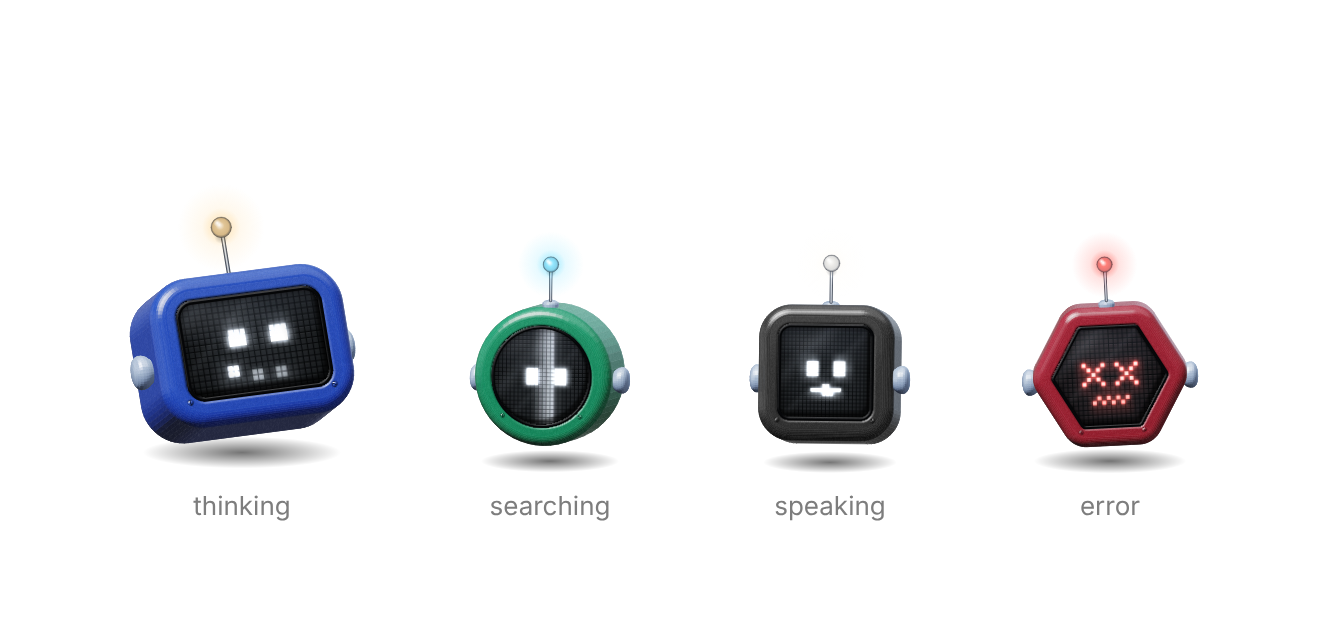
A glossy TV-headed robot whose LED face acts out what your agent is doing: idle, thinking, searching, listening, speaking, working, happy, error or sleeping. Four head shapes, eyes that follow the pointer, a hop on click. 2D canvas, no WebGL, no dependencies.
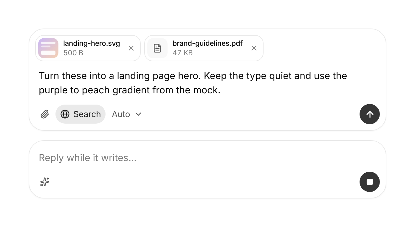
The box at the bottom of an AI chat: a textarea that grows with the text, Enter to send and Shift+Enter for a new line, files by picker, paste or drop shown as chips with thumbnails, a row of tools, and a send button that turns into stop while the model answers.
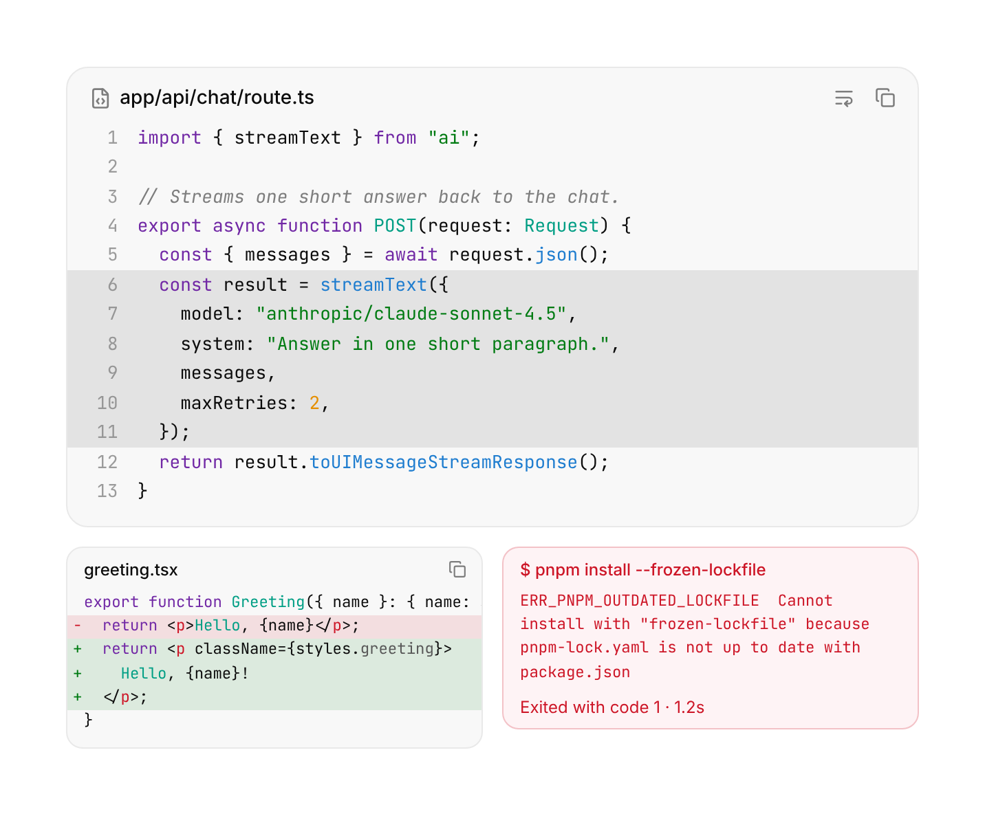
Code, terminal output, logs and diffs in a quiet panel: a header with the file name and a copy button, built-in highlighting, line numbers that are never copied, added / removed / highlighted lines, wrapping, and folding long blocks to a few lines.
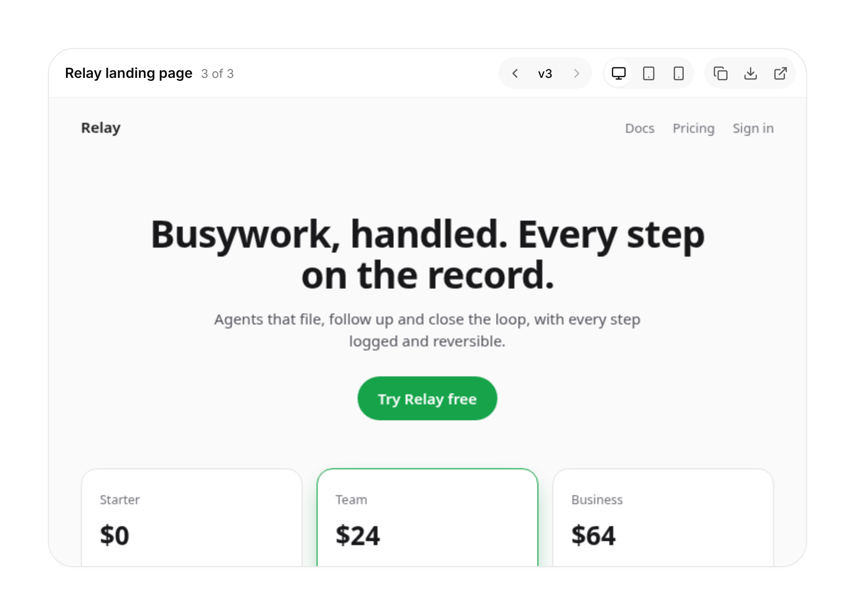
The pane beside an AI chat that shows the HTML page the model is writing: a live, scriptless draft while it streams, then sandboxed versions that swap in without a flash, with a version stepper, desktop / tablet / phone widths, and copy, download and open.
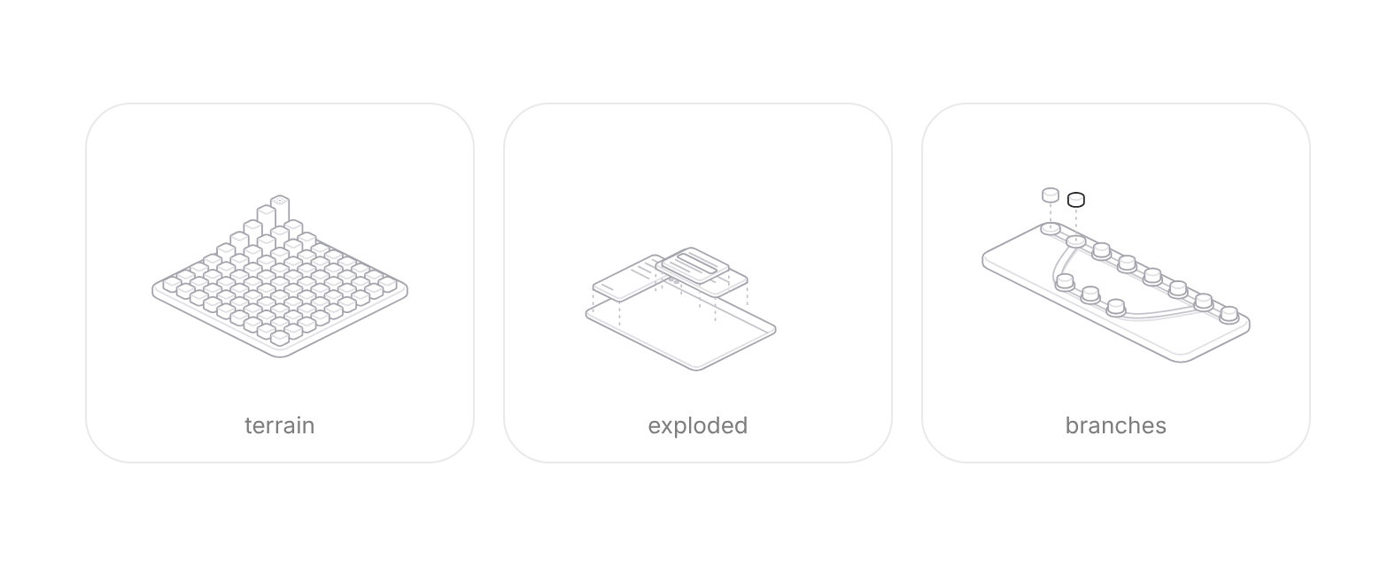
33 isometric line drawings that answer the pointer: pillars rise, app layers part, a terminal scrolls back, a commit graph lifts its history. Zero dependencies, one shared animation loop, light and dark.
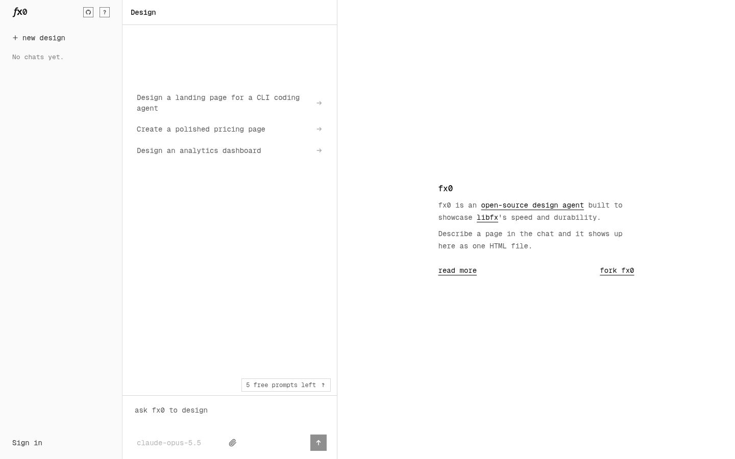
Open-source "mini v0": a chat on the left, the HTML page the agent writes on the right. Built on libfx (Vercel's durable agent runtime): streaming, tool calls, retries and sessions that survive a function dying mid-reply. 200+ models through AI Gateway; every turn keeps its versi
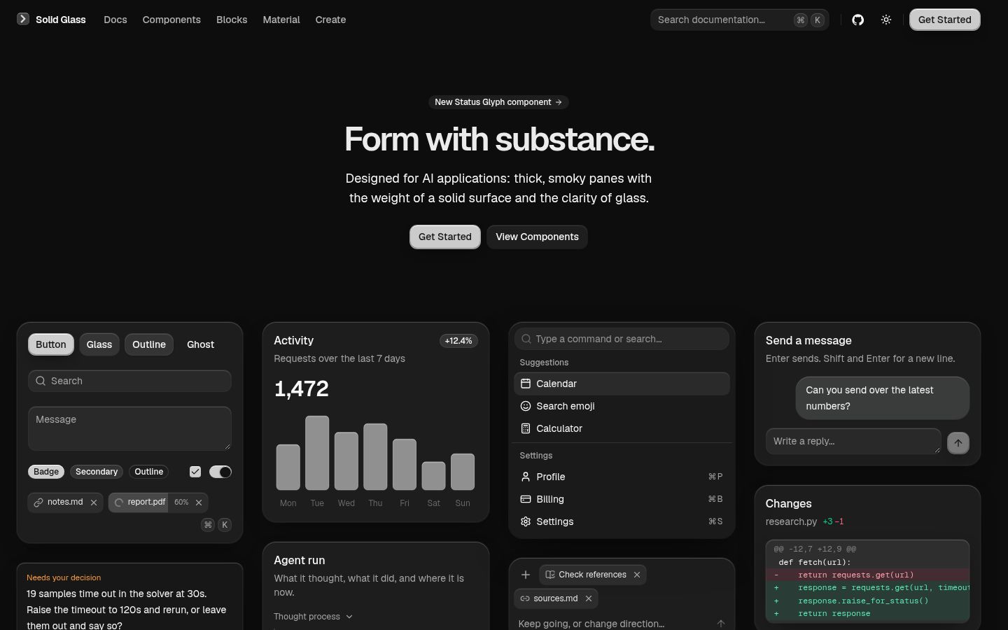
One stylesheet that restyles a shadcn/ui (Base UI, Tailwind 4) project as "solid glass": smoky, thick panes with fine edge highlights, between flat and liquid glass. Ships AI components as a registry (status glyph, context ring, diff view, reasoning, tool steps, turn status, task
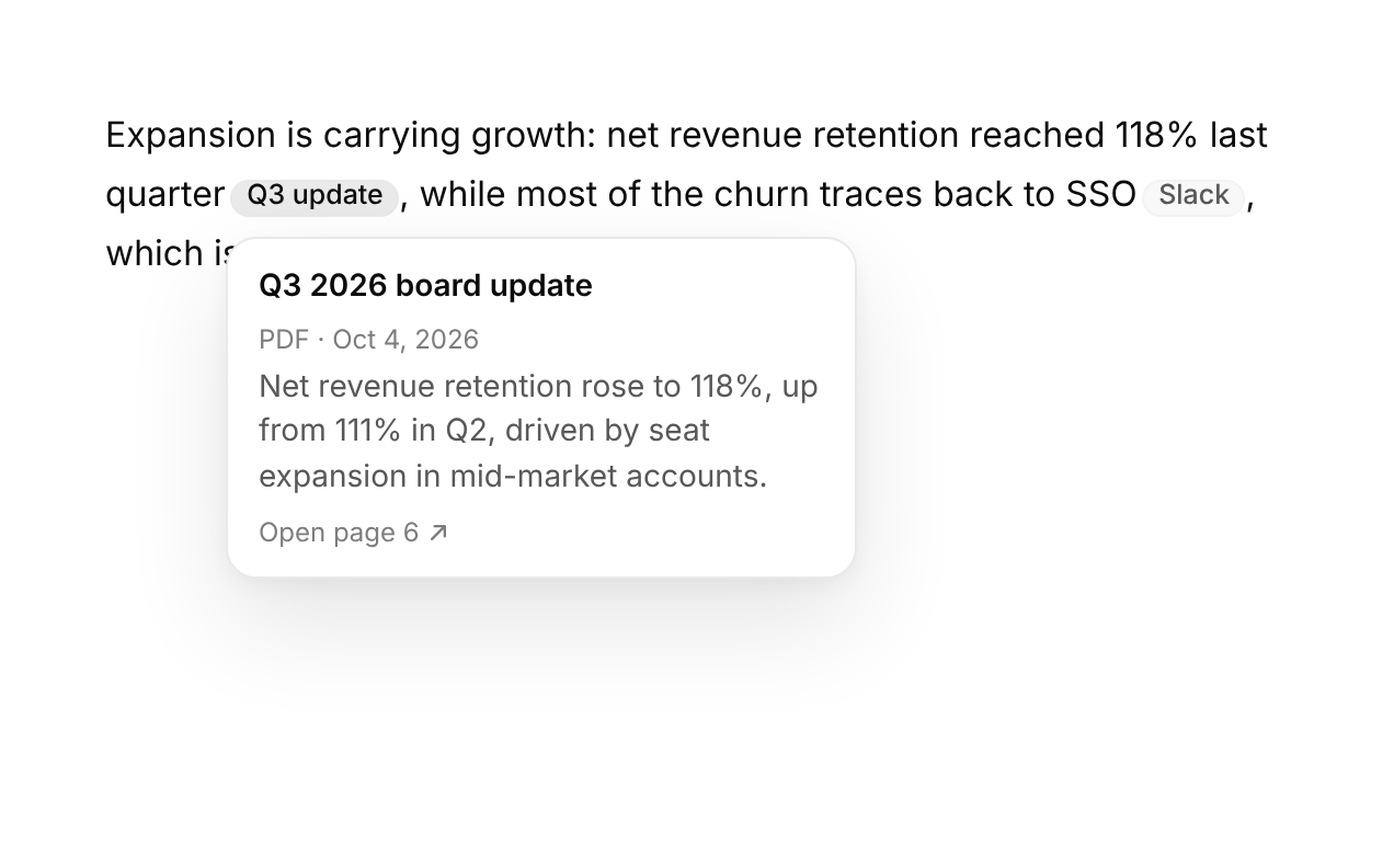
A source chip inside the sentence that relies on it: hover or focus opens a card with the source's title, type, date, the quoted passage and a link.
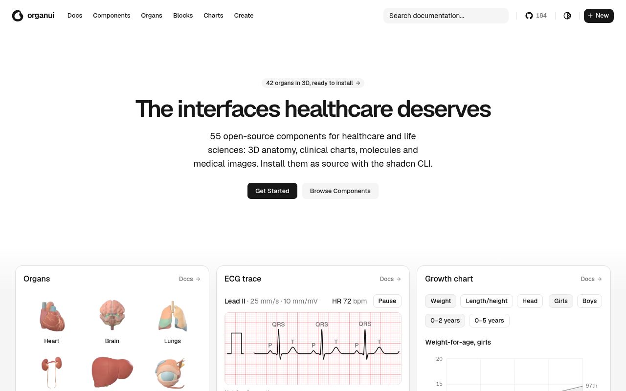
shadcn registry for healthcare and life sciences: 3D anatomy viewers, vital signs, ECG trace, lab results, growth charts, clinical charts and AI-review components (citations, disclaimers, clinician sign-off).
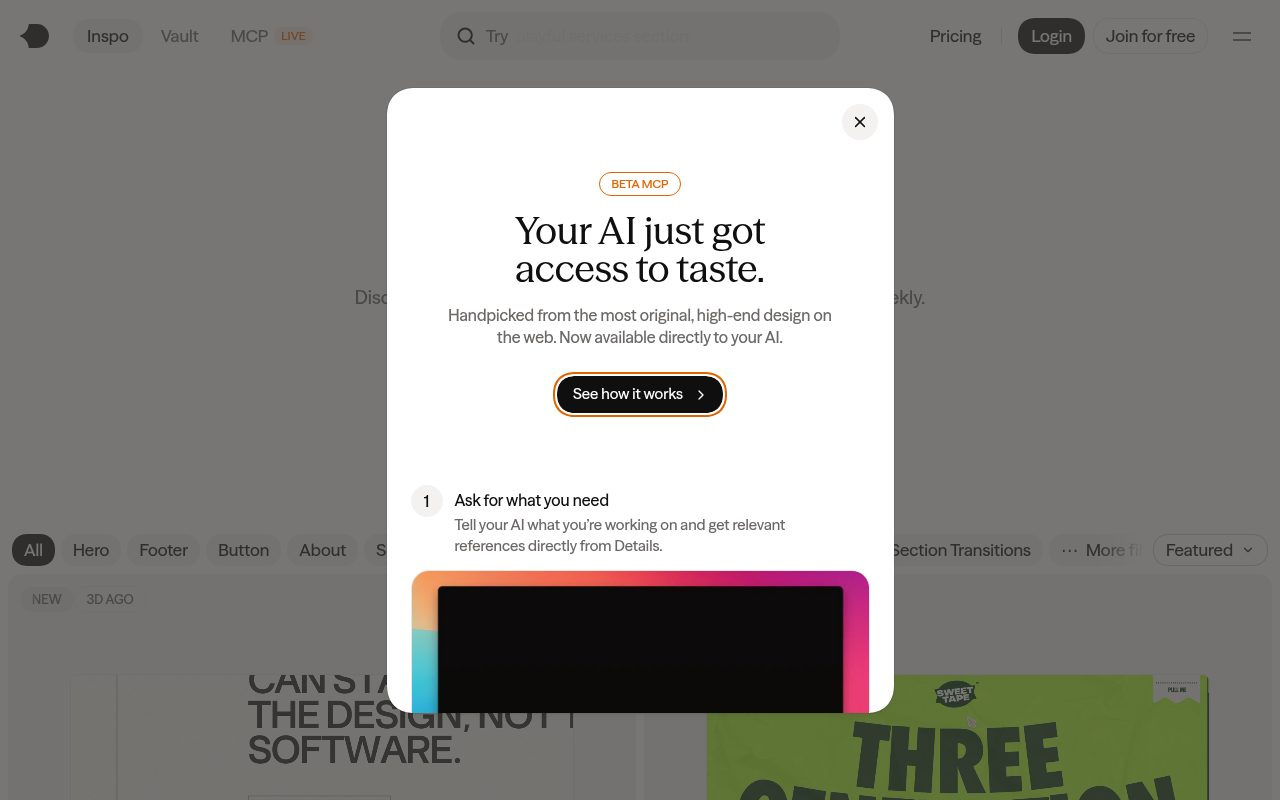
Hosted MCP server for details.so, a curated library of real-site design references (heroes, footers, preloaders, page transitions, animations).
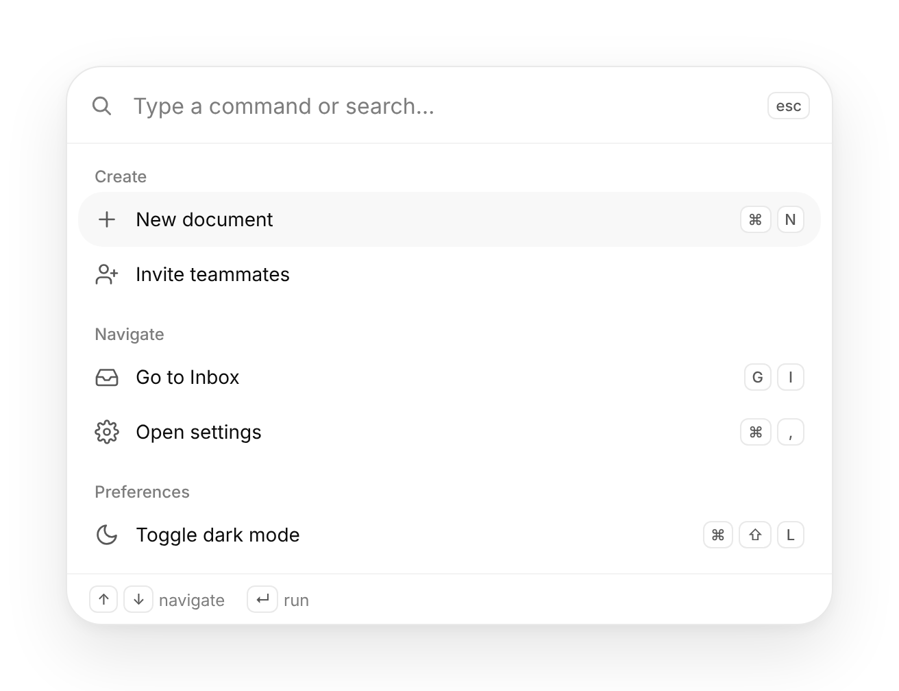
A ⌘K launcher: type to fuzzy-filter grouped commands, arrow to highlight, Enter to run.
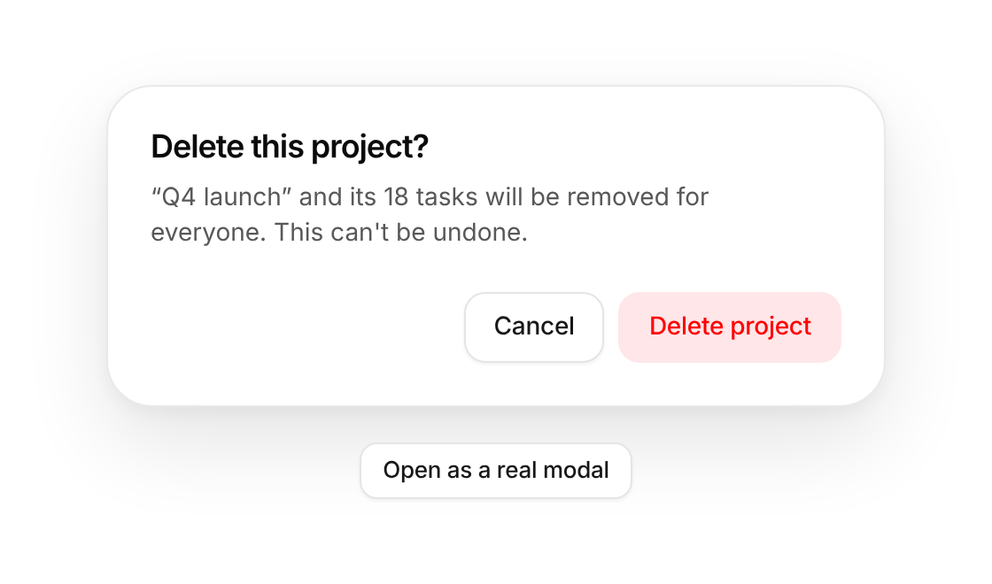
A centred modal on the native <dialog> element: title, description, body and a button row, with an alert variant for confirmations.
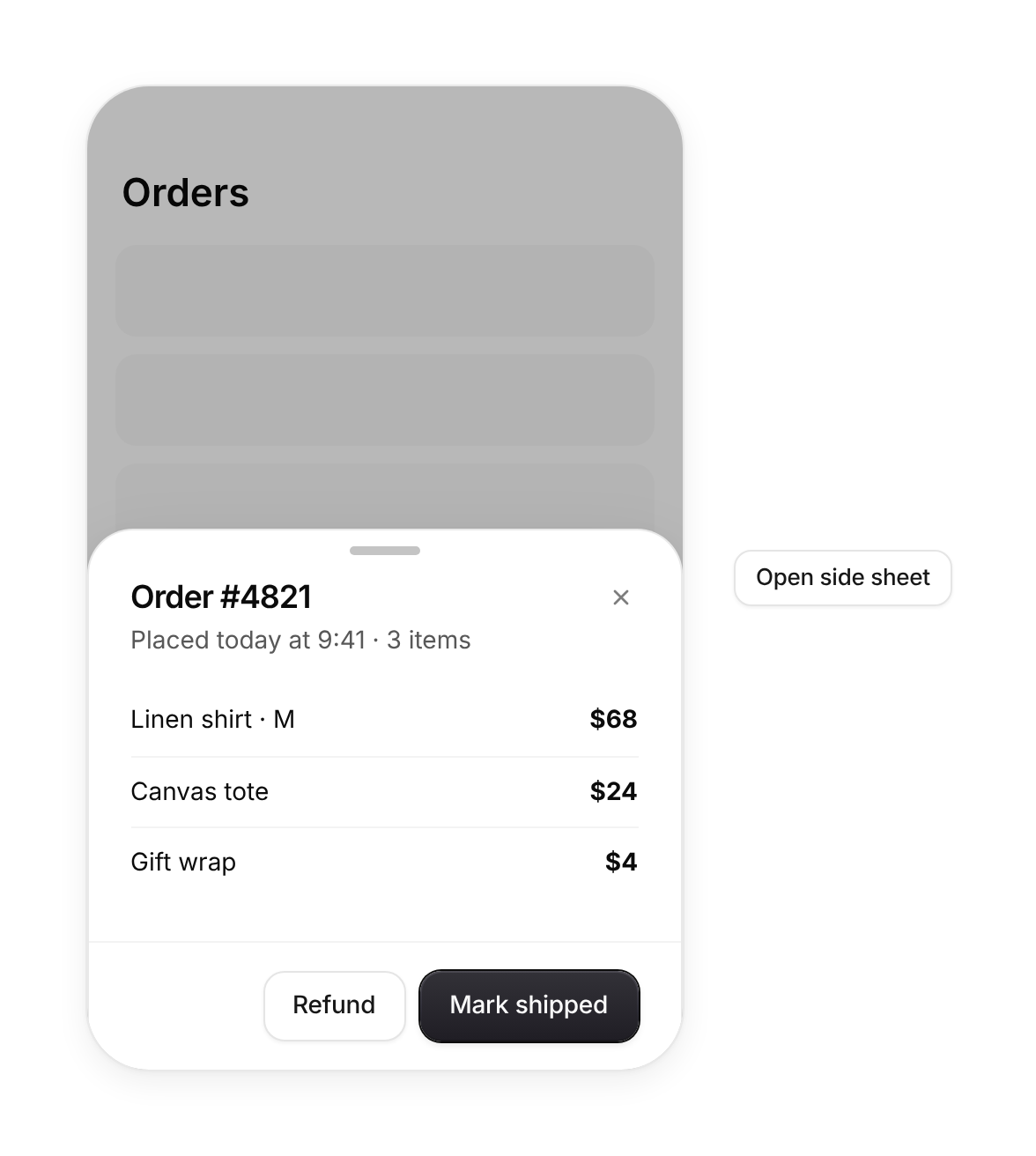
A panel that slides in from the right, left or bottom. From the bottom it is a mobile drawer with a grab handle you drag down to dismiss.
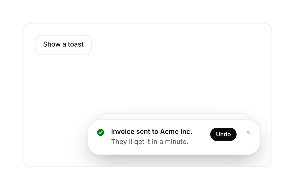
Brief notices that stack in a corner, fan out on hover, pause while you read and swipe away. Call toast() from anywhere.
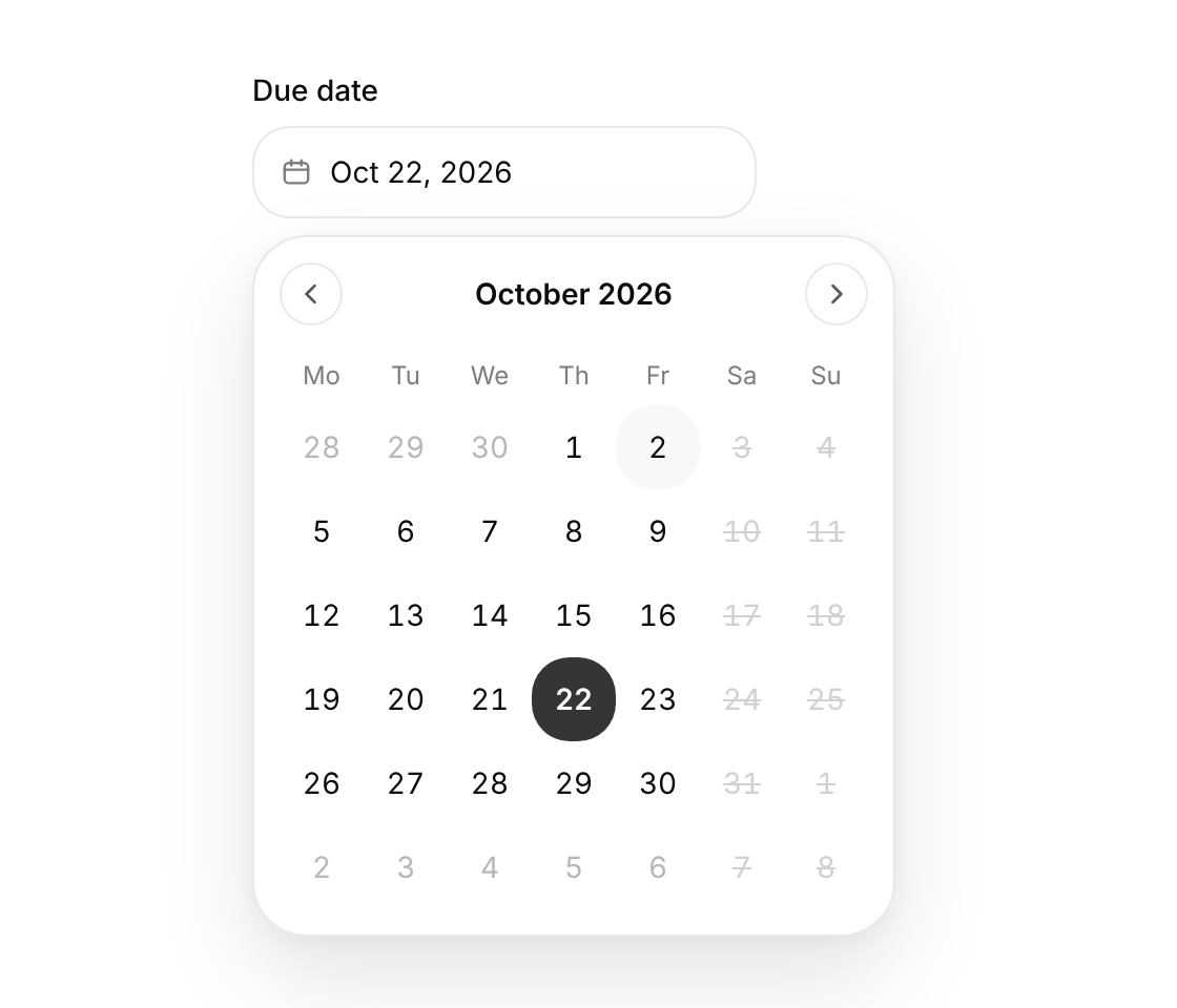
A date field that opens a month calendar, plus the Calendar on its own, with the full WAI-ARIA grid keyboard model.
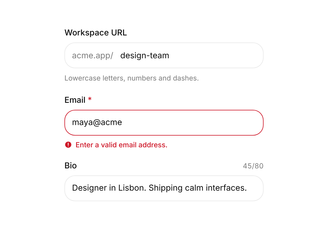
Label, input, hint, error and character count wired together with the right ids and ARIA; validate inline or pass errors from your form library.
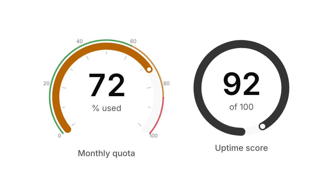
An SVG arc meter with an animated fill, ticks, coloured bands and a centred readout.
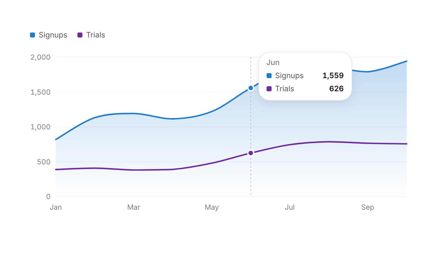
Smooth lines with a soft area fill, a shared crosshair and a tooltip; arrow keys step through the points.
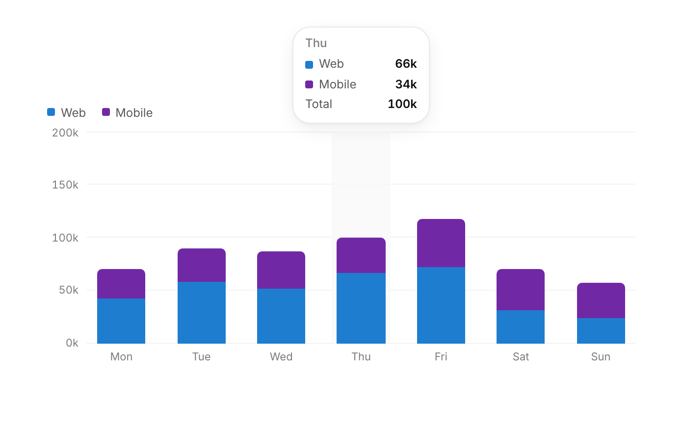
Grouped or stacked vertical bars with a value tooltip on hover or focus; every bar is reachable by keyboard.
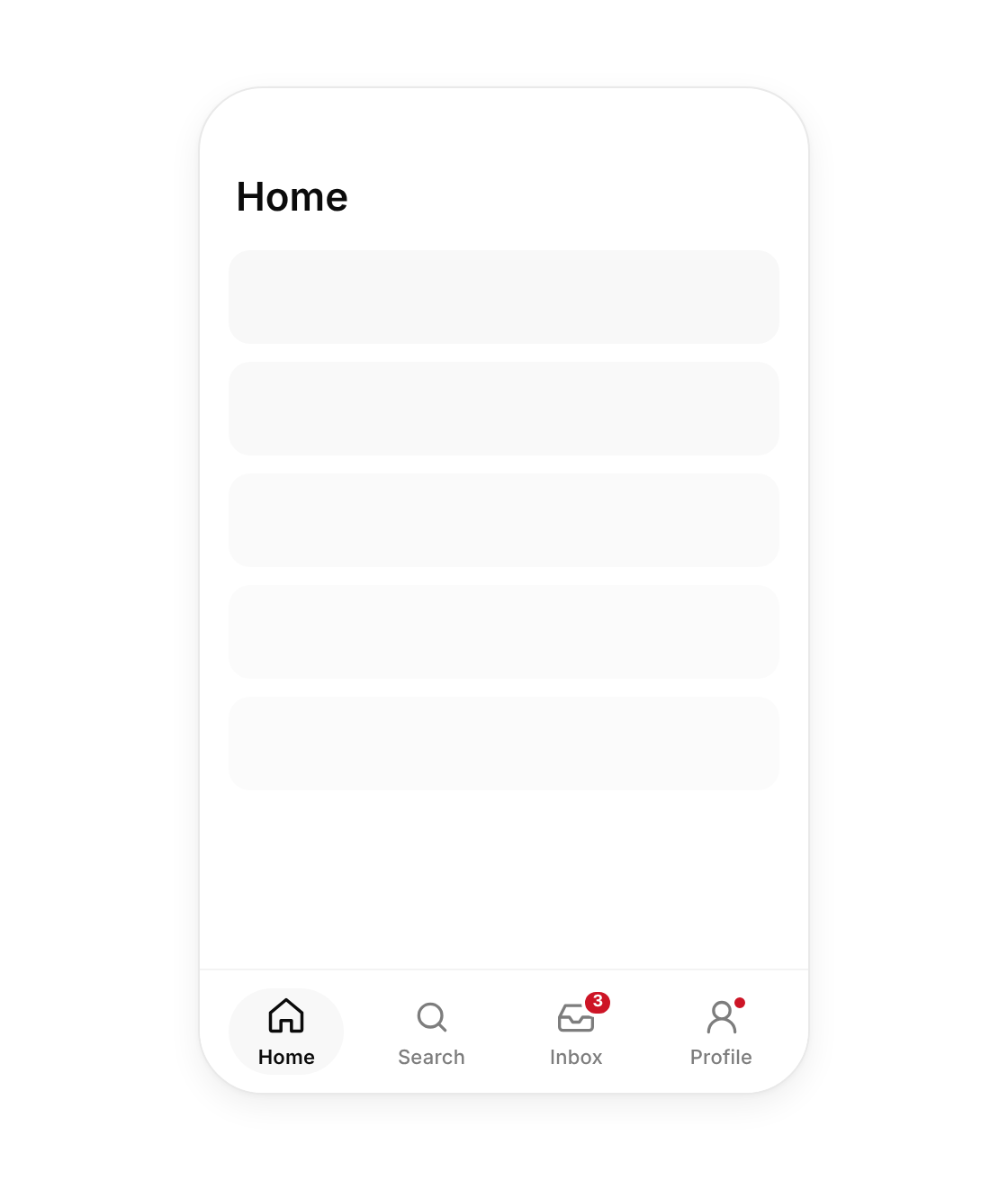
The bottom navigation of a mobile app: icons, labels, badges and a pill that glides to the active tab.
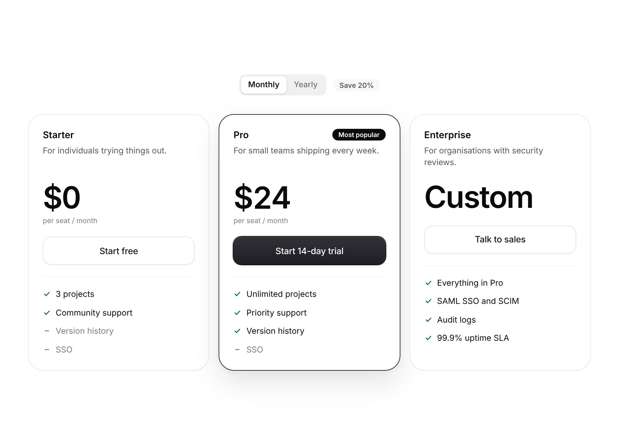
Plan cards with a monthly / yearly switch, a highlighted plan, included and excluded features, and prices that roll to the new number.
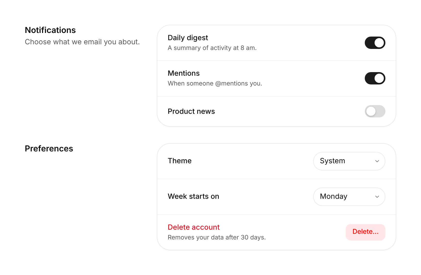
Titled sections of setting rows, each with a label, description and a switch, select or your own control. Includes a Switch.
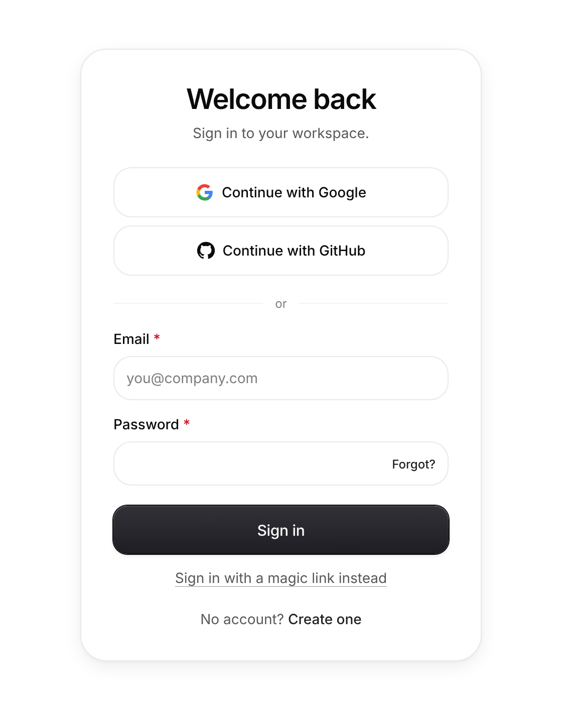
A sign-in card with social providers, email and password, a magic-link alternative, inline validation and a submitting state.
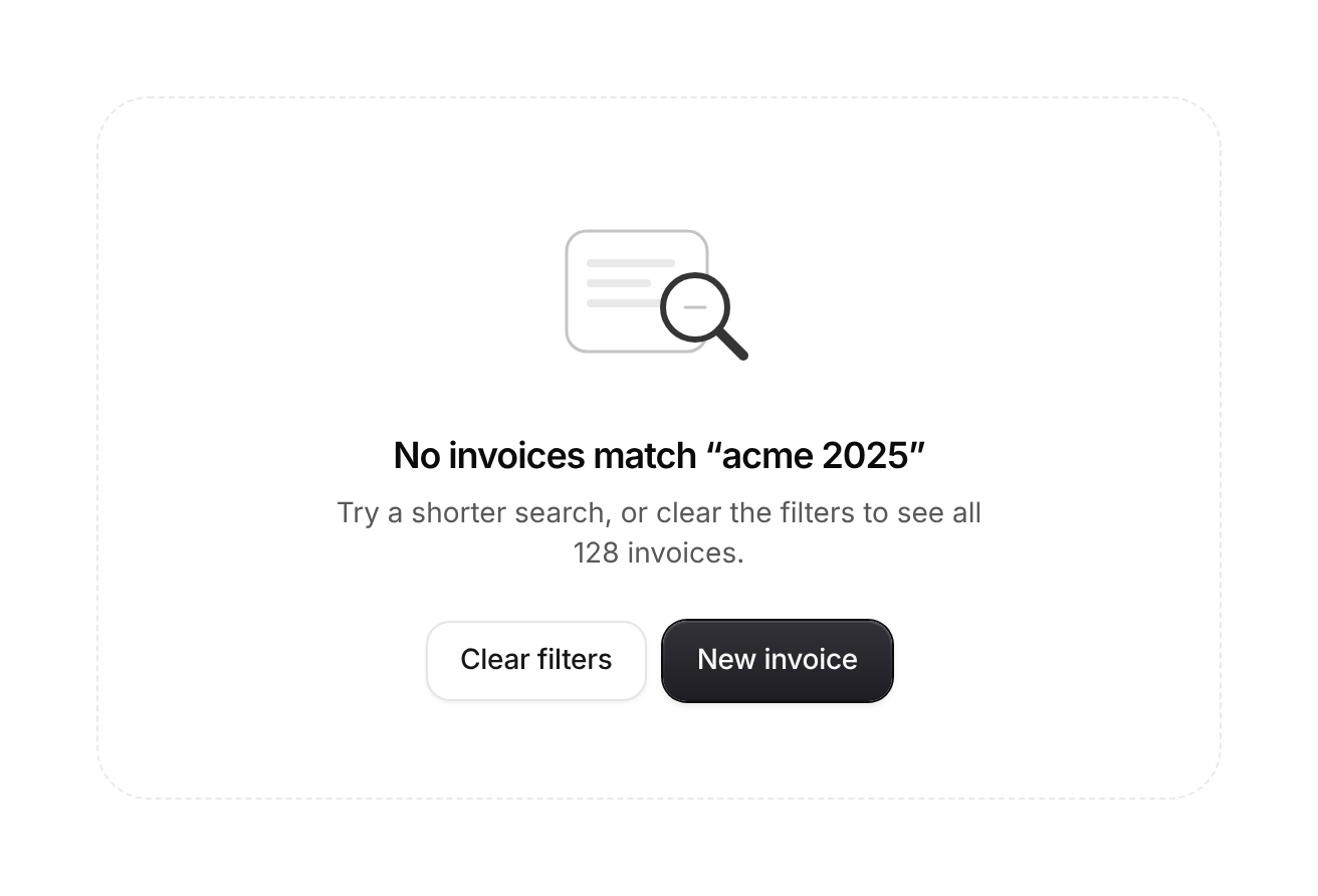
An illustration, a headline, a sentence of why, and one or two actions, for lists and pages with nothing in them yet.
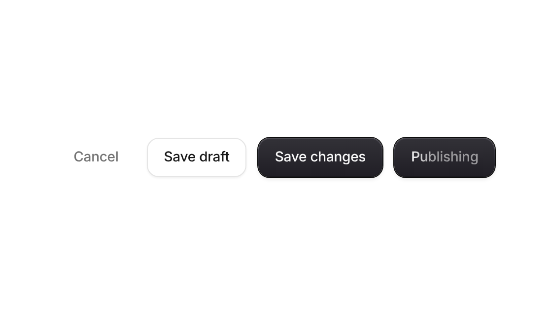
Primary, secondary, ghost and destructive buttons with icons, sizes and a shimmering loading state
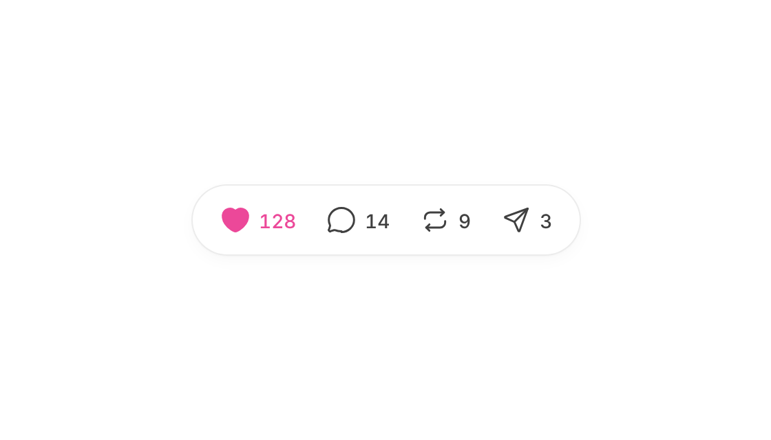
Like, comment, repost and share in one pill – icons pop and fill, counts roll in digit by digit
Every click throws a short burst of rays from the pointer.
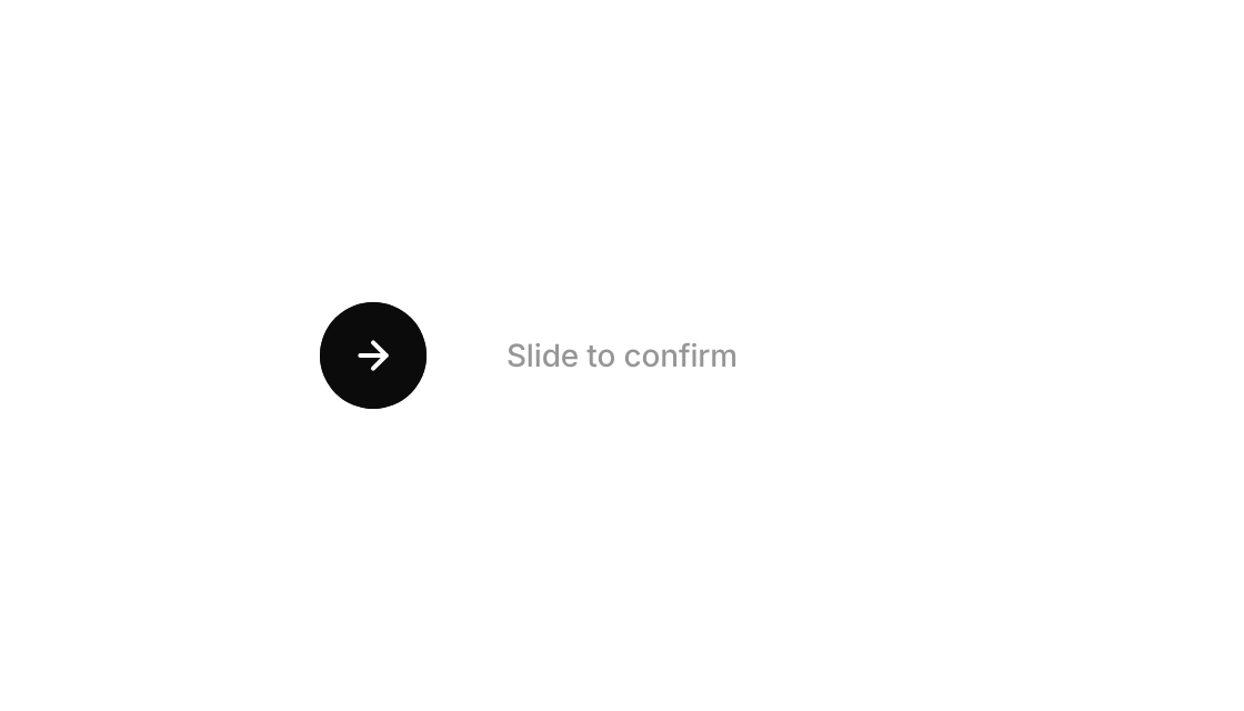
A handle you push across a track; past the mark it finishes the journey itself and unfurls into the confirmation.
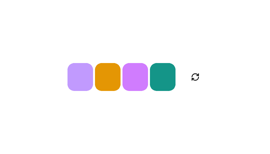
A strip of colour swatches that morph to a new palette on refresh, with tunable corner and morph speed.
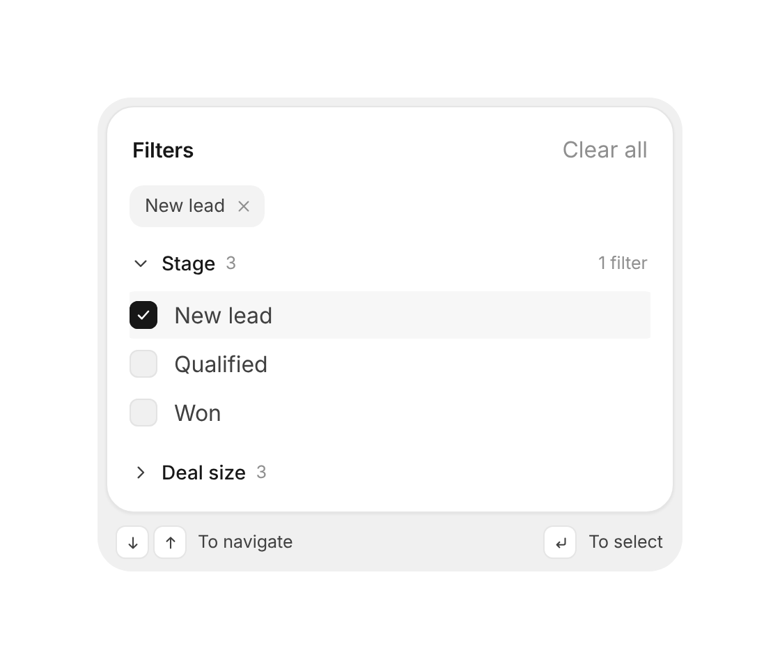
Grouped filters with removable chips, collapsible checkbox groups, Clear all and full keyboard control
The verification code field done right – a gliding focus ring, paste and SMS autofill, a calm shake on errors and a morph into Verified

A search pill that leans toward the cursor and springs open into a field.
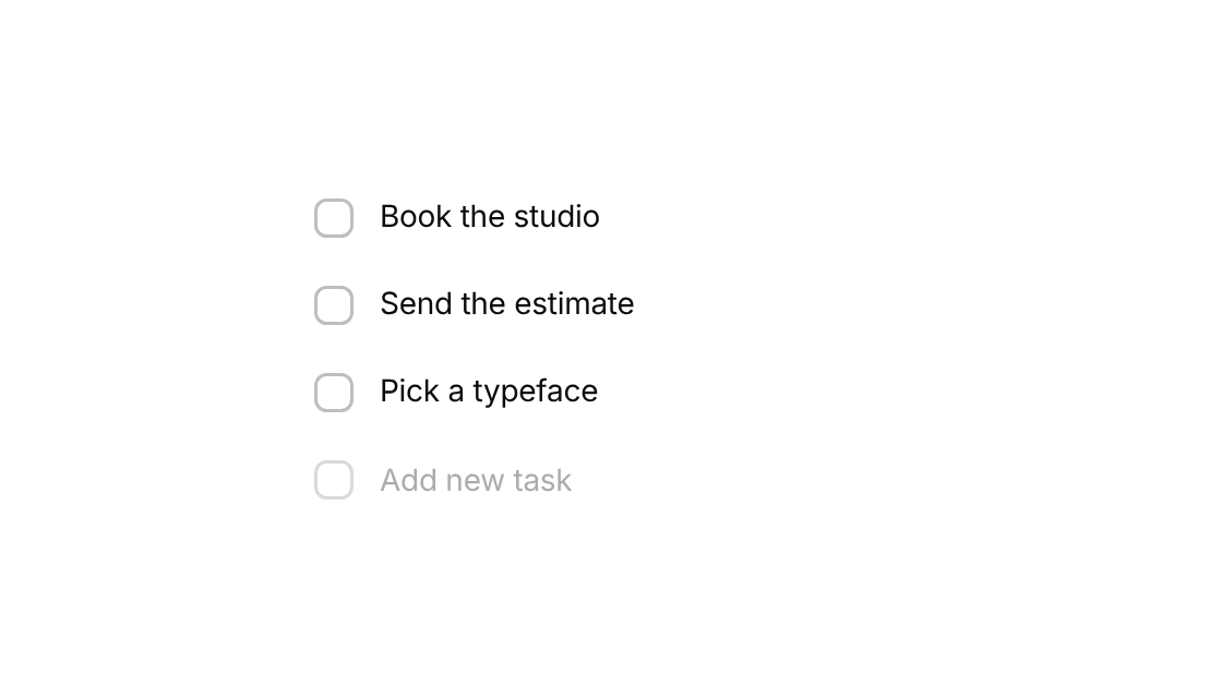
A to-do list whose boxes swell and settle with a tunable spring when ticked.
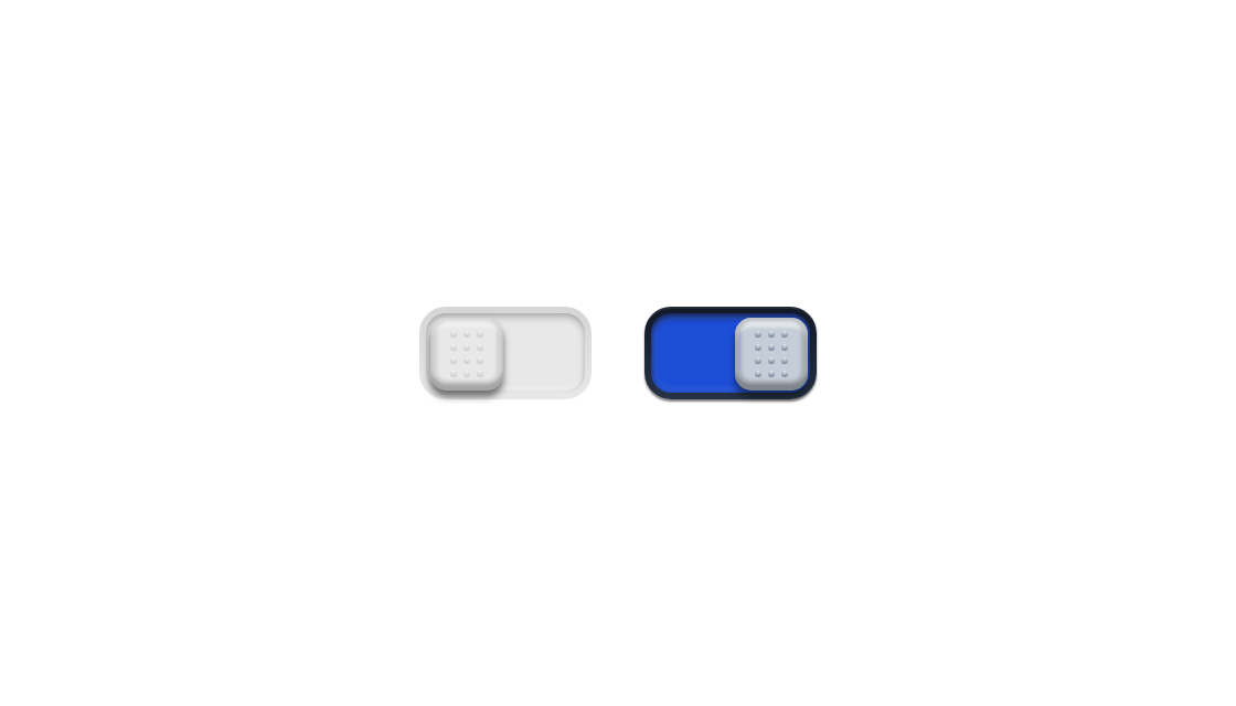
A recessed hardware switch with a grippy knob that slides across.
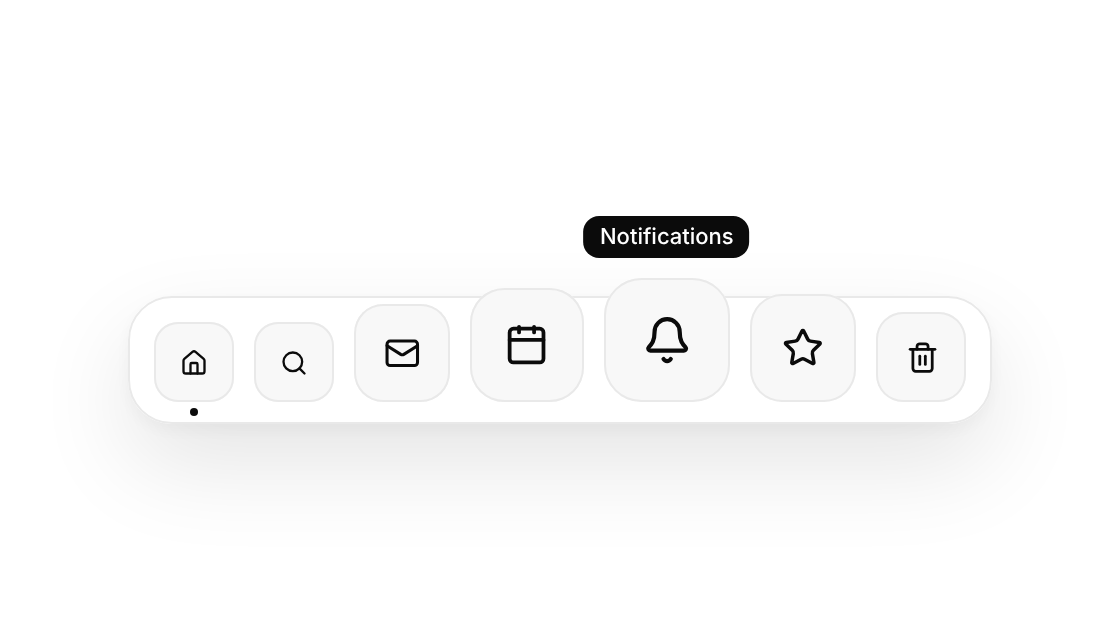
A macOS-style dock whose icons swell as the pointer passes.
A menu button whose list oozes out of the trigger like a droplet.
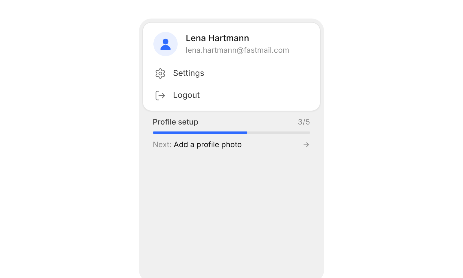
Account card with the signed-in user, menu actions and profile setup progress
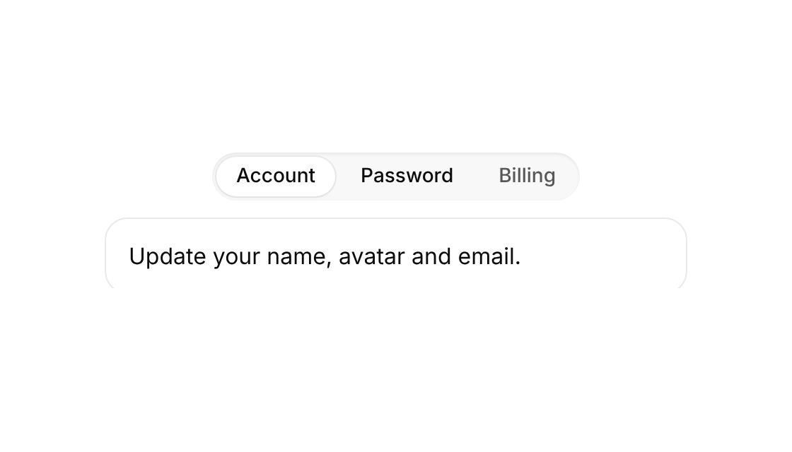
Tabs whose content slides in from the side you moved toward while the panel height springs to fit.
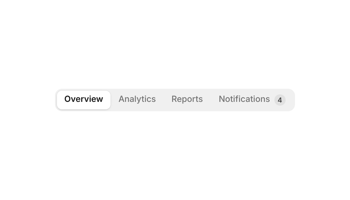
Switch between two to six options – a raised pill or underline that glides, stretches a little and can be dragged across, with icons, counts and badges
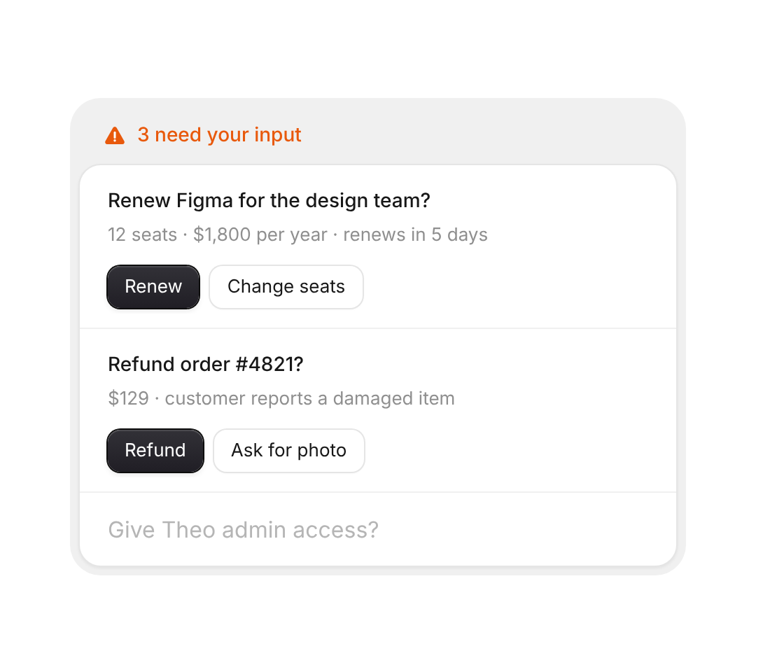
Open decisions with two quick answers each – answered ones confirm and fold away
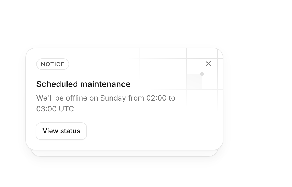
Notice cards stacked behind each other – dismiss the front one to reveal the next
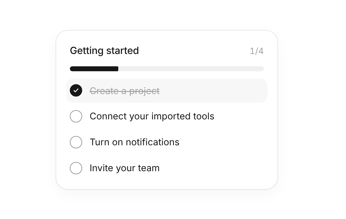
Onboarding checklist with an animated progress bar, ticks that draw themselves and auto play
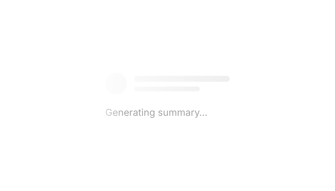
Skeleton blocks that share one soft light sweep, plus shimmering text for “Thinking…” states

The classic twelve-bar activity spinner.
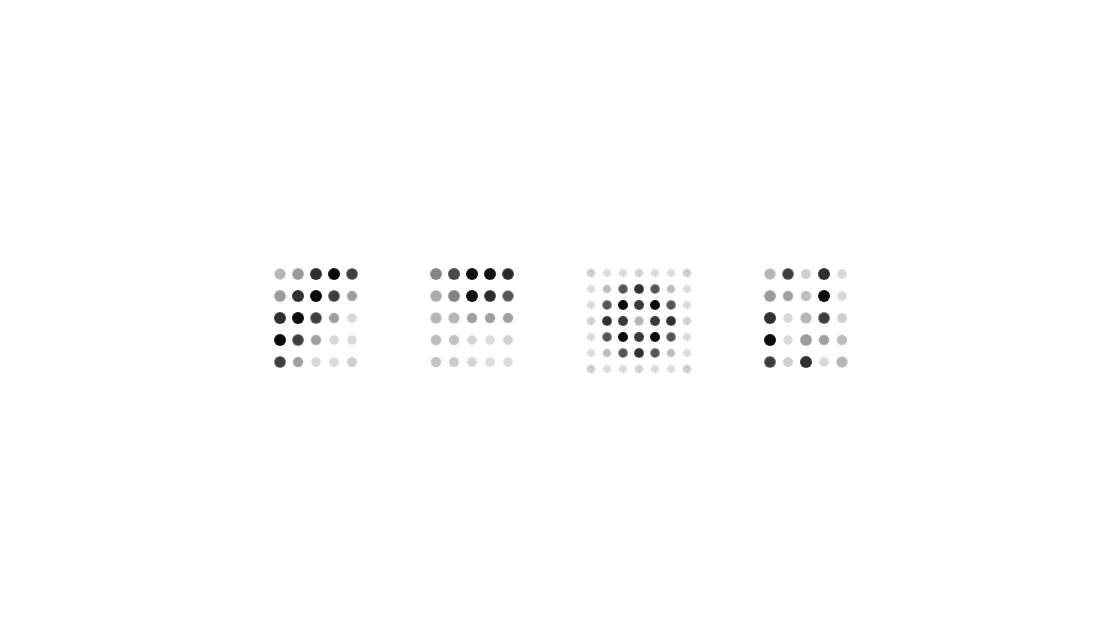
A small LED-style grid of dots that light in a pattern while something loads.
Three blobs that melt into each other through an SVG goo filter.
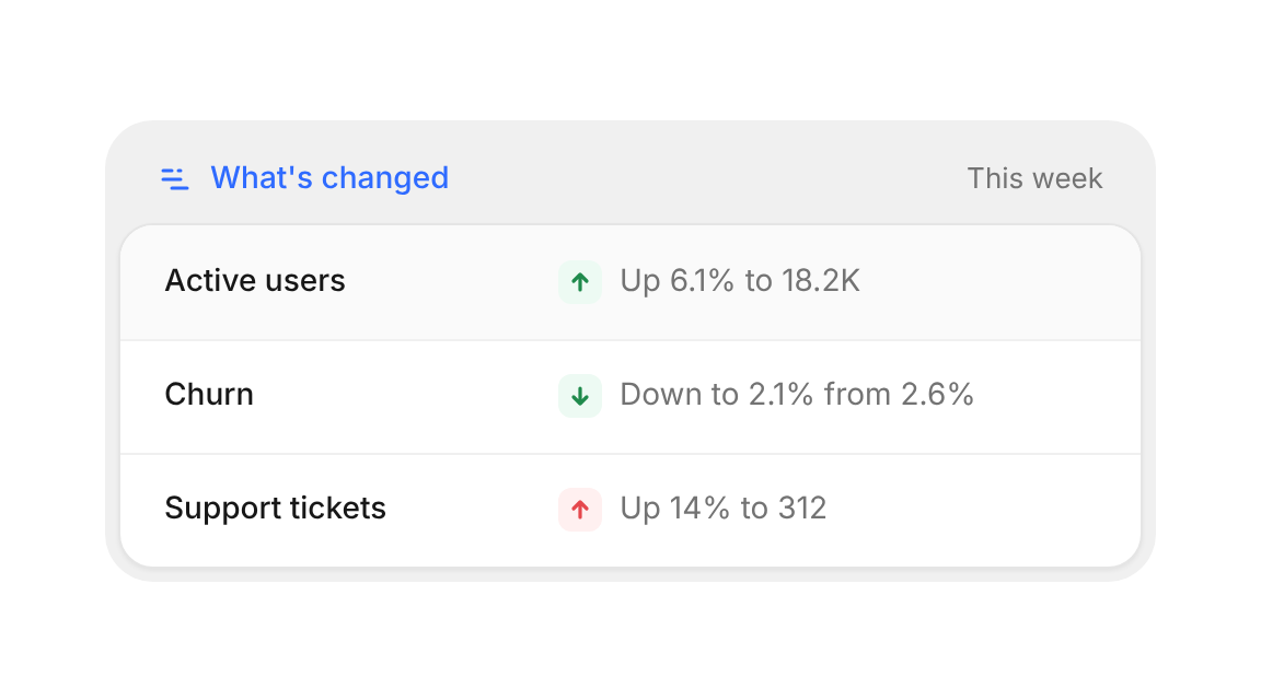
What moved since last time – one metric per row with a colored trend
A physics stack of task blocks: finish one and the tower above it drops into place.
A radial tick gauge whose lit band carries a travelling wave.
An endless ticker for logos, testimonials or text, with edge fades and pause on hover.
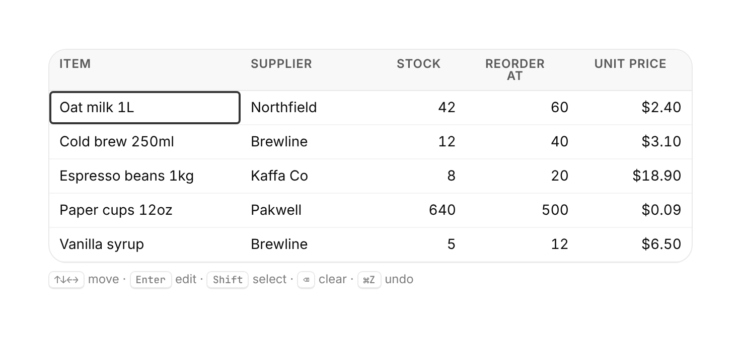
A compact spreadsheet-style grid with keyboard navigation, inline edits, range select, sort and undo.
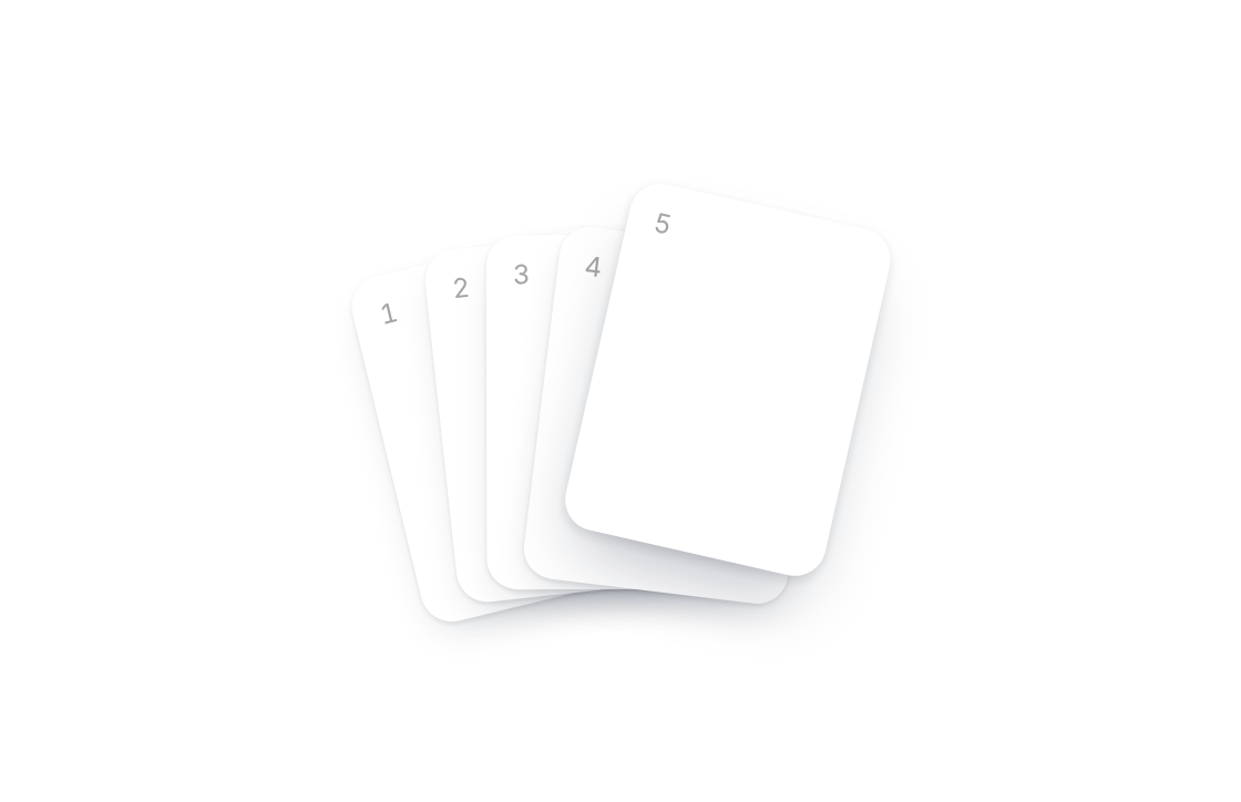
A pile of cards that fans out on hover and springs back into a scattered stack.
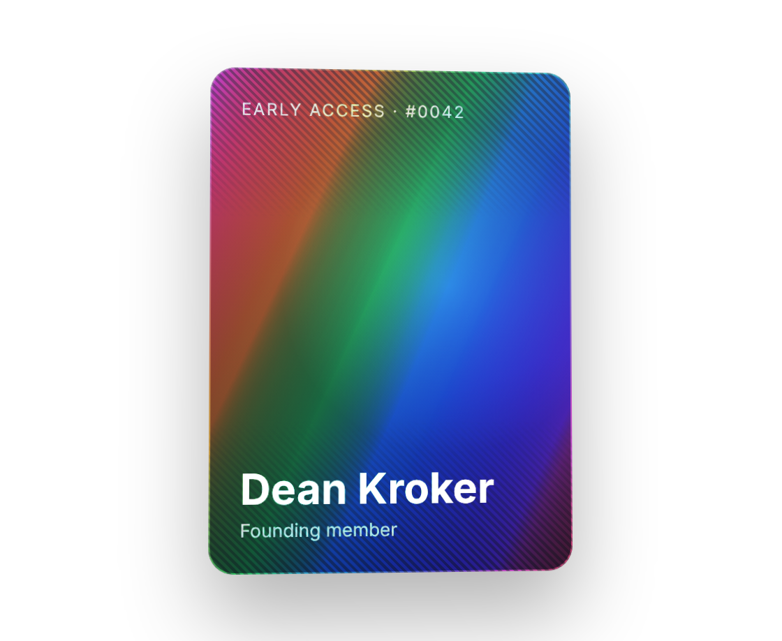
A trading-card surface with a rainbow foil that shifts as it tilts toward the pointer.
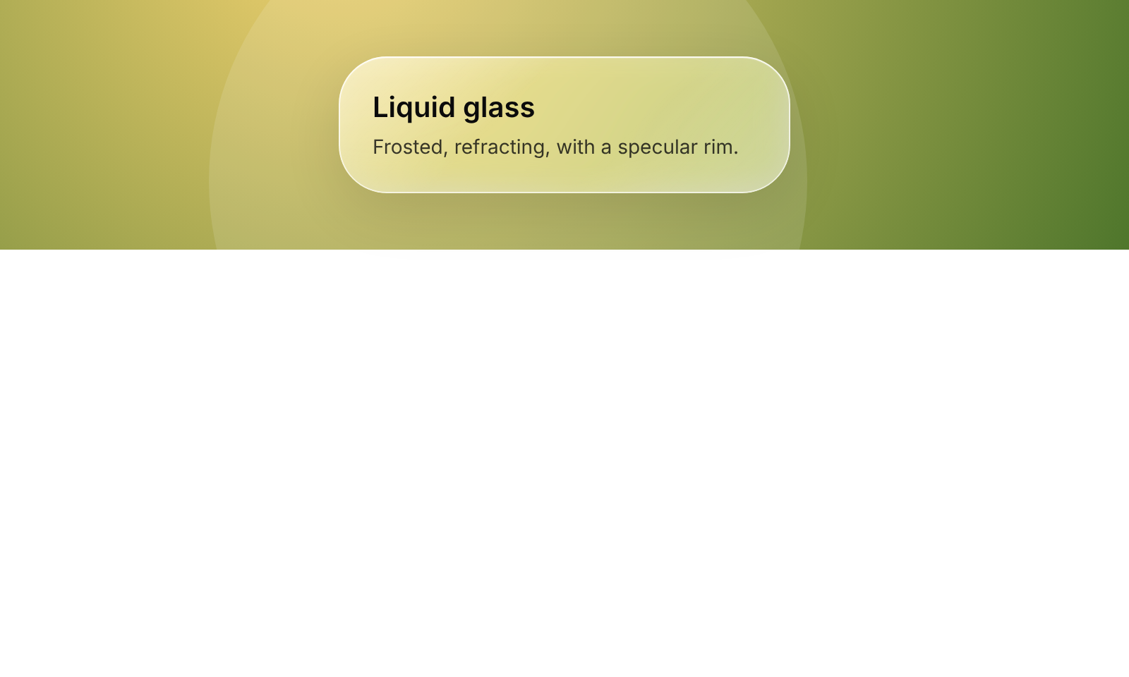
A glass panel that frosts and slightly refracts whatever sits behind it.
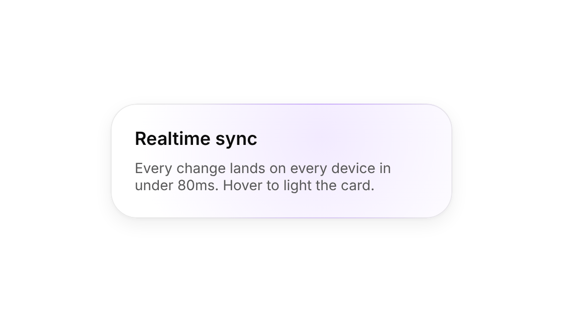
A card that lights up under the pointer, with a brighter rim where the light meets the edge.
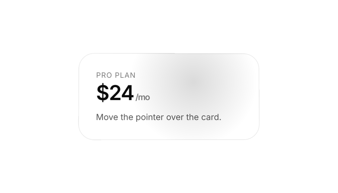
A card that leans toward the pointer in 3D with a following glare.
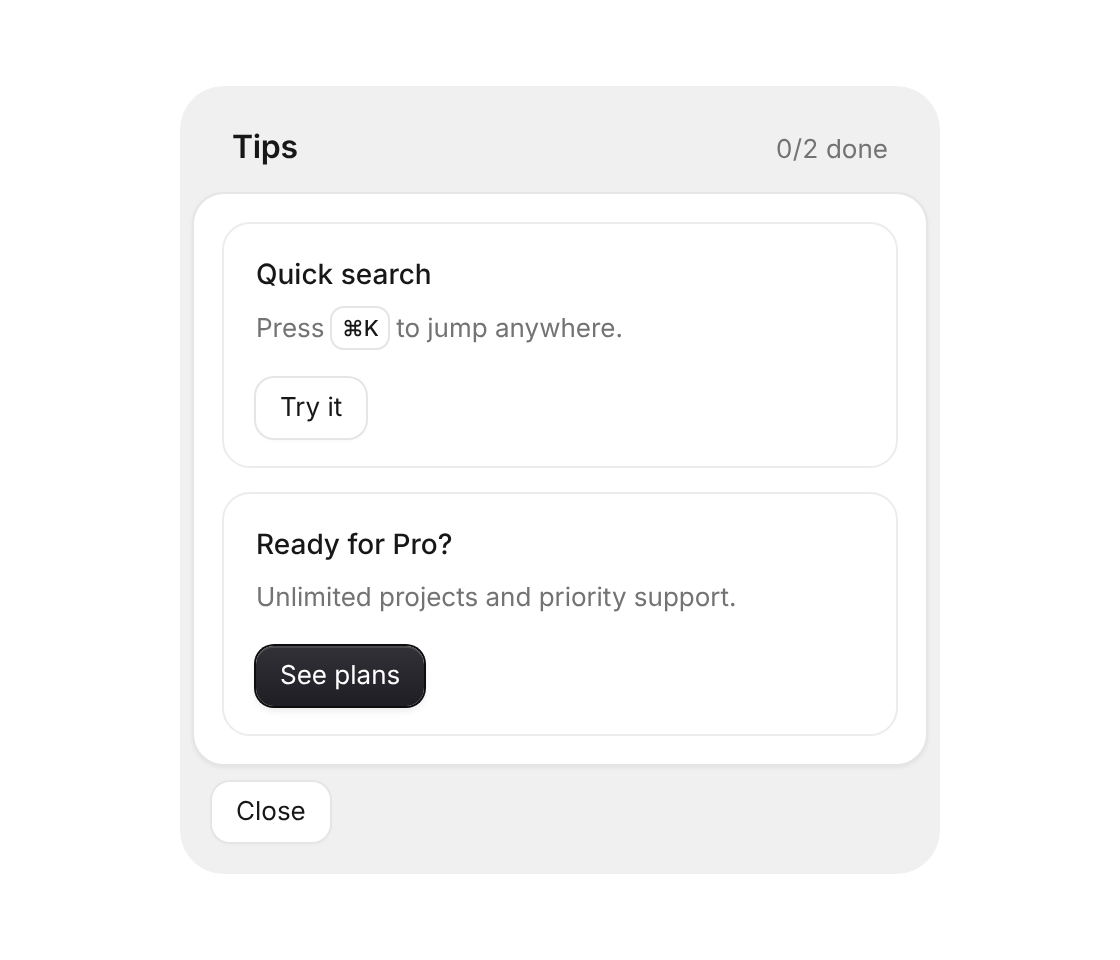
Grid of short tips with one action each – taken tips turn into a done state
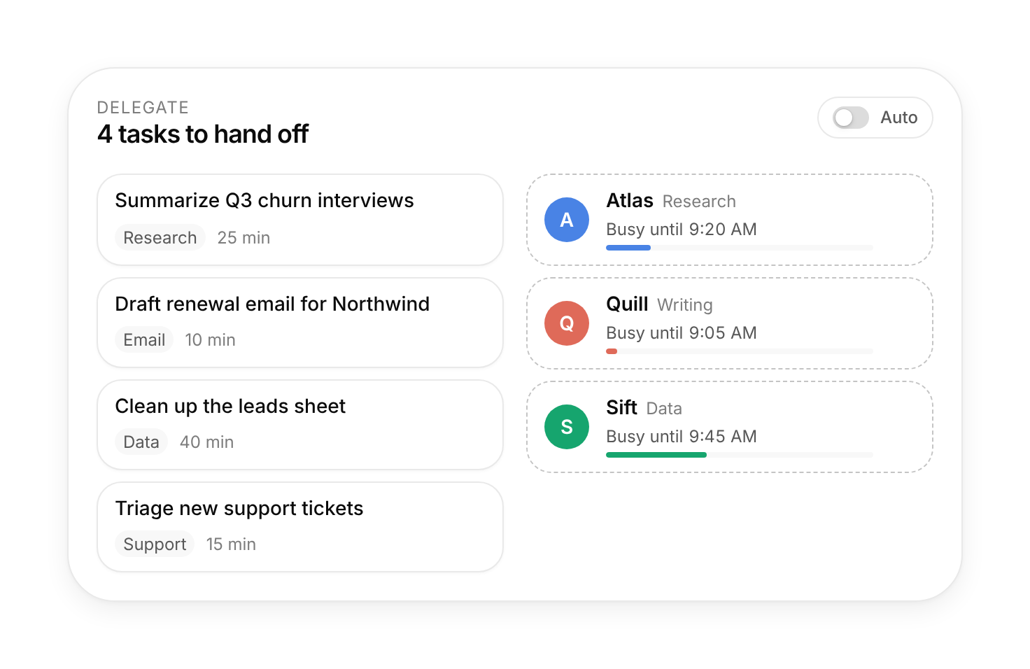
Hand tasks to agents by dragging them on; each agent previews its new "busy until" time, or switch on Auto.
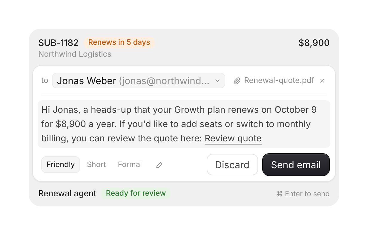
Agent-written email for review – switch recipient and tone, edit inline, remove the attachment, send or discard with undo
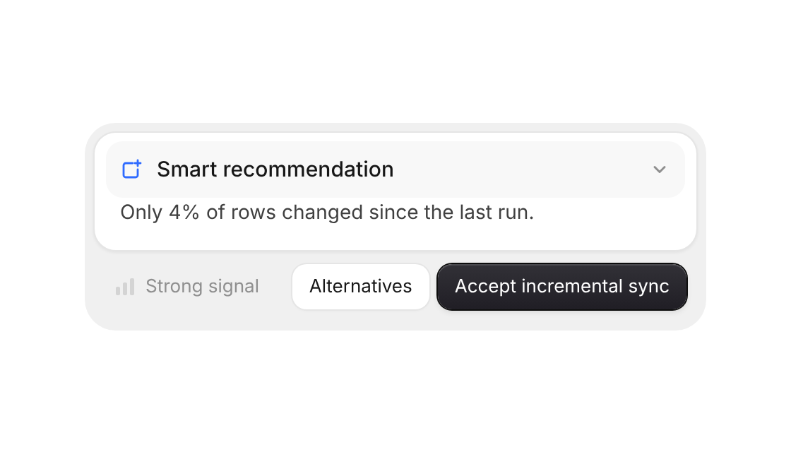
Suggestion card with a confidence signal, alternatives to switch to and accept with undo
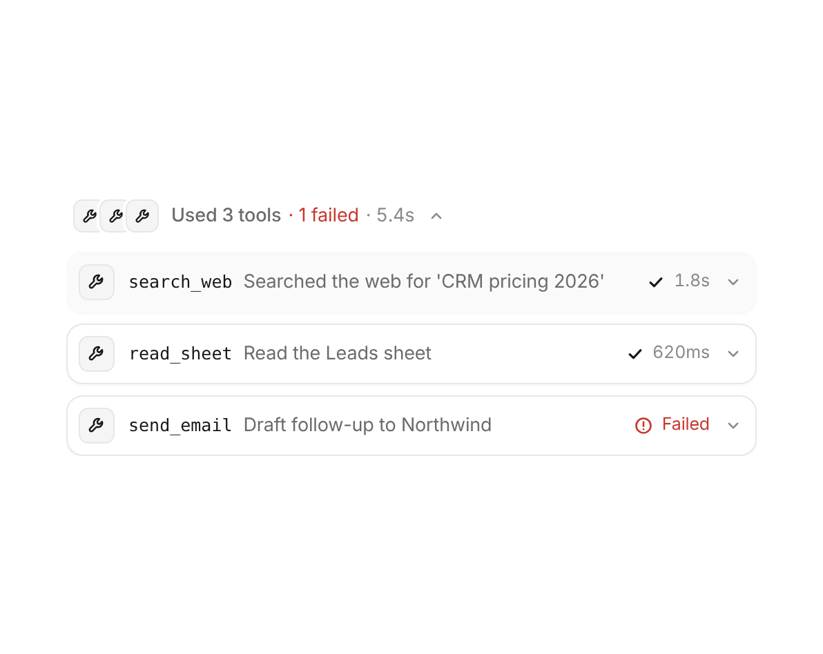
An agent's tool call in one line – live timer, status and summary, folds open to highlighted arguments and result with copy, retry on errors and a group that sums them up
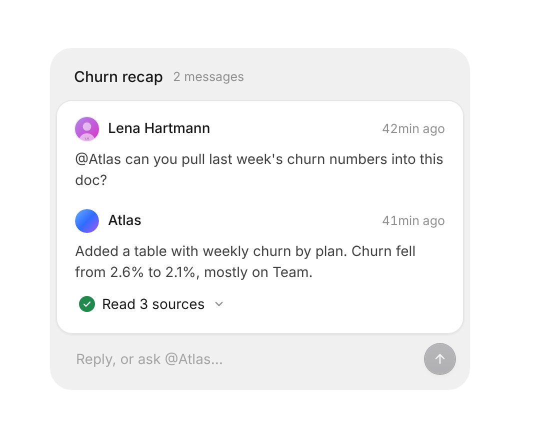
One comment with replies – an assistant reports what it did, folds open details and answers @mentions
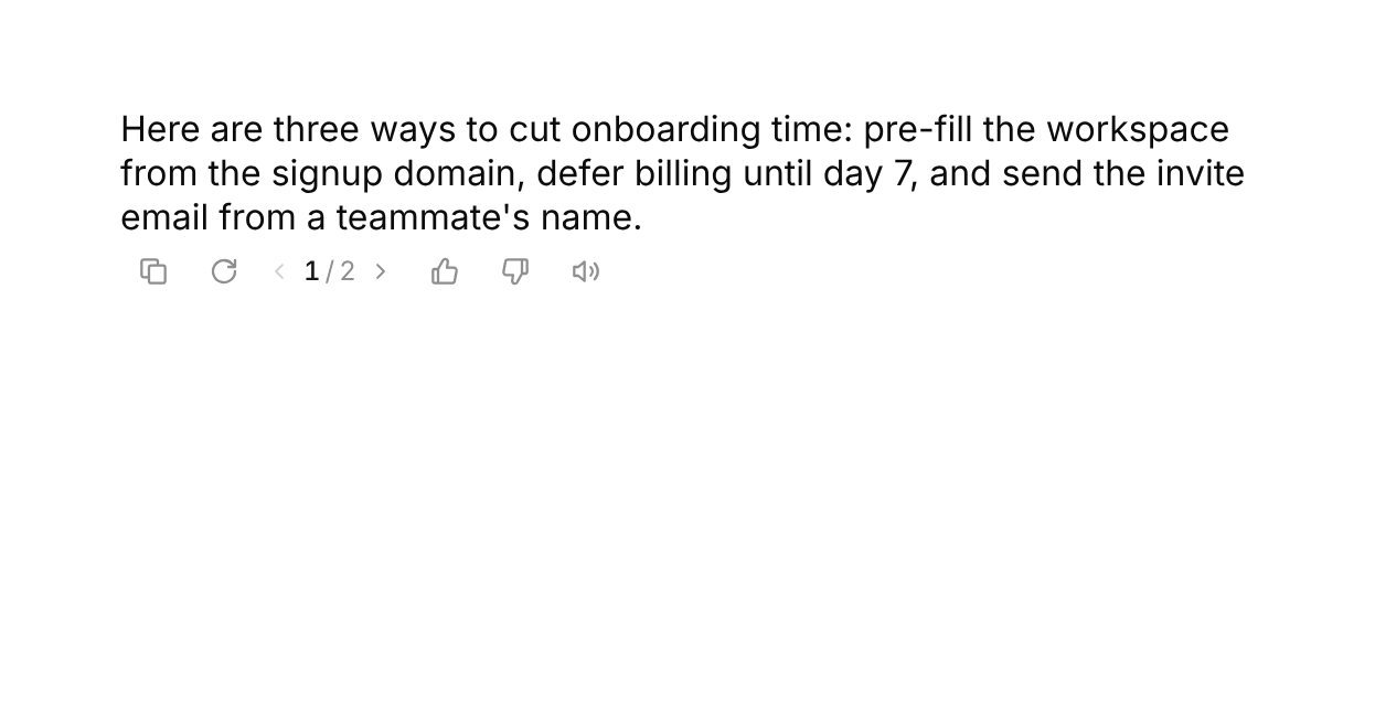
The quiet bar under an AI message – copy turns into a check, regenerate spins and unfolds a version switcher, thumbs pop and ask why, read aloud becomes a tiny equalizer
A small working pill for AI replies – an eight-ray spinner and a shimmering label that rolls through phases and settles on a check
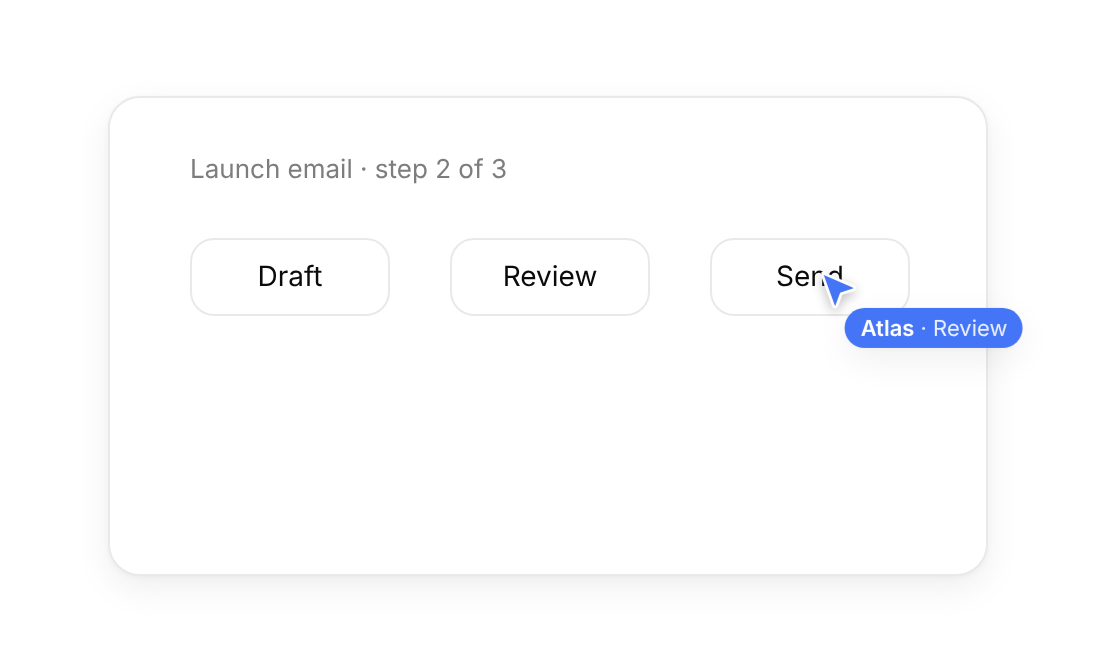
An AI agent's cursor that moves through a path with human-like aim, a name tag and click pulses.
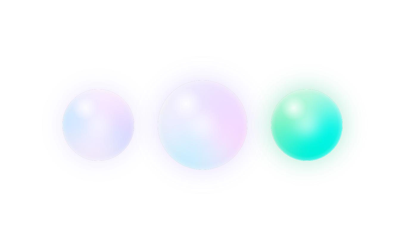
A glassy swirling AI presence orb that changes pace as the assistant listens, thinks or speaks.
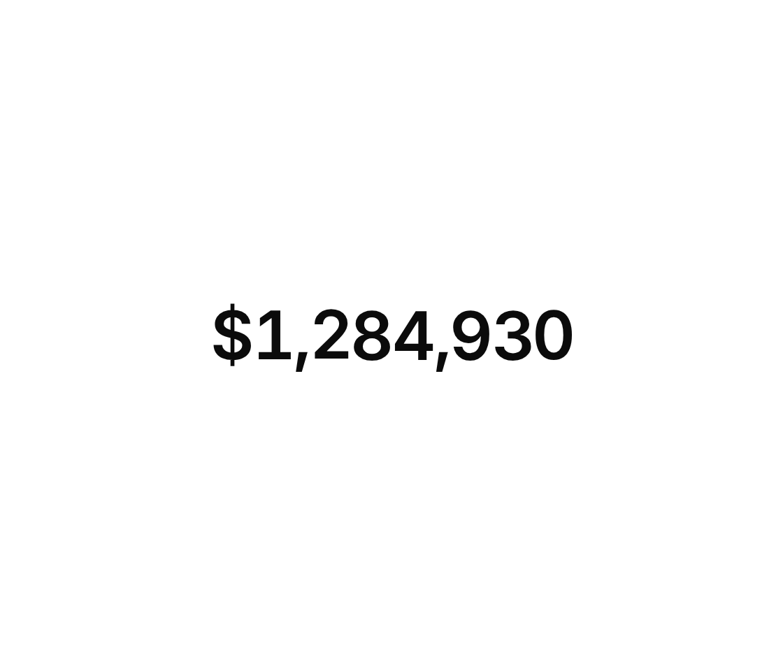
Odometer-style numbers – every digit rolls to its new value and counts in from zero when it scrolls into view
Text that sharpens into place from a soft blur, letter by letter or word by word.
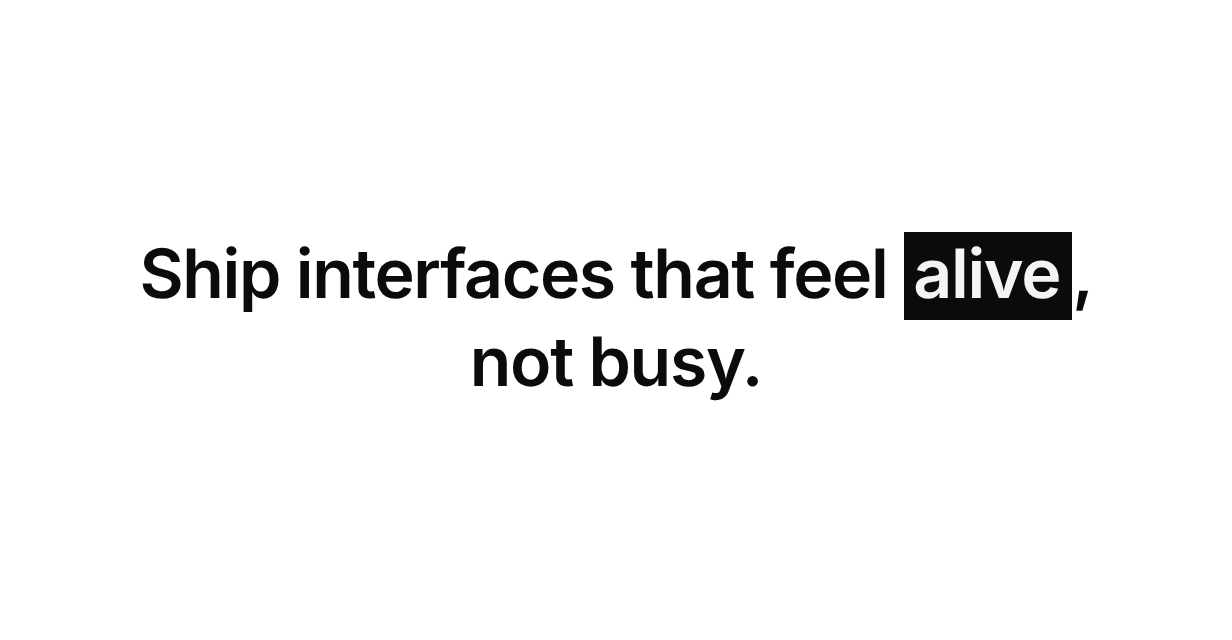
An inline marker that sweeps behind a phrase and inverts the text it covers.
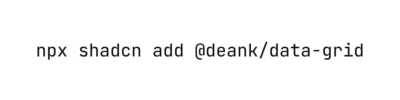
Text that resolves left to right out of random glyphs, like a terminal decoding.
Text that arrives word by word or letter by letter – each piece rises out of a soft blur as it scrolls into view
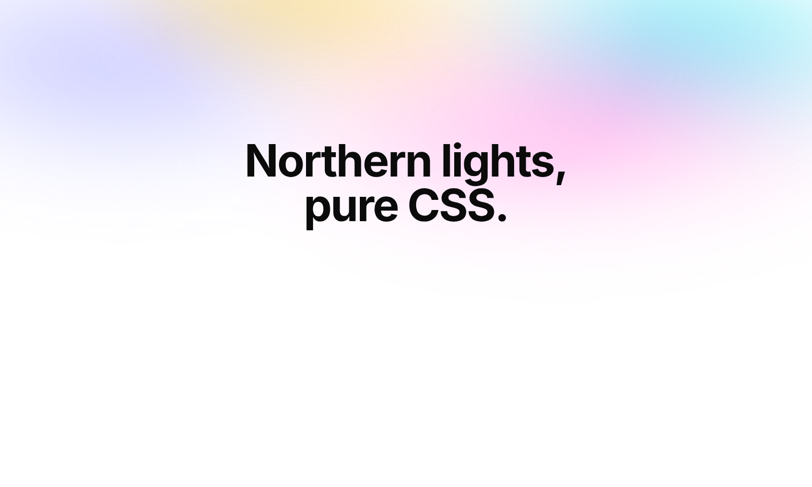
Slow drifting bands of soft color behind your content.
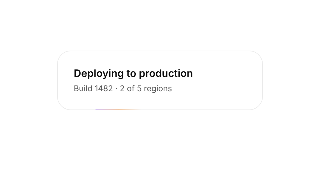
A light that travels around the border of its positioned parent.

Streaks that fall across a positioned parent.
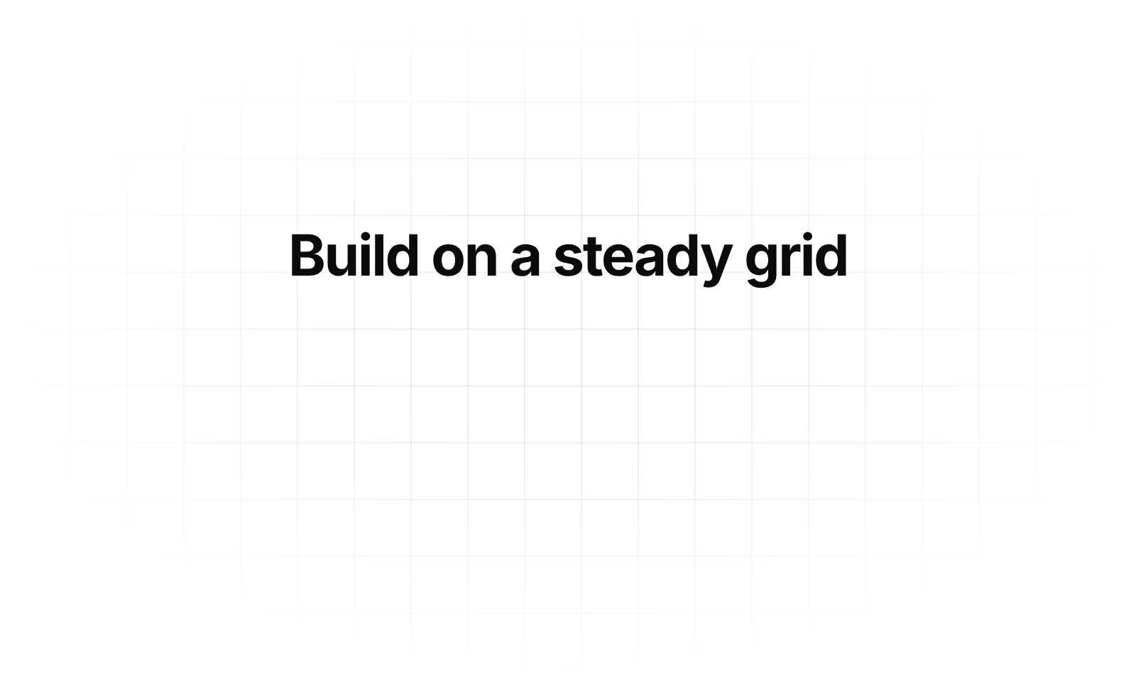
A fine line grid that drifts slowly behind your content and fades out towards the edges
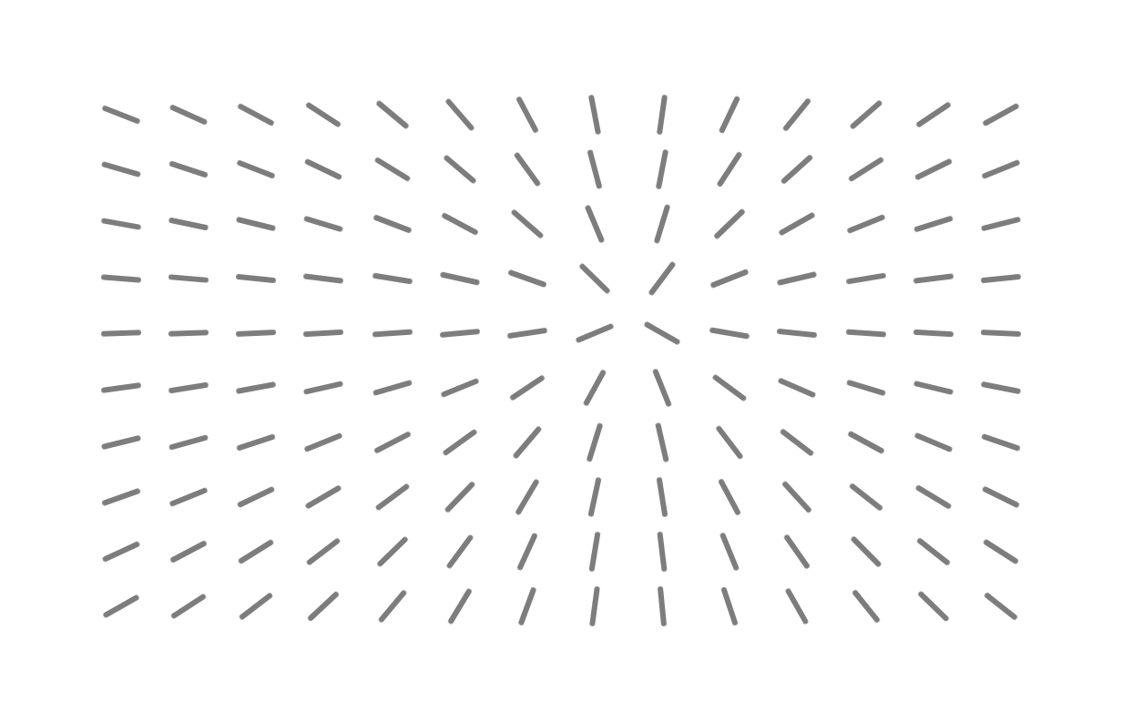
A grid of short lines that all turn to point at the cursor.
Concentric rings that breathe outward from the center.
The endless “Trusted by” strip – a seamless loop that eases to a stop on hover, scrubs with inertia and lifts the hovered logo to colour
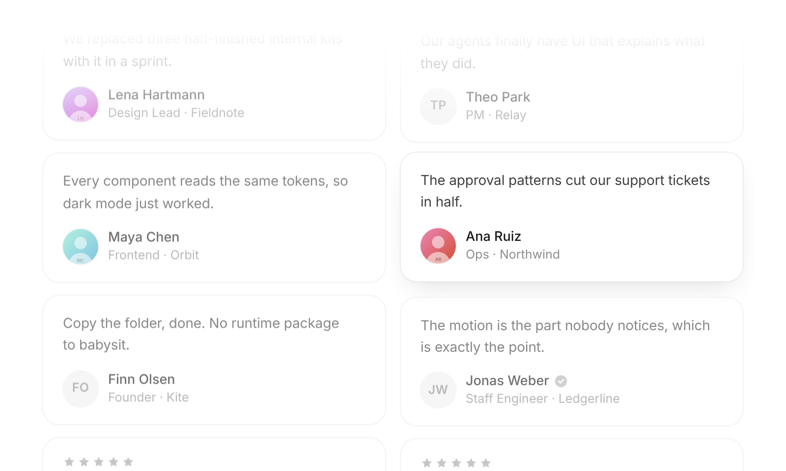
The landing-page wall of quotes – columns that scroll endlessly in opposite directions, ease to a stop on hover and scrub with inertia
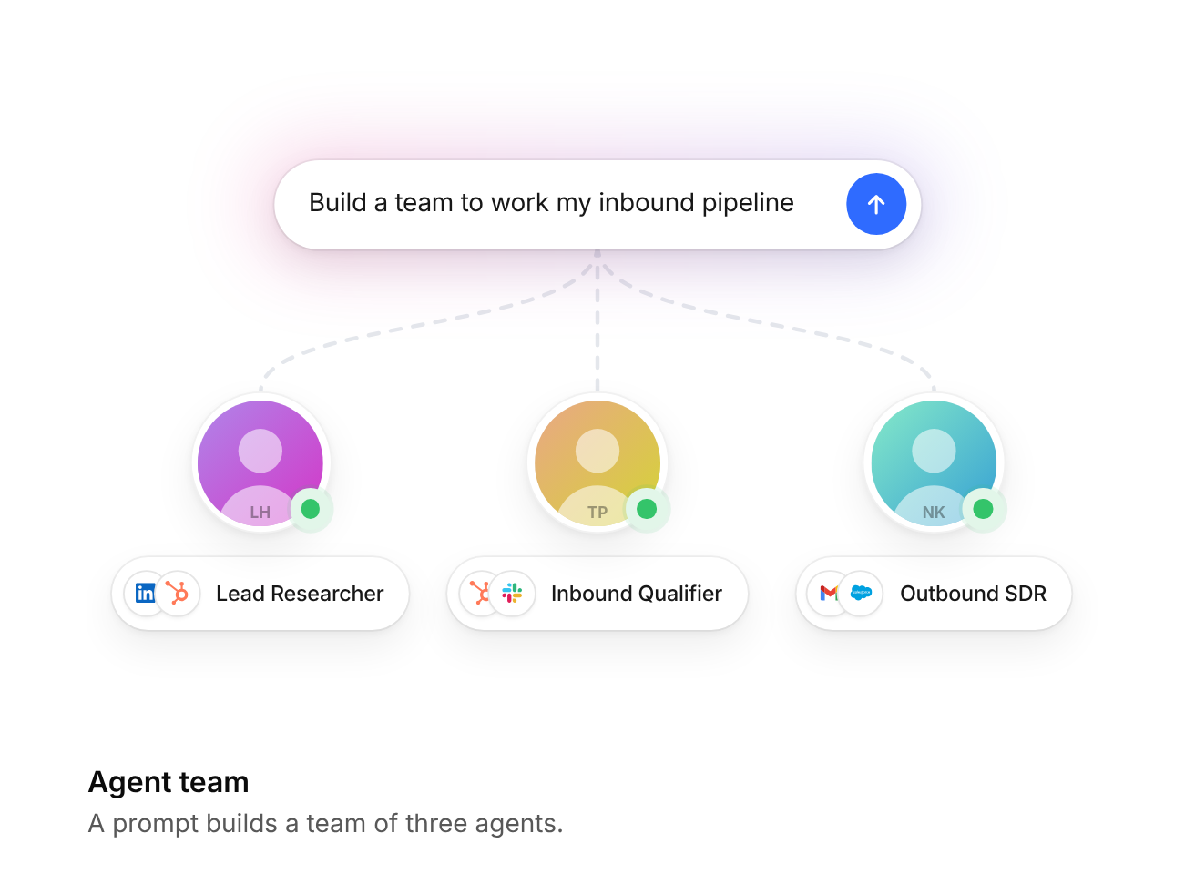
A prompt types itself and branches out into three agents, each with a role and overlapping tool logos
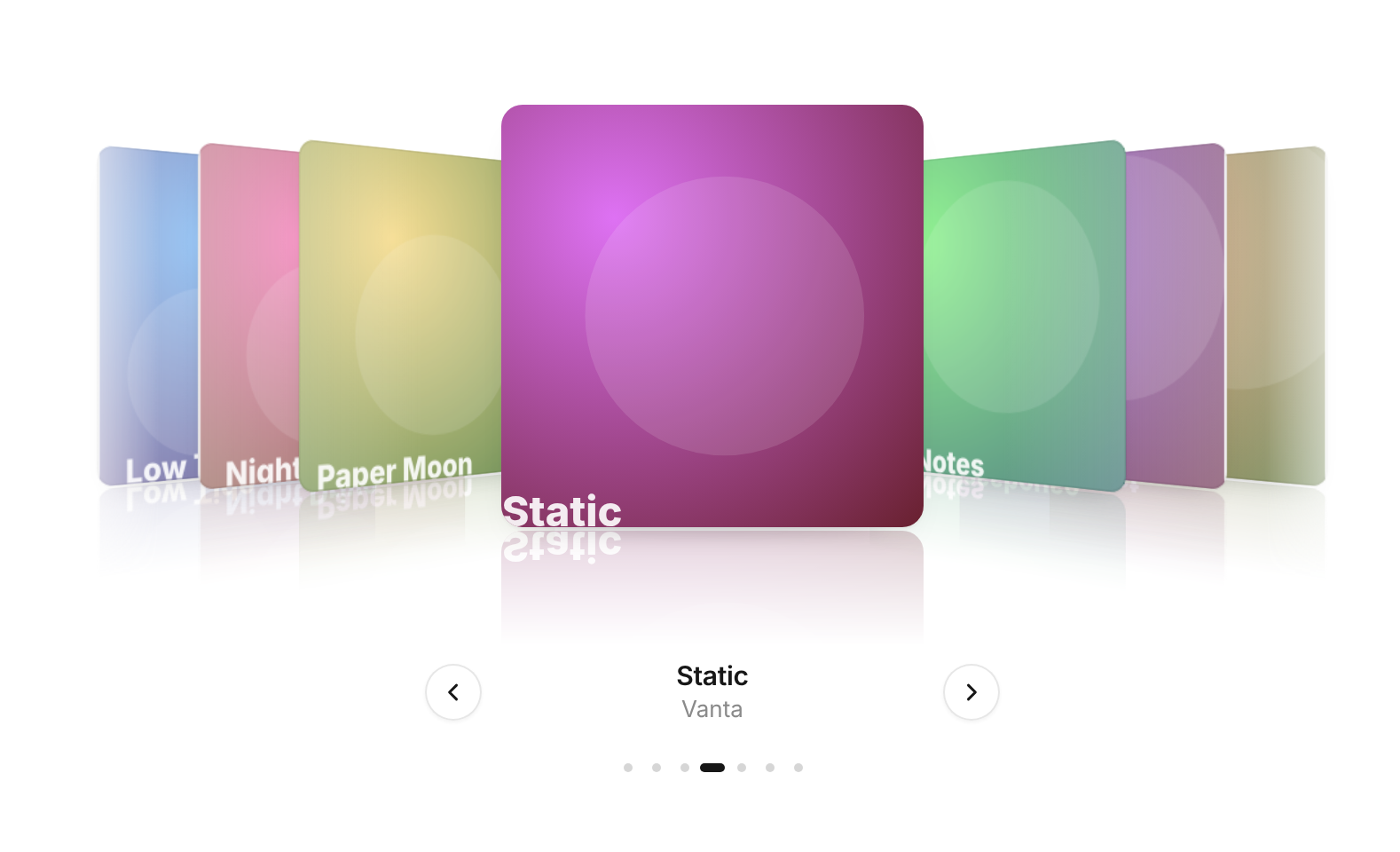
Browse covers in 3D – drag, flick or scrub the row, it springs to the nearest cover; images drift in their frames over a soft reflection
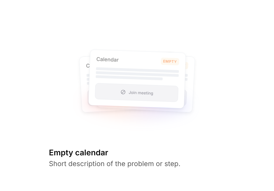
Stack of calendar cards marked empty, fanning out on hover
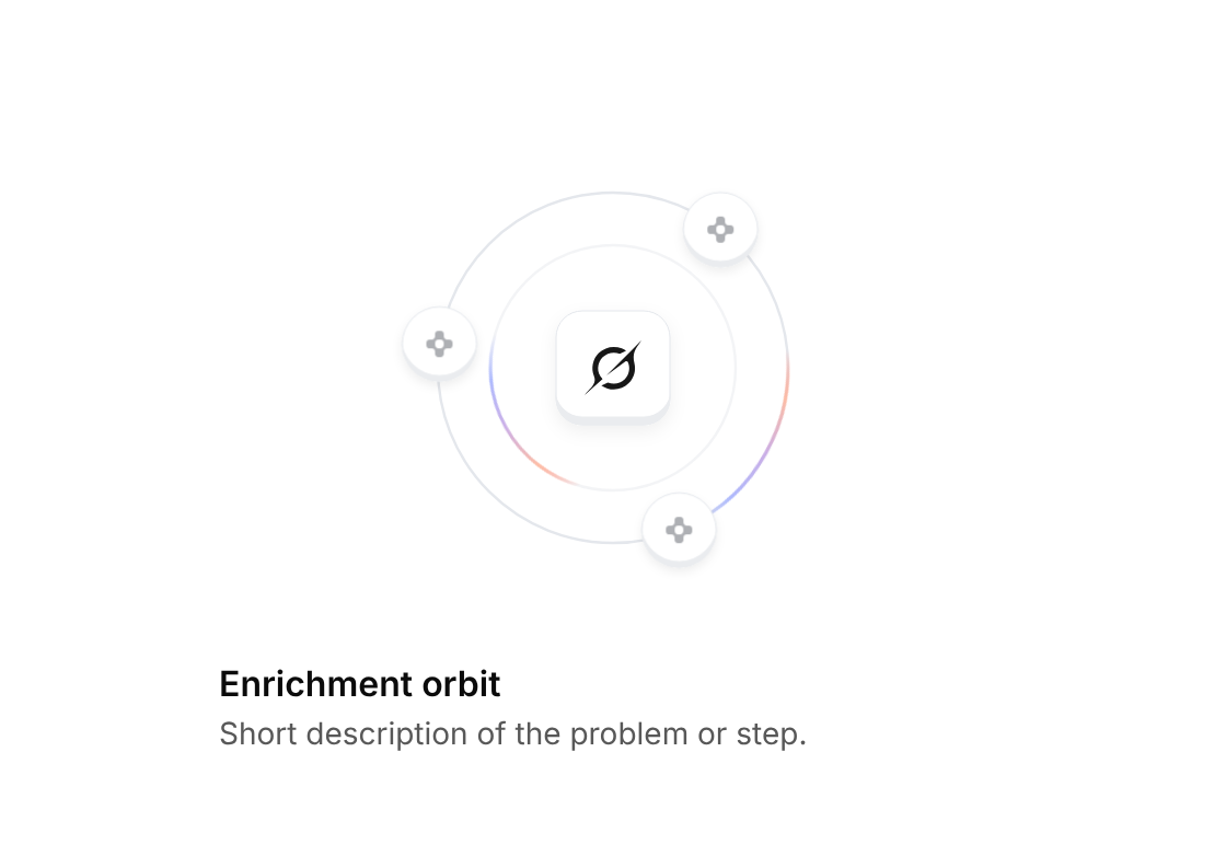
Grok tile inside two rings with comets and data nodes orbiting around it
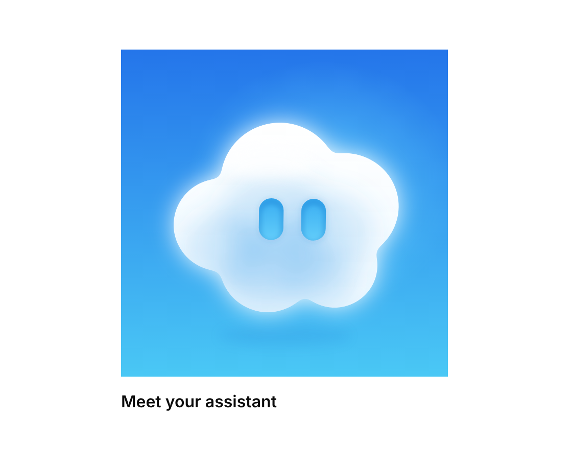
A frosted white cloud with eyes cut out of it, on a red-orange or blue sky – it floats, turns to look around, blinks, follows the pointer and bounces with a wink when clicked
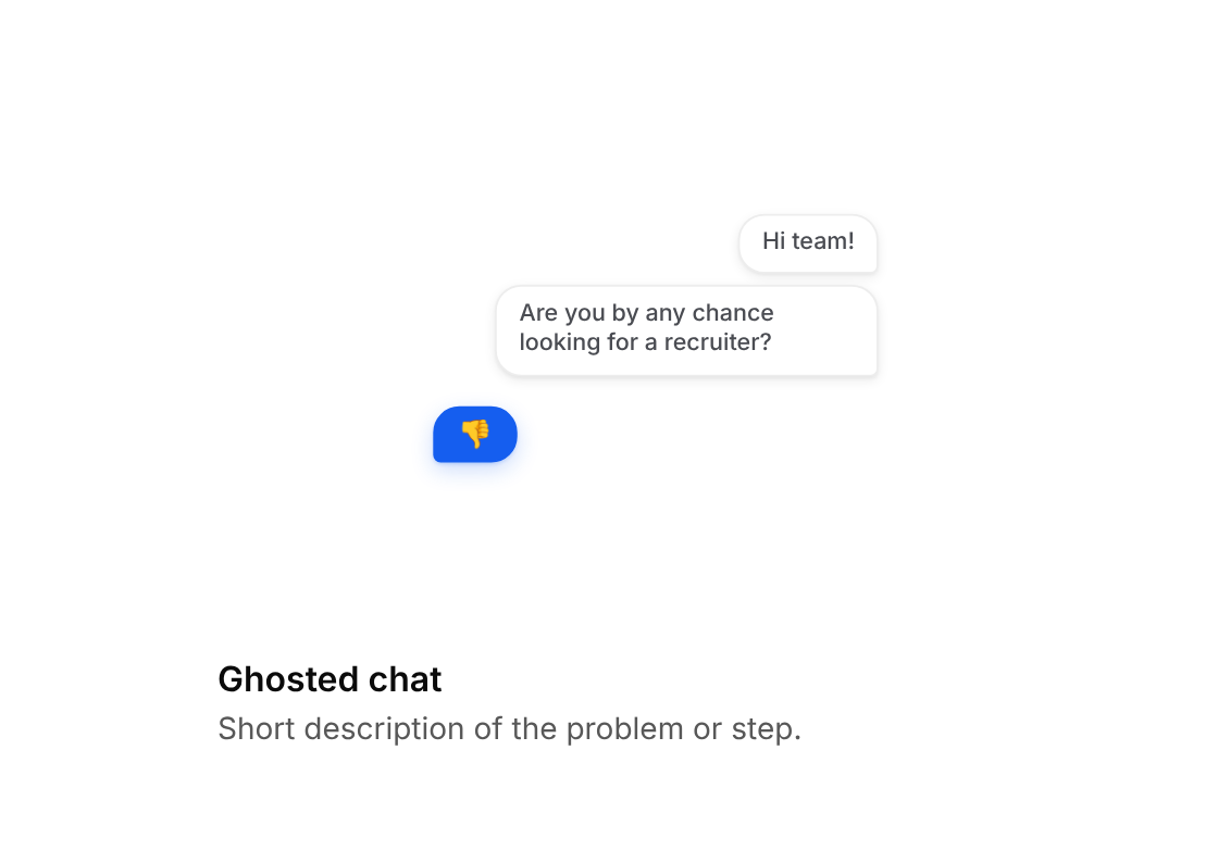
Unanswered chat messages marked as read, with a thumbs-down reply on hover
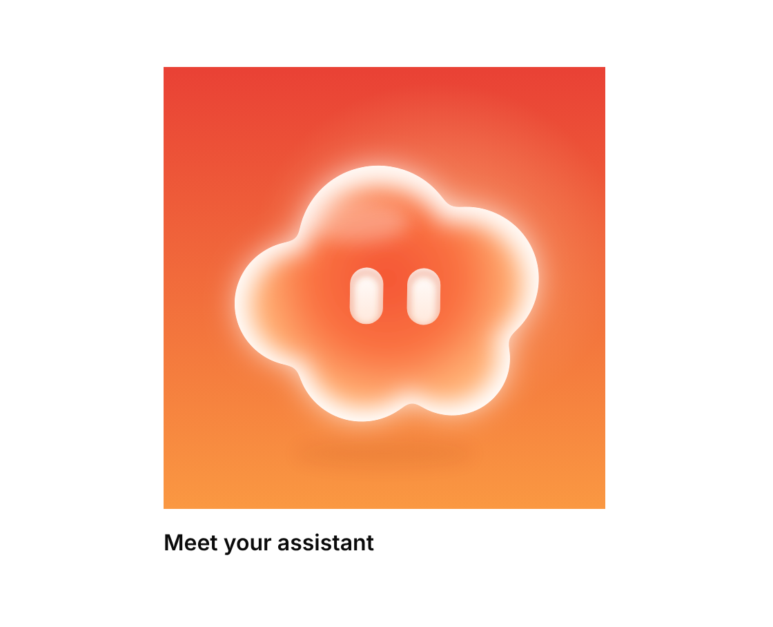
A glowing cloud with eyes in blue or red-orange – it floats, turns to look around, blinks, follows the pointer and bounces with a wink when clicked
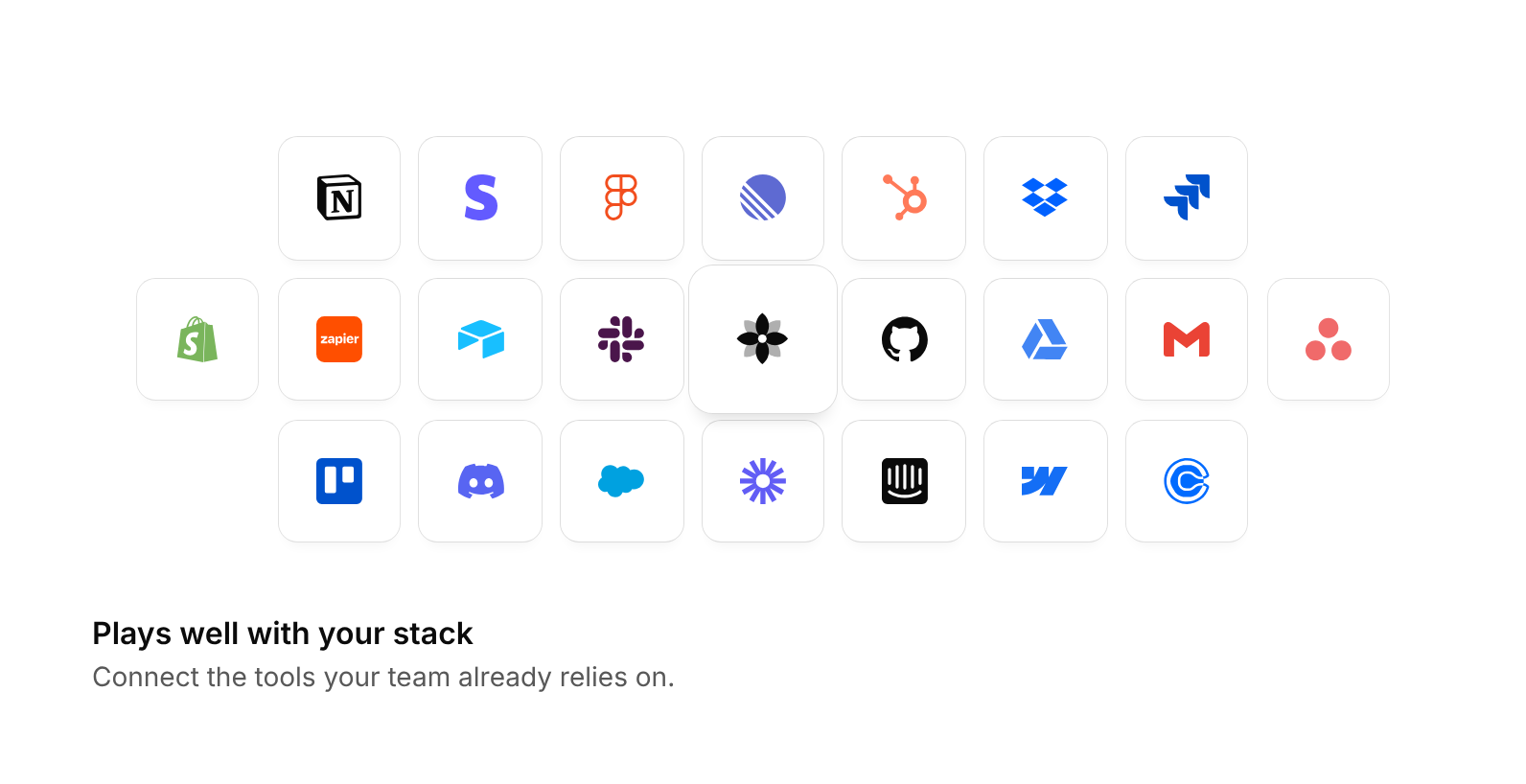
Honeycomb-like wall of integration logos around a bright centre tile with your product mark, fading out toward the edges
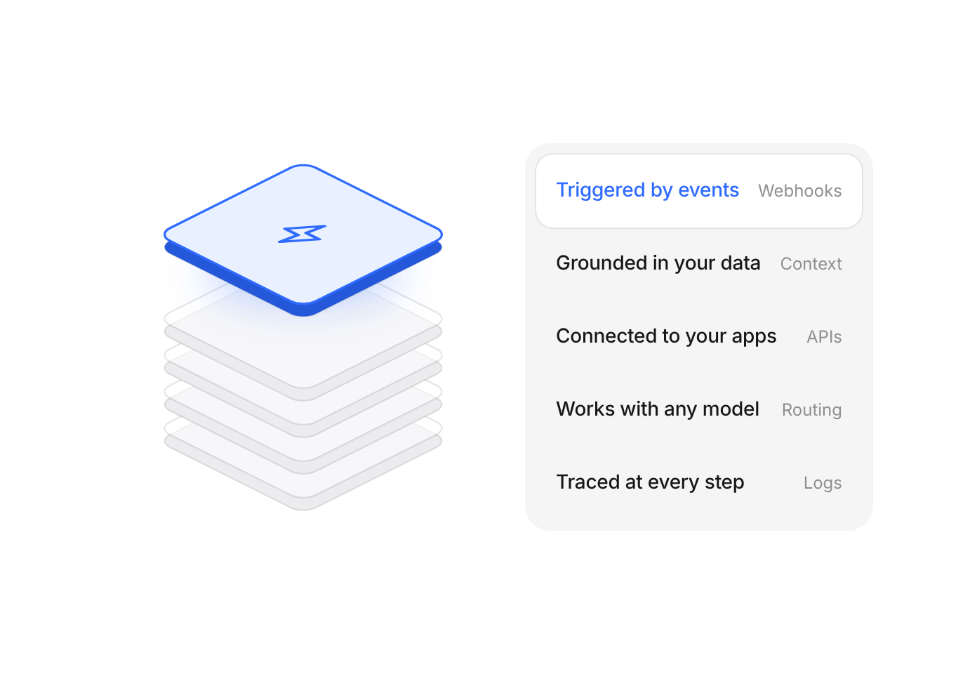
Isometric stack of five layers with a list beside it – the chosen entry lifts its layer out in color
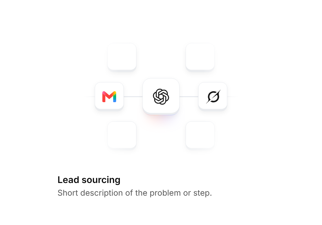
ChatGPT tile linked to Gmail and Grok, with a shine running along the connection
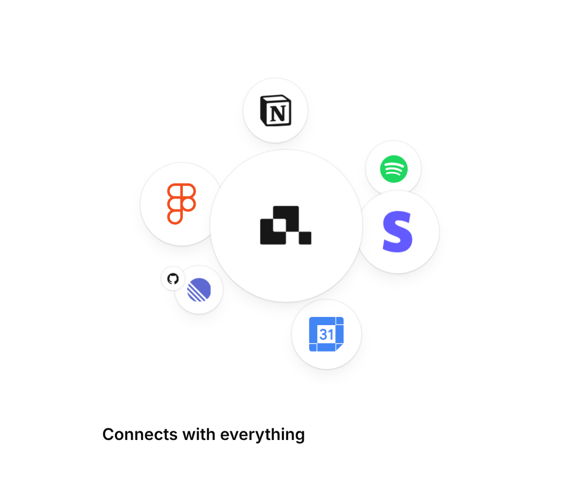
Your mark on a white disc in the middle – company logos bounce out of it and settle around it
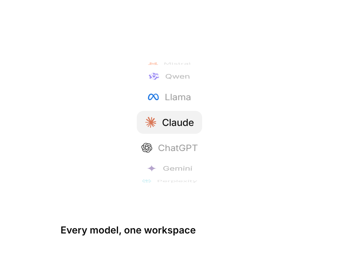
AI model names on a turning drum – the rows bend away at the edges and each model lands on a soft gray fill
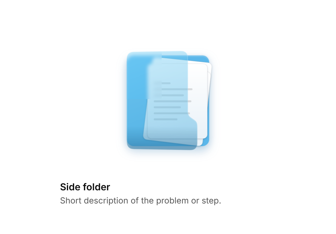
Glassy blue folder on its side, documents sliding out to the right as the pocket swings open on hover
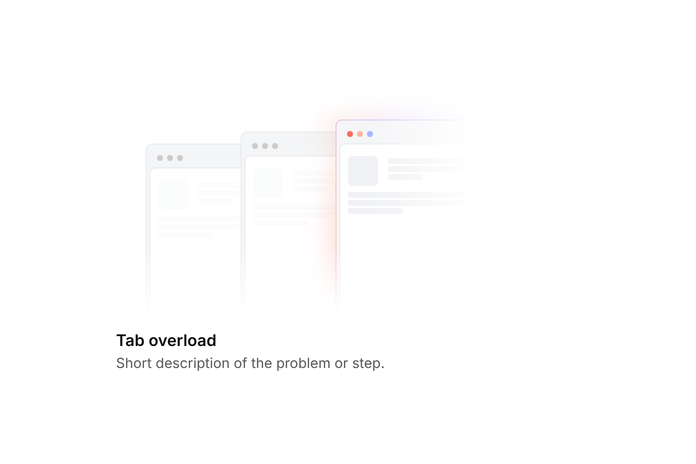
Overlapping browser windows where the highlight follows the hovered tab
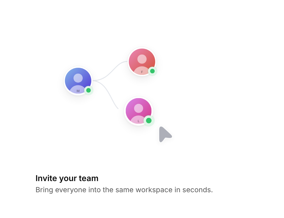
Connected teammates – a cursor drags a new one into the empty slot, the line turns solid and they go online
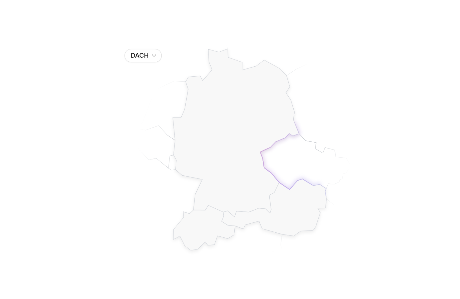
DACH map with fading neighbours and a pastel band along the border, switchable to the US, China, India, Brazil or Japan
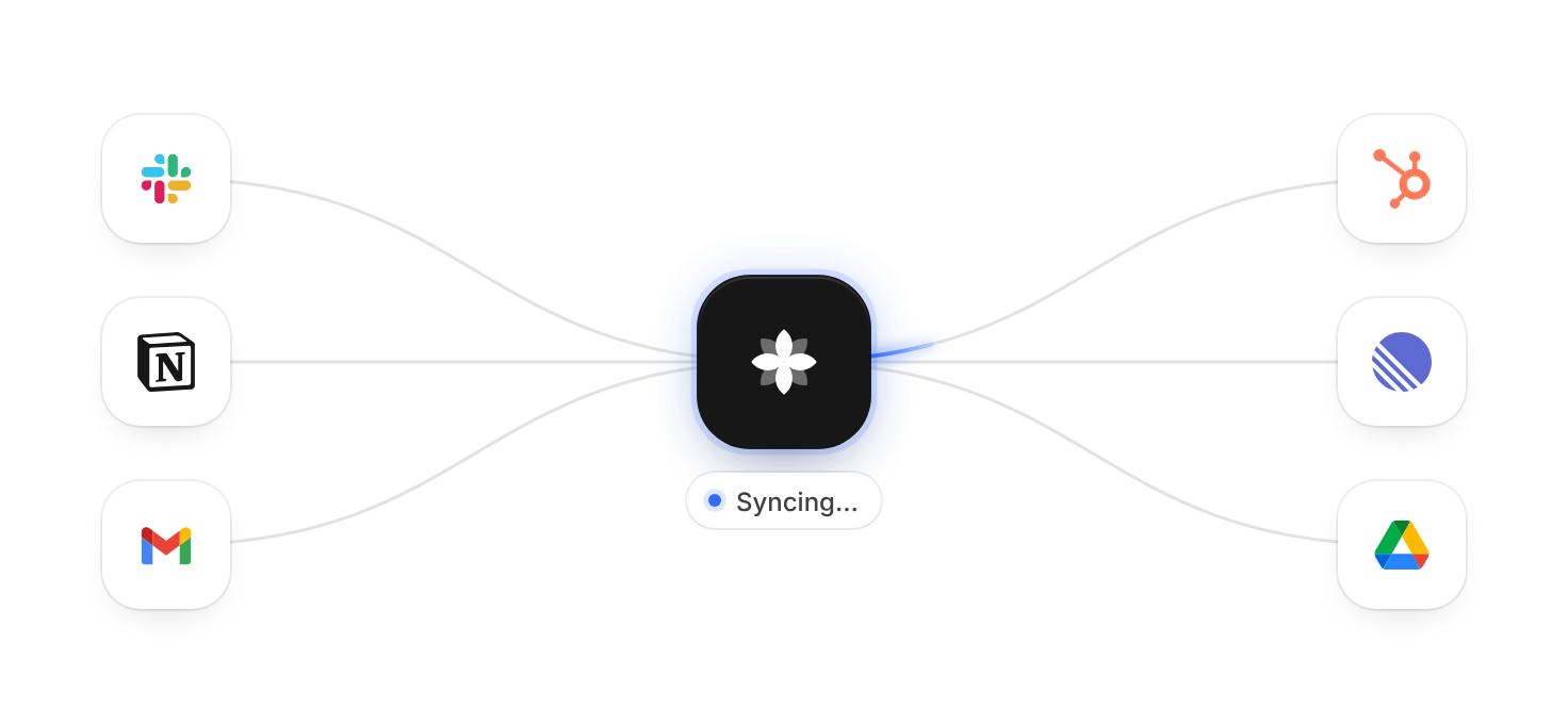
Your product between the tools it connects – light pulses flow along curved beams, hover to focus a tool, click to pause it