Usage
import { TextField } from "@/registry/components/text-field/text-field";

<TextField label="…" />
Props
| Prop | Type | Default | Description |
|---|---|---|---|
label | string | ||
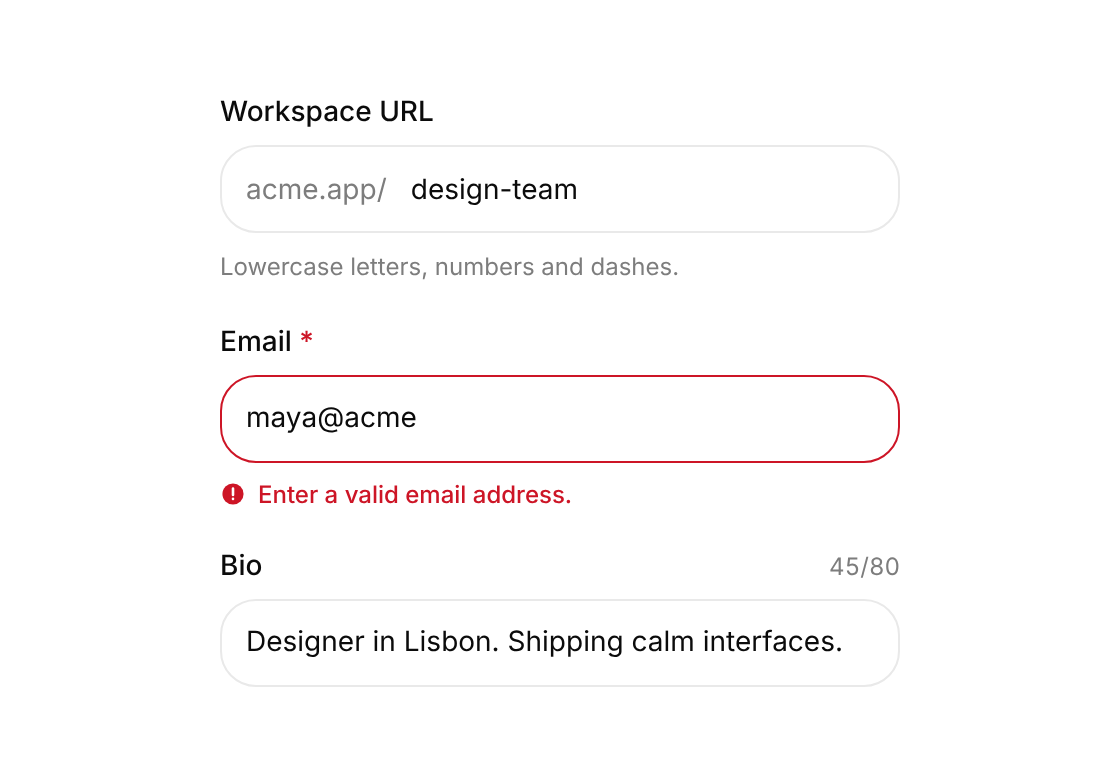
hint? | ReactNode | Help text under the input | |
error? | string | Error message; when set the field is marked invalid | |
validate? | (value: string) => string | undefined | null | false | Inline validator; return a message to show or nothing when valid. Runs after first blur. | |
prefix? | ReactNode | Leading adornment, e.g. an icon or "https://" | |
suffix? | ReactNode | Trailing adornment, e.g. a unit or a button | |
counter? | boolean | false | Show a live count when maxLength is set |
size? | "sm" | "md" | "lg" | "md" |
When to use
Every single-line form input: email, name, URL, amounts with a prefix or unit.
When not to use
Multi-line text (use a textarea); one-time codes (use otp-input); choosing from a list (use filter-menu or a select).