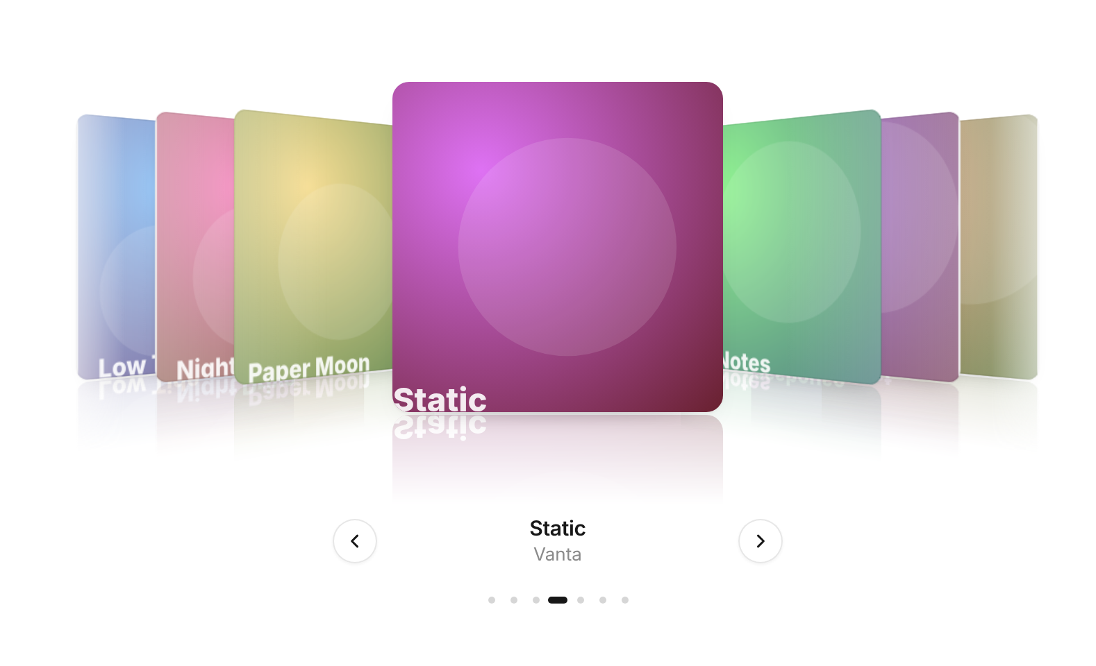
Usage
import { CoverFlow } from "@/registry/blocks/cover-flow/cover-flow";

<CoverFlow items={[/* … */]} />
Props
| Name | Type | Default | Description |
|---|---|---|---|
| items | CoverFlowItem[] | { id, title?, subtitle?, image?, alt?, cover? } – pass an image URL or any ReactNode as cover | |
| index | number | Controlled front cover – pair with onIndexChange | |
| defaultIndex | number | middle cover | Starting cover when uncontrolled |
| onIndexChange | (index: number) => void | Called whenever a different cover reaches the front, also while dragging | |
| onSelect | (item, index) => void | Clicking the front cover or pressing Enter – e.g. open a detail view | |
| itemWidth | number | 280 | Cover width in px – the whole row scales down in narrow containers (to half at most) |
| itemHeight | number | 280 | Cover height in px |
| angle | number | 50 | How far the side covers turn away, in degrees |
| reflection | boolean | true | Mirror the covers on the floor |
| caption | boolean | true | Title and subtitle of the front cover |
| renderCaption | (item, index) => ReactNode | Replaces the default caption | |
| controls | boolean | true | Previous and next buttons beside the caption |
| ticks | boolean | true | Small position ticks under the caption – clicking one jumps there |
| sound | boolean | false | A soft click each time a new cover reaches the front (Web Audio, no file) |
| aria-label | string | "Cover flow" | Names the carousel |
| className | string | Extra class on the root |
When to use
- Six to twenty visual items where looking at one at a time is the point – albums, places, products, case studies, templates - A showcase row that should feel physical: drag, flick, sideways trackpad scroll
When not to use
Interactive app UI; these are illustrations, so keep them out of task flows.