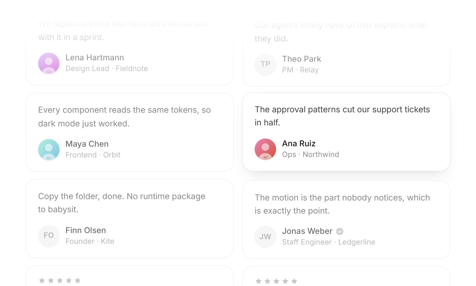
Usage
import { TestimonialWall } from "@/registry/blocks/testimonial-wall/testimonial-wall";

<TestimonialWall items={[/* … */]} />
Props
| Name | Type | Default | Description |
|---|---|---|---|
| items | { quote, name, role?, company?, avatar?, rating?, verified? }[] | The quotes. avatar is a photo URL – without one the initials sit on a soft gray circle. rating (1–5) adds a small gray star row, verified a gray check beside the name | |
| columns | 1 | 2 | 3 | 3 | Most columns on a wide container; the wall itself drops to 2 below 740px and 1 below 480px of its own width |
| speed | number | 28 | Pixels per second of the first column; the others run about 15 % slower and faster, in alternating directions |
| pauseOnHover | boolean | true | Ease the hovered column to a stop and wind it back up on leave. Keyboard focus always stops its column |
| label | string | "What customers say" | Accessible name of the wall |
| className | string | Extra class on the wrapper. Set the height with --ui-tw-height (600px by default) and the edge fade with --ui-tw-fade (96px) |
When to use
- A “Loved by” section on a landing or pricing page with eight or more quotes - Social proof that should feel alive without asking for attention – it runs slowly and stops the moment someone reads
When not to use
Few quotes (use static cards).