Usage
import { Button } from "@/registry/components/button/button";

<Button>Label</Button>
Props
| Name | Type | Default | Description |
|---|---|---|---|
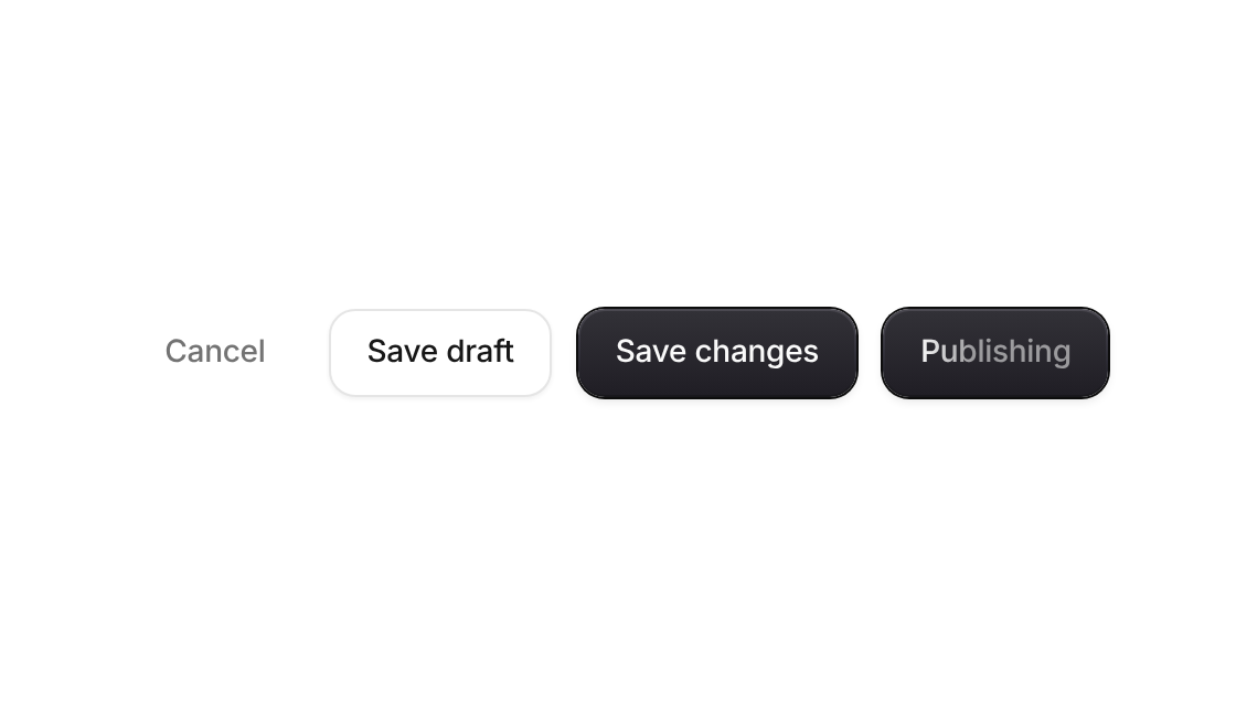
| variant | "primary" | "secondary" | "ghost" | "destructive" | "primary" | Dark filled, white with an outline, text only, or red for deleting |
| size | "sm" | "md" | "lg" | "md" | 32, 40 or 48px high |
| loading | boolean | false | Swaps the left icon for a spinner, shimmers the label, sets aria-busy and ignores clicks |
| icon | ReactNode | Icon before the label; without children the button becomes square | |
| iconRight | ReactNode | Icon after the label | |
| ...props | button attributes | Everything a native button takes, including ref, type and disabled |
When to use
- Any action a user triggers: submit a form, send a message, open a dialog - Async actions that take a moment – the loading state keeps the label readable while it works
When not to use
Navigation to another page (use a link styled as a button), or toggles (use tactile-toggle / segmented-control).