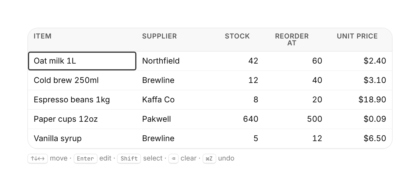
Usage
import { DataGrid } from "@/registry/components/data-grid/data-grid";

<DataGrid columns={[/* … */]} rows={[/* … */]} />
Props
| Prop | Type | Default | Description |
|---|---|---|---|
columns | DataGridColumn<Row>[] | ||
rows | Row[] | ||
onRowsChange? | (rows: Row[]) => void | Called with the full next rows after every edit or undo. | |
label? | string | "Data grid" | Accessible name for the grid. |
className? | string |
When to use
Editable tabular data: spreadsheets, admin tables, inline edits with sorting and range select.
When not to use
Read-only small tables (a plain `<table>` is simpler).