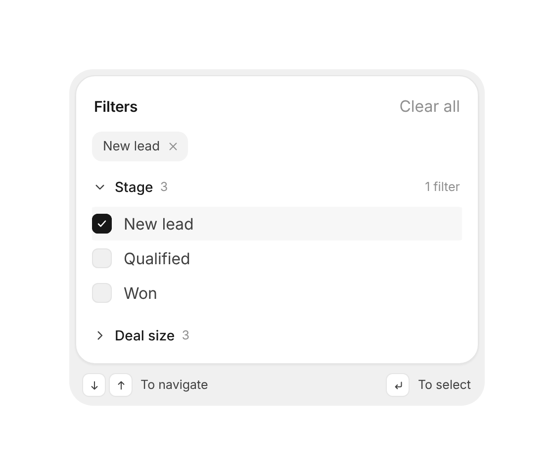
Usage
import { FilterMenu } from "@/registry/components/filter-menu/filter-menu";

<FilterMenu groups={[/* … */]} />
Props
| Name | Type | Default | Description |
|---|---|---|---|
| groups | FilterGroup[] | Required. Each { id, label, options: { id, label }[], chipPrefix? } | |
| value | Record<string, string[]> | Picked option ids per group – makes it controlled | |
| defaultValue | Record<string, string[]> | {} | Starting filters when uncontrolled |
| onChange | (value) => void | Called with the new filters after every change | |
| defaultOpen | string[] | the first group | Groups that start open |
| title | string | "Filters" | Heading on top |
| hints | boolean | true | Shows the keyboard hints on the tray |
| className | string | Extra class on the root |
When to use
- Filtering a list, table or board by a few groups of options – stage, owner, region and the like - Side panels or popovers where people pick several filters and want to see them all at a glance
When not to use
One single choice (segmented-control) or a short action list (goo-dropdown / profile-menu).