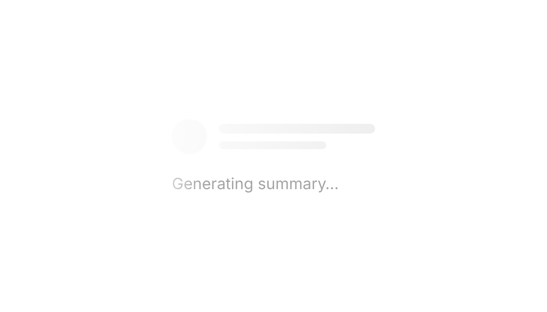
Usage
import { Skeleton } from "@/registry/components/shimmer-loader/shimmer-loader";

<Skeleton>Label</Skeleton>
Props
| Name | Type | Default | Description |
|---|---|---|---|
| Skeleton · width | number | string | "100%" | Width – numbers are px, strings any CSS length |
| Skeleton · height | number | string | 12 | Height – numbers are px |
| Skeleton · radius | number | string | 6 | Corner radius |
| Skeleton · circle | boolean | false | Round shape that uses width for both sides, e.g. for avatars |
| Skeleton · className / style | string / CSSProperties | Extra class or inline styles on the block | |
| ShimmerText · children | ReactNode | The label the highlight runs through | |
| ShimmerText · duration | number | 2 | Seconds for one pass of the highlight |
| ShimmerText · className | string | Extra class – font size and weight are inherited |
When to use
- Placeholders while cards, lists or profiles load, shaped like the content that will arrive - A shimmering status label while an AI answer or a long task is being generated
When not to use
Known-duration progress (use a progress bar) or full-page blocking loads.