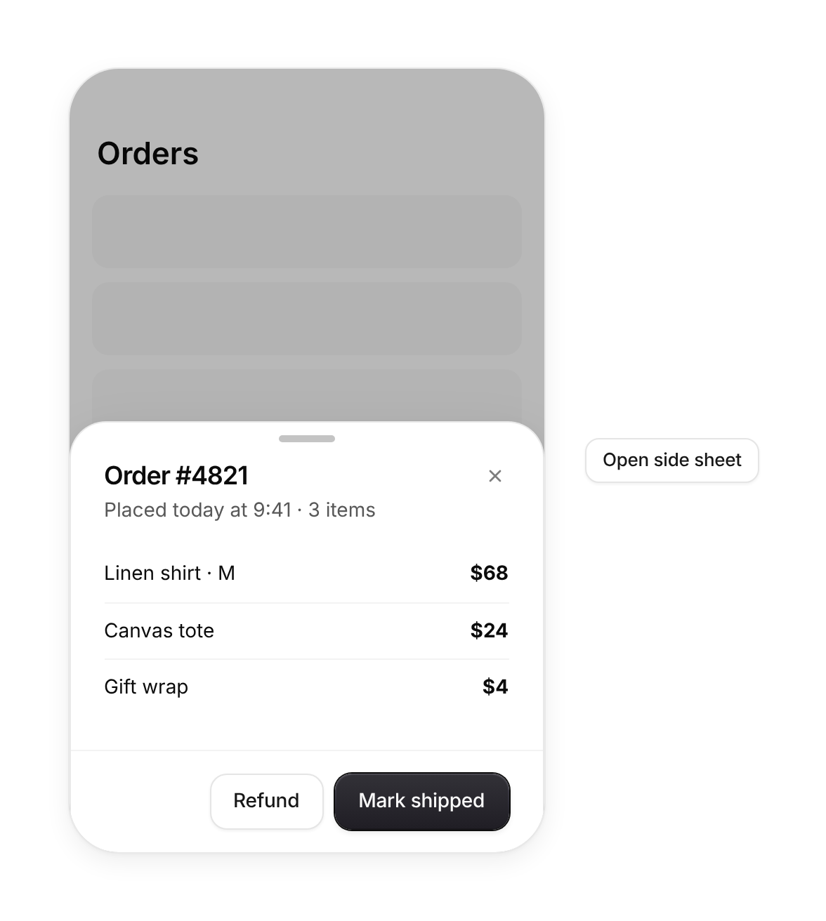
Usage
import { Sheet } from "@/registry/components/sheet/sheet";

<Sheet open onOpenChange={() => {}} title="…">Label</Sheet>
Props
| Prop | Type | Default | Description |
|---|---|---|---|
open | boolean | ||
onOpenChange | (open: boolean) => void | ||
title | string | ||
description? | string | ||
side? | "right" | "left" | "bottom" | "right" | |
children? | ReactNode | ||
footer? | ReactNode | ||
size? | number | 380 | Width for side sheets, max height share for bottom sheets is fixed at 85% |
inline? | boolean | false | Render in place without the modal layer (docs and previews) |
When to use
Detail views, filters and settings that keep the page in context (side), and mobile action sheets or pickers (bottom).
When not to use
Short blocking confirmations (use dialog); primary navigation on desktop.