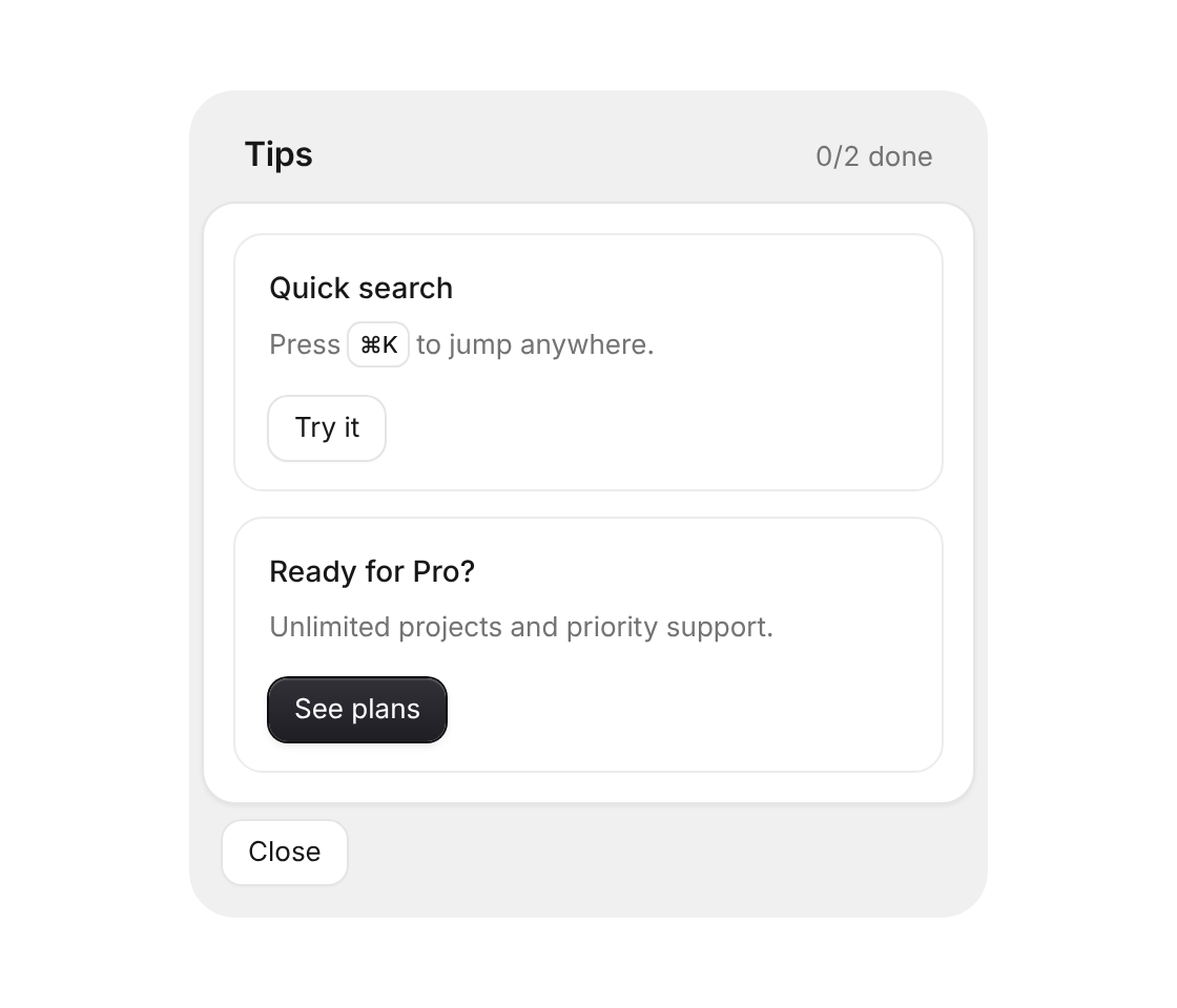
Usage
import { TipsPanel } from "@/registry/components/tips-panel/tips-panel";

<TipsPanel tips={[/* … */]}>Label</TipsPanel>
Props
| Name | Type | Default | Description |
|---|---|---|---|
| tips | Tip[] | id, title, description, action, doneLabel, primary and onAction | |
| title | string | "Tips" | Heading in the gray tray |
| onClose | () => void | Shows a Close button in the footer | |
| closeLabel | string | "Close" | Text of the Close button |
| className | string | Extra class on the tray |
When to use
- Pointing new users to features they haven't tried yet - A “What's new” or getting-started panel in a dashboard or a dialog
When not to use
Onboarding with required steps (progress-tracker).