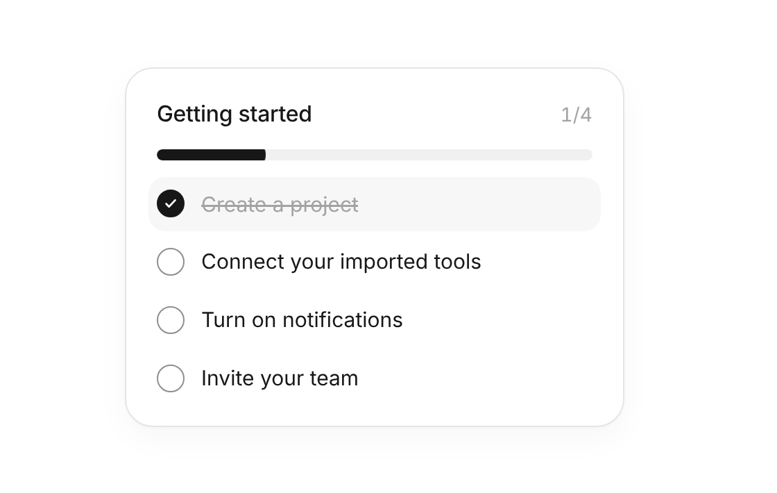
Usage
import { ProgressTracker } from "@/registry/components/progress-tracker/progress-tracker";

<ProgressTracker steps={[/* … */]} />
Props
| Name | Type | Default | Description |
|---|---|---|---|
| steps | ProgressStep[] | Each step has an id, a label, an optional done flag and icon | |
| title | string | "Getting started" | Heading above the bar |
| autoPlay | boolean | false | Ticks the open steps one by one and starts over – stops when someone clicks or types |
| interval | number | 2200 | Pause between two automatic steps, in ms |
| onChange | (steps: ProgressStep[]) => void | Called with every step and its state | |
| className | string | Extra class on the card |
When to use
- Onboarding checklists that guide new users through their first steps - Any short list of tasks where progress should feel rewarding
When not to use
Step-by-step wizards that block navigation.