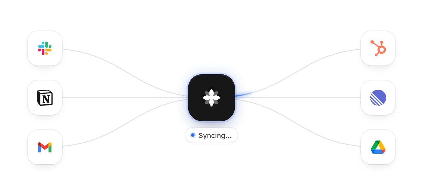
Usage
import { IntegrationBeam } from "@/registry/blocks/integration-beam/integration-beam";

<IntegrationBeam>Label</IntegrationBeam>
Props
| Name | Type | Default | Description |
|---|---|---|---|
| left | { name: string; logo: ReactNode }[] | Slack, Notion, Gmail | Tools that send data in – on the left, or above the hub on narrow widths. The logo fills a 28 × 28 box |
| right | { name: string; logo: ReactNode }[] | HubSpot, Linear, Google Drive | Tools that receive data – on the right, or below the hub on narrow widths |
| center | { name: string; logo?: ReactNode } | { name: "Acme" } | Your product. The logo is drawn white into a 36 × 36 box on the dark tile (currentColor); a neutral flower mark when left out |
| label | string | "Acme connected to Slack, Notion, …" | Accessible name of the scene |
| className | string | Extra class on the root, e.g. for width or margins |
When to use
- A hero or integrations section that shows your product sitting between the tools a team already uses - Landing pages where a calm, self-playing data flow explains “we connect to X and Y” faster than a logo wall
When not to use
Interactive app UI; these are illustrations, so keep them out of task flows.