Usage
import { IntegrationGrid } from "@/registry/blocks/integration-grid/integration-grid";

<IntegrationGrid />
Props
| Name | Type | Default | Description |
|---|---|---|---|
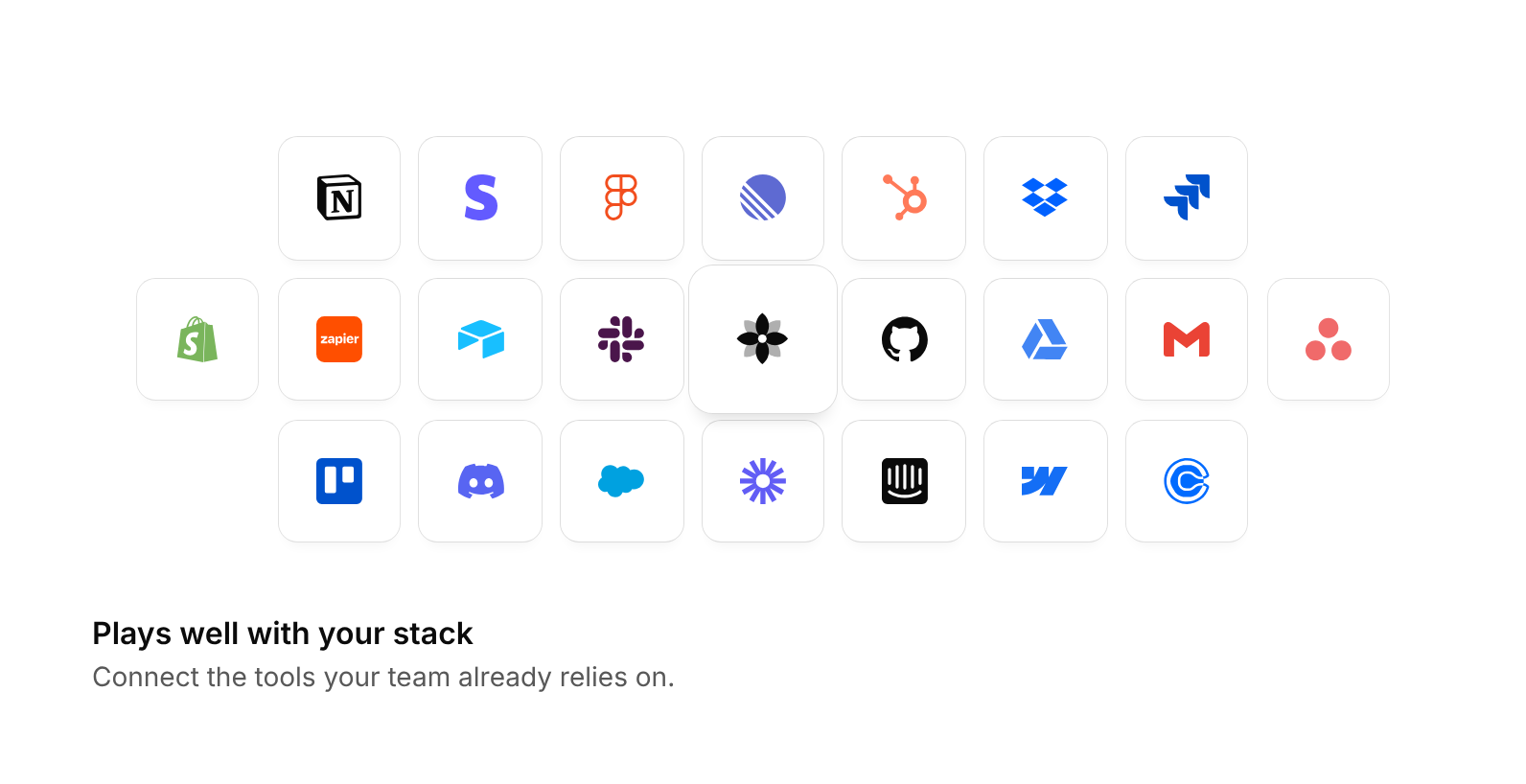
| logos | IntegrationGridLogo[] | 22 well-known tools | Logos filled row by row around the centre – each { name, path, color?, darkColor? } with a single 24 × 24 SVG path (e.g. from simple-icons); without color the mark follows the ink color |
| mark | ReactNode | a neutral flower mark | Content of the larger centre tile – usually your product logo |
| columns | 5 | 7 | 9 | 9 | Tiles in the middle row – the rows above and below get two fewer. Fewer columns make the tiles larger |
| label | string | Accessible description – by default lists the integrations | |
| className | string | Extra class on the root, e.g. for width or margins |
When to use
- Integration sections and feature cards like “Works with the tools you already use” - Landing pages that show your product at the centre of an ecosystem
When not to use
Interactive app UI; these are illustrations, so keep them out of task flows.