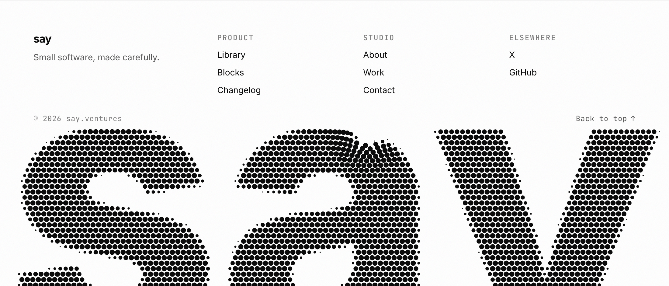
Usage
import { HalftoneFooter } from "@/registry/blocks/halftone-footer/halftone-footer";

<HalftoneFooter word="…" />
Props
| Prop | Type | Default | Description |
|---|---|---|---|
word | string | The brand word printed huge along the bottom. Keep it short: 3 to 8 letters read best. | |
columns? | HalftoneFooterColumn[] | [] | Link columns shown above the wordmark. |
brand? | ReactNode | Logo or brand mark at the top left. Defaults to word in the display font. | |
tagline? | ReactNode | One line under the brand. | |
note? | ReactNode | Small print in the bottom bar, e.g. "© 2026 Studio". | |
backToTop? | boolean | true | Show a "Back to top" button in the bottom bar. Default true. |
cell? | number | 9 | Distance between dot centres in CSS pixels. Default 9. |
crop? | number | 0.78 | How much of the word's height stays visible above the bottom edge, 0.3 to 1. Default 0.78. |
color? | string | Dot colour. Defaults to the text colour. | |
font? | string | Font family for the wordmark, drawn at weight 800. Defaults to the display font. | |
interactive? | boolean | true | Pointer parting and click shock rings. Default true; always off under prefers-reduced-motion. |
grain? | boolean | true | Fine noise over the footer, like newsprint. Default true. |
className? | string | ||
style? | CSSProperties |
When to use
The last screen of a landing page, portfolio or studio site where the brand name should be the closing image; a footer that needs a little play without a video or WebGL.
When not to use
App chrome and dashboards (use a plain footer row); long brand names that would shrink the letters to texture; pages where the footer has to carry dense legal or sitemap content.
Related
Dot matrix loader · Dither gradient · Pixel FX · Logo marquee