Usage
import { IsoFigure } from "@/registry/blocks/iso-figure/iso-figure";

<IsoFigure>Label</IsoFigure>
Props
| Prop | Type | Default | Description |
|---|---|---|---|
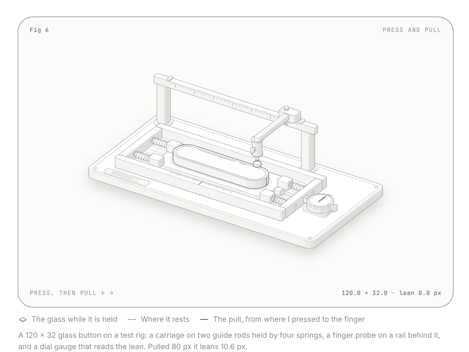
figure? | IsoFigureName | "test-rig" | A ready figure. "test-rig": a glass button on a spring rig you press and pull; a dial gauge reads the lean. Ignored when children are given. |
theme? | "auto" | "light" | "dark" | "auto" | "auto" follows data-theme="dark" (or .dark) on the html element. The kit draws dark by default and has a light palette. |
children? | ReactNode | Your own figure, built from Plate, IsoSvg, Solid, Line, Wire, Dots and FaceText (exported from this file) and the isoKit geometry. |
When to use
Docs, landing and feature sections that explain how a technical thing works (a cache, a rate limiter, a queue, a button's physics) with a crafted, solid object people can press, drag or hover, plus a live readout. Also the kit when I want my own isometric machine with shading, halos, wires and a framed plate.
When not to use
Calm decorative line art for empty states or small cards (use hairline-figure); data that must be read precisely (use a chart); dense app screens where a large interactive figure competes with the task.