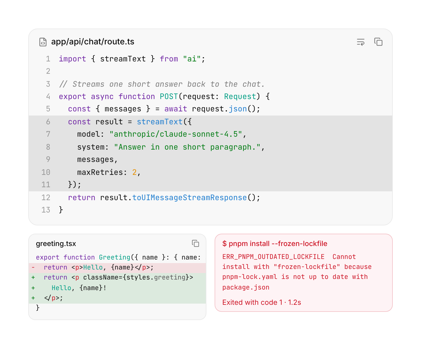
Usage
import { CodeBlock } from "@/registry/components/code-block/code-block";

<CodeBlock>Label</CodeBlock>
Props
| Prop | Type | Default | Description |
|---|---|---|---|
code? | string | Shortcut: the code to show. Renders a header (when title is set), a copy button and the content for you. Leave out to compose the parts yourself. | |
language? | CodeLanguage | "text" | Language for the built-in highlighter when code is set. |
title? | ReactNode | File name or label in the header (shortcut mode). | |
lineNumbers? | boolean | false | Number the lines (shortcut mode). |
wrap? | boolean | false | Wrap long lines instead of scrolling sideways (shortcut mode). |
highlight? | number[] | Zero-based line indexes to mark (shortcut mode). | |
maxLines? | number | Fold to this many lines with a "Show more" button (shortcut mode). | |
variant? | CodeBlockVariant | "default" | destructive tints the block for errors and failed commands. |
size? | CodeBlockSize | "default" | sm is denser, for tool output inside a chat or a tool call. |
children? | ReactNode |
Also accepts every prop of Omit<HTMLAttributes<HTMLDivElement>, "title">.
When to use
Showing code anywhere: docs and READMEs, install commands, an agent's commands and their output, error logs, and diffs of what changed. Use `size="sm"` inside chats, tool calls and tight panels.
When not to use
A live, rendered HTML page (artifact-preview); a whole tool call with arguments, status and result (tool-call-card); editable code (use an editor such as CodeMirror or Monaco); a single inline term in a sentence (use a `<code>` element).