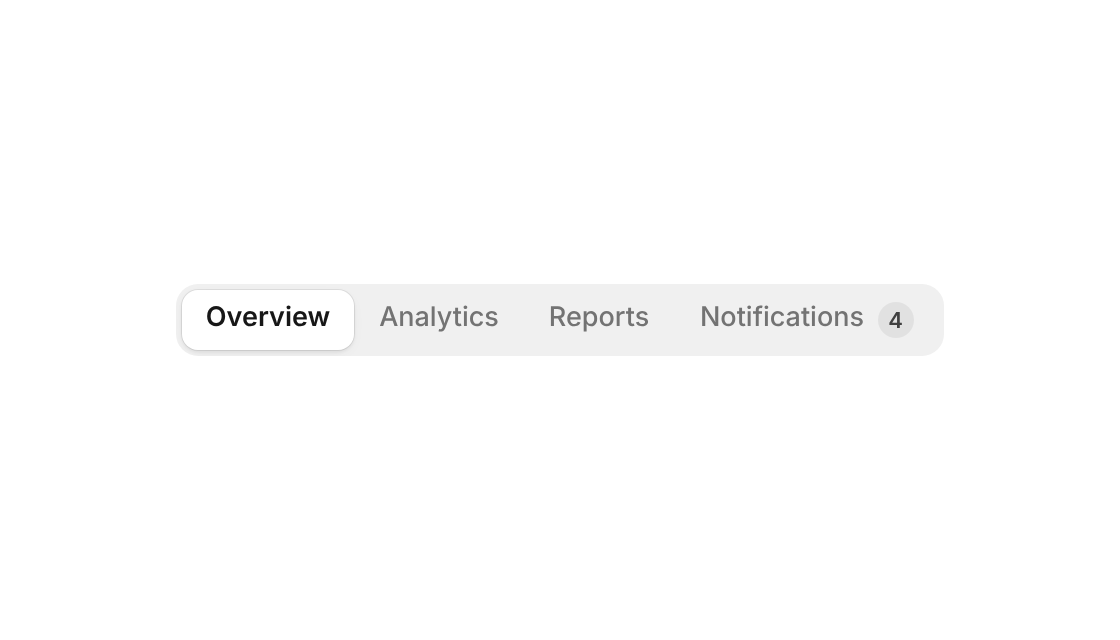
Usage
import { SegmentedControl } from "@/registry/components/segmented-control/segmented-control";

<SegmentedControl options={[/* … */]} />
Props
| Name | Type | Default | Description |
|---|---|---|---|
| options | SegmentOption[] | { value, label?, icon?, count?, badge?, disabled?, ariaLabel?, controls? } – two to six work best; give icon-only options an ariaLabel | |
| value | string | Controlled value | |
| defaultValue | string | first enabled option | Starting value when uncontrolled |
| onChange | (value: string) => void | Called with the new value – on click, while dragging the pill and on arrow keys | |
| size | "sm" | "md" | "lg" | "md" | 26, 30 or 36px tall options (40px+ on touch screens) |
| variant | "tray" | "underline" | "tray" | A gray track with a raised white pill, or text tabs on a hairline with a sliding line |
| fullWidth | boolean | false | Fills its container with equal segments, each as wide as the widest one needs |
| kind | "radio" | "tabs" | "radio" | A radiogroup, or a tablist that switches panels (pair with controls on each option) |
| disabled | boolean | false | Disables the whole control |
| aria-label | string | Names the group – or use aria-labelledby | |
| className | string | Extra class on the root |
When to use
- Switching between two to six views of the same content – sections of a dashboard, list / board / calendar, monthly / yearly - A choice that applies right away and where every option should stay visible
When not to use
More than six options, or multiple selection (filter-menu).