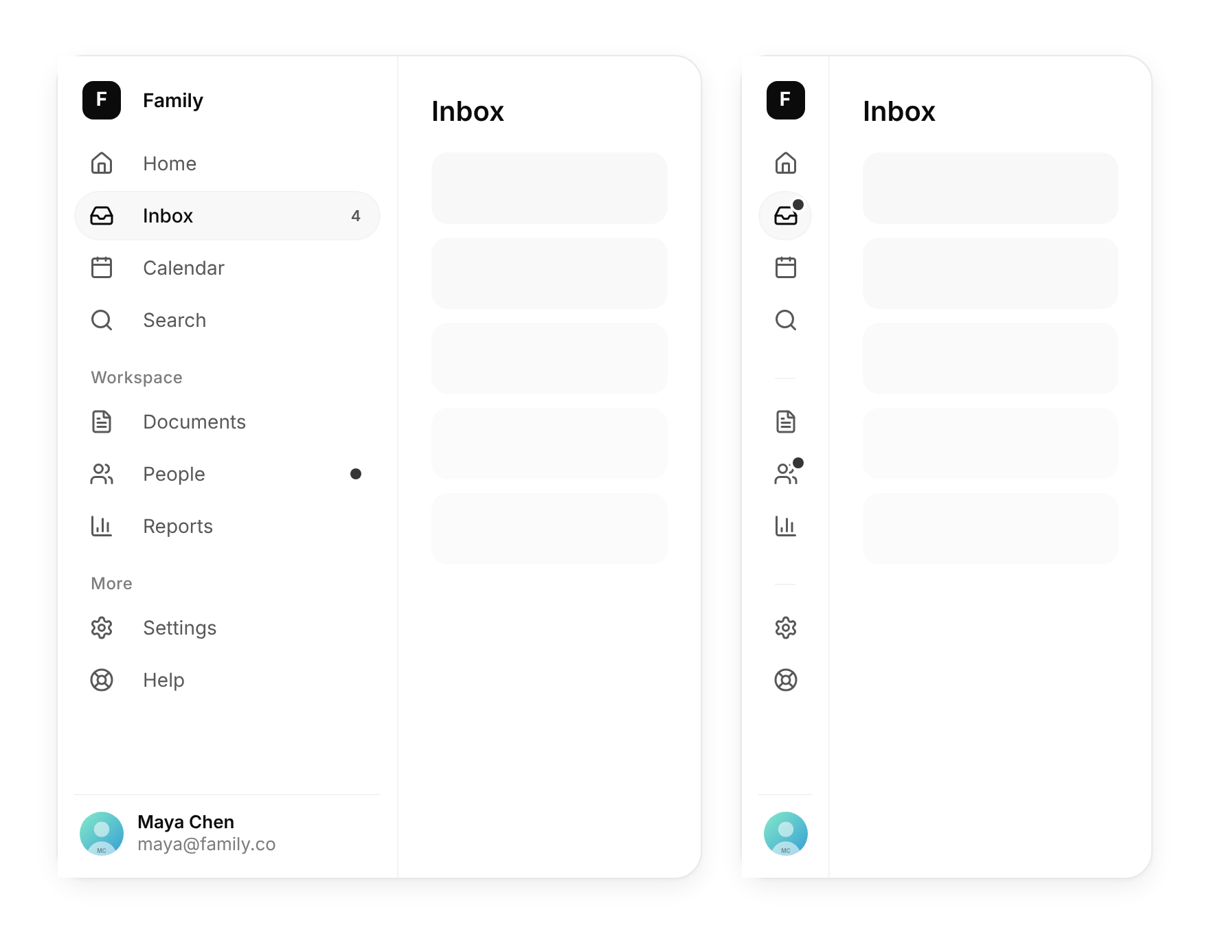
Usage
import { NavSidebar } from "@/registry/components/nav-sidebar/nav-sidebar";

<NavSidebar sections={[/* … */]} value="…" onChange={() => {}} />
Props
| Prop | Type | Default | Description |
|---|---|---|---|
sections | NavSidebarSection[] | ||
value | string | Id of the active item | |
onChange | (id: string) => void | ||
brand? | { mark: ReactNode; name: string } | Mark and name at the top. The name hides in the rail. | |
footer? | ReactNode | ((collapsed: boolean) => ReactNode) | Pinned to the bottom, such as an account row. Receives whether the sidebar is collapsed. | |
collapsed? | boolean | Controlled collapsed state | |
defaultCollapsed? | boolean | false | |
onCollapsedChange? | (collapsed: boolean) => void | ||
collapsible? | boolean | true | Show the collapse button and listen for ⌘B / Ctrl+B |
width? | number | 248 | Width when open, in px |
railWidth? | number | 64 | Width of the icon rail, in px |
label? | string | "Main" | Accessible name for the navigation landmark |
When to use
The main navigation of a desktop web app, dashboard or admin tool with roughly 5 to 20 destinations in a few groups, where people want to fold it away to give the content more room.
When not to use
Mobile navigation (tab-bar, or put this inside a sheet); a handful of app-level shortcuts floating over content (floating-dock); switching views inside one page (direction-aware-tabs, segmented-control); deep trees of files or folders (it is one level only).