Usage
import { ProfileMenu } from "@/registry/components/profile-menu/profile-menu";

<ProfileMenu name="…" email="…">Label</ProfileMenu>
Props
| Name | Type | Default | Description |
|---|---|---|---|
| name | string | Name of the signed-in user | |
string | Email under the name, cut off with an ellipsis when long | ||
| avatar | ReactNode | Replaces the default avatar, e.g. an <img> | |
| items | ProfileMenuItem[] | Actions with label, icon, optional badge and onSelect | |
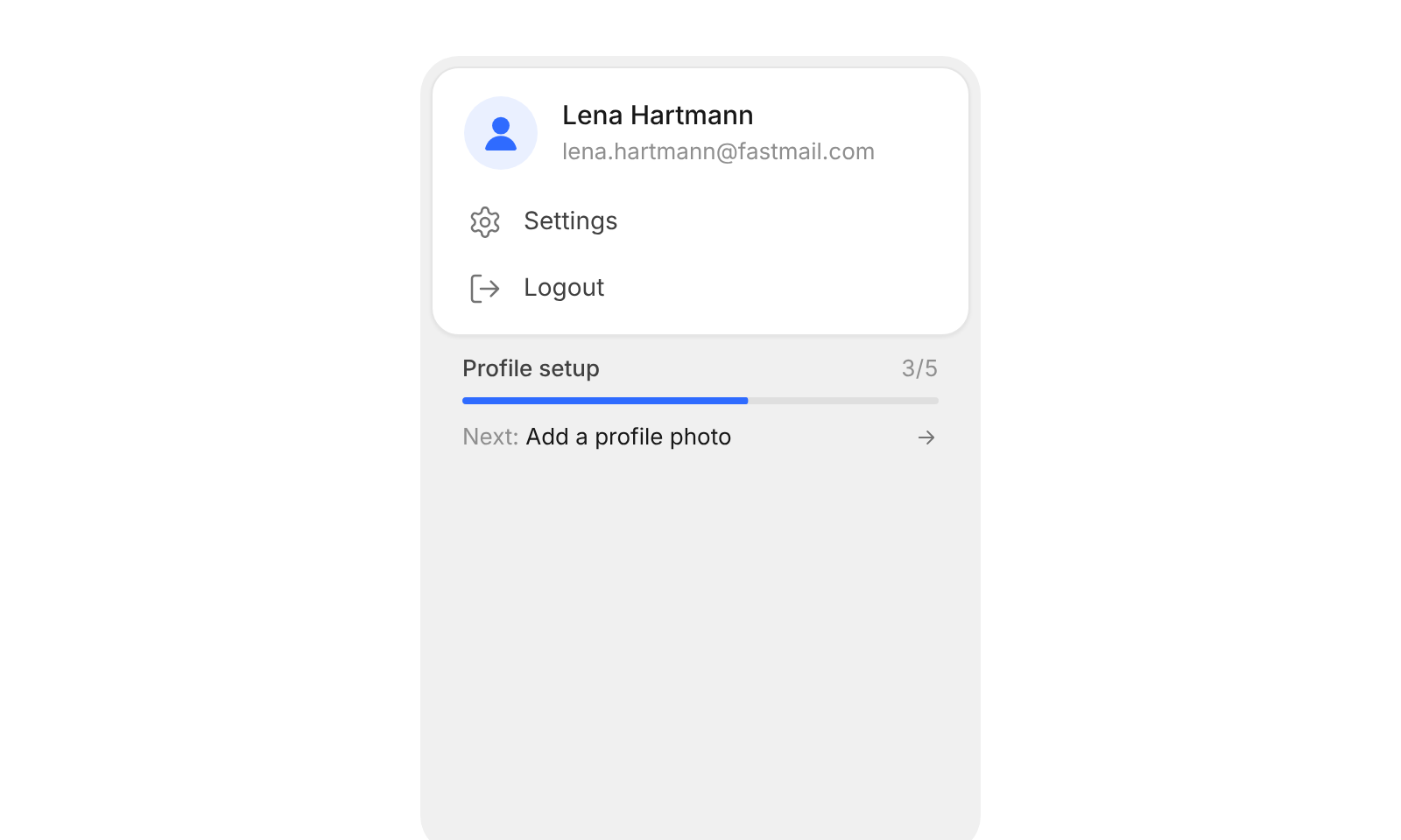
| setup | ProfileSetup | Profile setup progress: done, total, the next step and onContinue – leave empty to hide | |
| className | string | Extra class on the card |
When to use
- The dropdown behind the avatar in an app header - Nudging people to finish their profile, right next to the account actions
When not to use
Generic action menus (goo-dropdown).