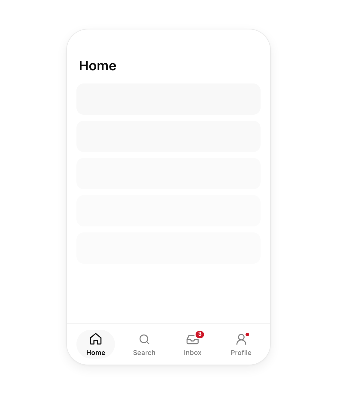
Usage
import { TabBar } from "@/registry/components/tab-bar/tab-bar";

<TabBar items={[/* … */]} value="…" onChange={() => {}} />
Props
| Prop | Type | Default | Description |
|---|---|---|---|
items | TabBarItem[] | ||
value | string | ||
onChange | (id: string) => void | ||
label? | string | "Primary" | Accessible name for the navigation landmark |
fixed? | boolean | true | Stick to the bottom of the viewport; off renders it in flow (demos, desktop frames) |
When to use
Three to five top-level sections in a mobile web app or PWA.
When not to use
Desktop navigation (use nav-sidebar or floating-dock); switching views inside one page (use segmented-control or direction-aware-tabs).
Related
Nav sidebar · Floating dock · Segmented control · Sheet / drawer