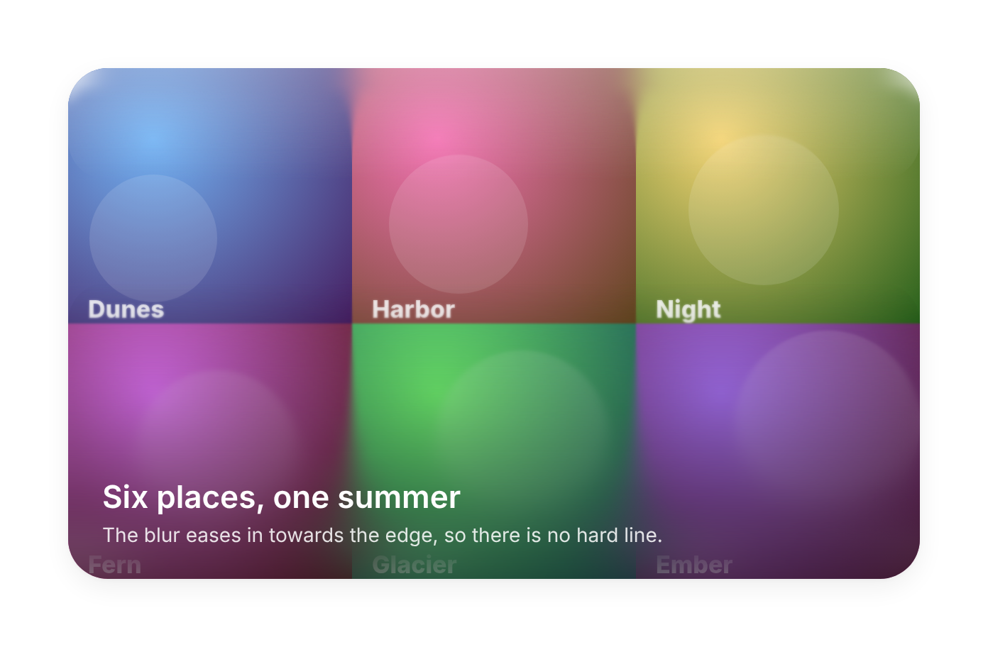
Usage
import { ProgressiveBlur } from "@/registry/components/progressive-blur/progressive-blur";

<ProgressiveBlur />
Props
| Prop | Type | Default | Description |
|---|---|---|---|
side? | ProgressiveBlurSide | "bottom" | Edge where the blur is strongest. It fades to nothing towards the opposite edge. |
size? | string | "33%" | Depth of the blurred band, any CSS length. "100%" covers the whole parent. |
blur? | number | 16 | Strongest blur at the edge, in px. |
layers? | number | 6 | How many stacked layers. More is smoother and costs more to paint; 5 to 8 reads well. |
tint? | string | Colour that fades in with the blur, such as "var(--background)", so text over busy images stays readable. | |
tintStrength? | number | 0.6 | How strong the tint gets at the edge, 0 to 1. |
position? | "absolute" | "fixed" | "absolute" | Positioning of the band. absolute sits on the nearest positioned parent; fixed sits on the viewport edge. |
Also accepts every prop of Omit<HTMLAttributes<HTMLDivElement>, "children">.
When to use
A sticky header, toolbar or tab bar over scrolling content; captions and controls laid over photos or video; the fade at the end of a scroll area or carousel; the bottom of a hero image where the next section starts.
When not to use
Dimming a whole page behind a dialog (use the dialog's overlay); a uniform frosted panel (liquid-glass-card); large full-screen areas on low-end devices, since every layer is a backdrop-filter.
Related
Liquid glass card · Aurora background · Grid background · Sheet / drawer