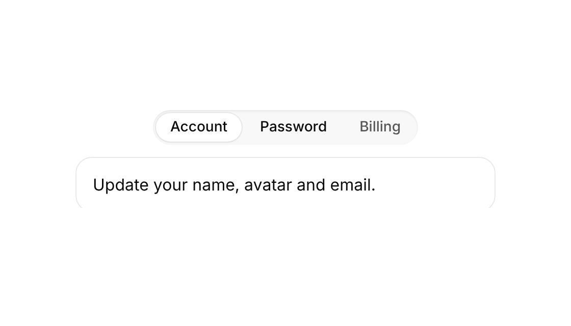
Usage
import { DirectionAwareTabs } from "@/registry/components/direction-aware-tabs/direction-aware-tabs";

<DirectionAwareTabs tabs={[/* … */]} />
Props
| Prop | Type | Default | Description |
|---|---|---|---|
tabs | DirectionAwareTab[] | ||
className? | string | ||
onChange? | (id: number) => void | Called with the new tab id. | |
defaultTab? | number | Initially selected tab id. Defaults to the first tab. |
When to use
Switching between a few content panels where the spatial direction helps orientation.
When not to use
Many tabs or tabs that must keep all panels mounted (forms).