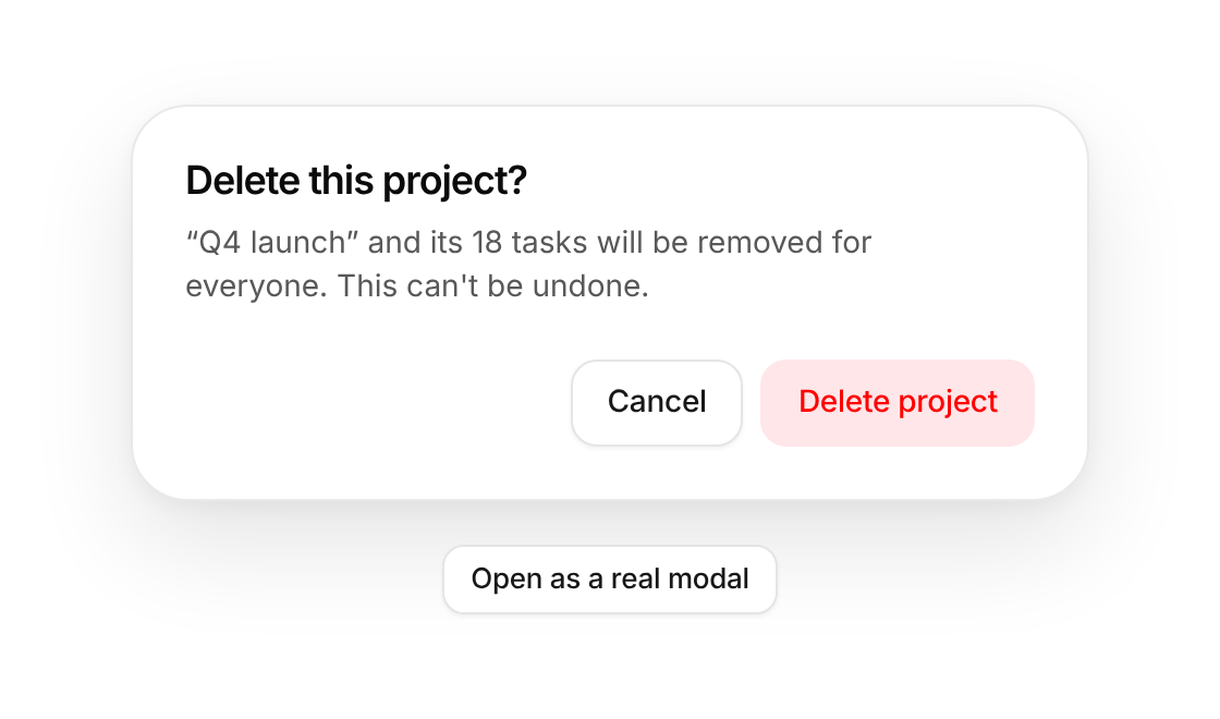
Usage
import { Dialog } from "@/registry/components/dialog/dialog";

<Dialog open onOpenChange={() => {}} title="…">Label</Dialog>
Props
| Prop | Type | Default | Description |
|---|---|---|---|
open | boolean | ||
onOpenChange | (open: boolean) => void | ||
title | string | ||
description? | string | ||
children? | ReactNode | ||
footer? | ReactNode | Buttons row at the bottom, e.g. Cancel and Confirm | |
dismissible? | boolean | true | Close when the backdrop is clicked |
variant? | "default" | "alert" | "default" | "alert" for confirmations that must be answered: no backdrop dismiss, role alertdialog |
width? | number | 440 | |
inline? | boolean | false | Render in place without the modal layer (docs and previews) |
When to use
A focused task or confirmation that must be finished or cancelled before going back to the page: delete confirmations, short forms, previews.
When not to use
Long forms or detail views (use sheet); non-blocking feedback (use toast); anything the user may want to compare with the page behind.