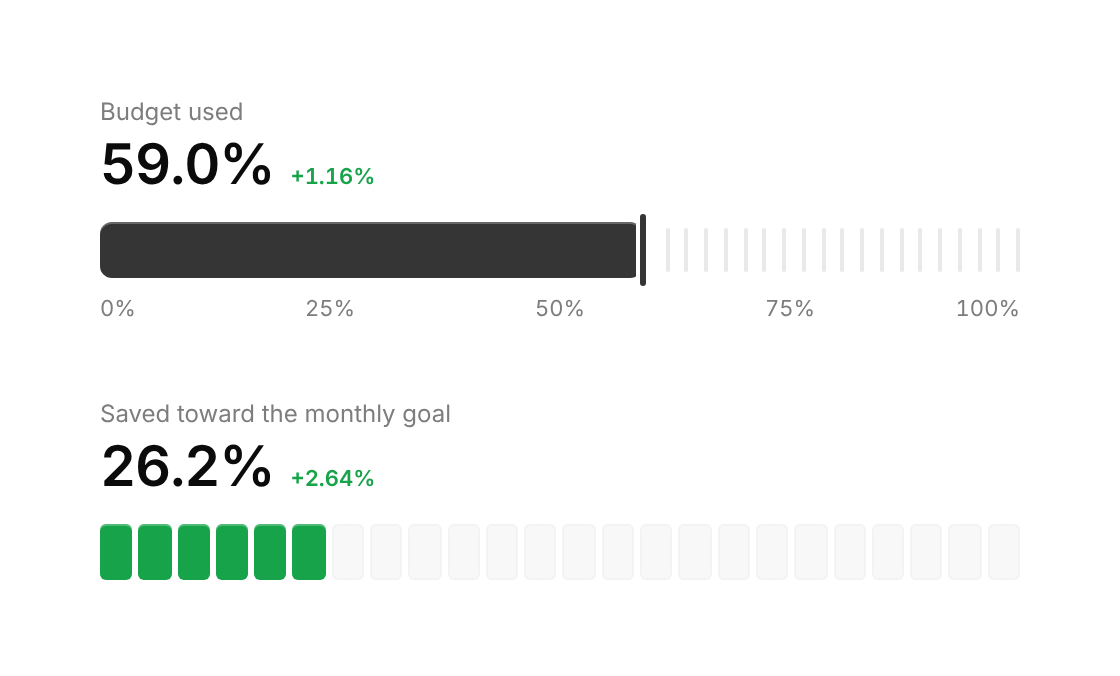
Usage
import { TickMeter } from "@/registry/components/tick-meter/tick-meter";

<TickMeter value={0} label="…" />
Props
| Prop | Type | Default | Description |
|---|---|---|---|
value | number | ||
max? | number | 100 | |
label | string | Accessible name, also shown as the caption above the value | |
variant? | "bar" | "cells" | "bar" | |
ticks? | number | Number of ticks (bar) or cells (cells) across the track | |
color? | string | "var(--accent)" | Fill colour; defaults to the accent |
delta? | string | Small text after the headline value, e.g. "+1.2%" | |
deltaTone? | "positive" | "negative" | "neutral" | "positive" | |
scale? | number[] | Values to label under the track, e.g. [0, 25, 50, 75, 100] | |
showValue? | boolean | true | |
height? | number | 28 | |
formatValue? | (v: number, max: number) => string | (v, m) => ${((v / m) * 100).toFixed(1)}% |
When to use
- Budget used, quota consumed, savings toward a goal, storage full - A dashboard card headline where one percentage needs more texture than a plain progress bar
When not to use
Several values to compare (use bar-chart); progress through steps of a task (use progress-tracker); a circular readout (use gauge); indeterminate work (use a loader).