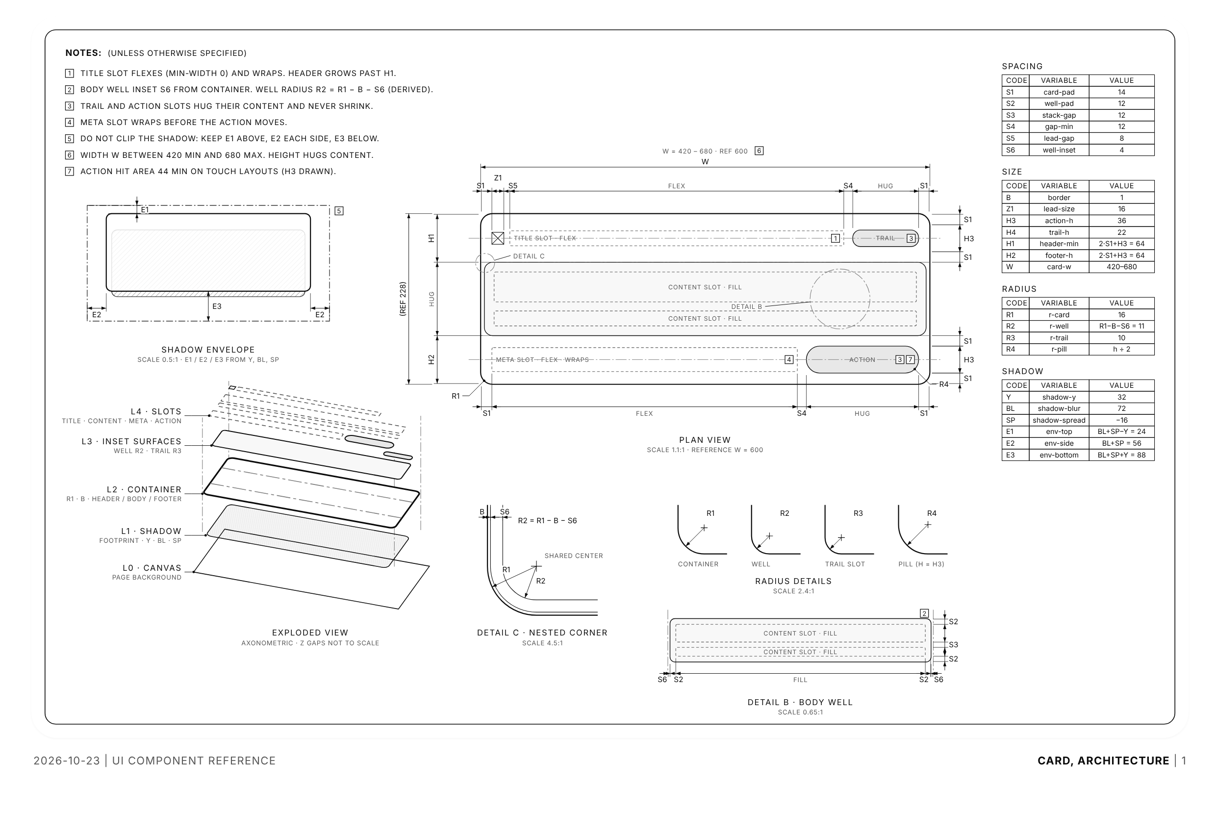
Usage
import { CardSpecSheet } from "@/registry/blocks/spec-sheet/spec-sheet";

<CardSpecSheet>Label</CardSpecSheet>
Props
| Prop | Type | Default | Description |
|---|---|---|---|
titleBlock? | boolean | true | Show the HTML title block above the sheet. Default true. |
animate? | boolean | false | Draw the lines in once on mount. Default false. |
date? | string | "2026-10-23" | Date in the footer. Default "2026-10-23", the upstream revision. |
className? | string |
When to use
Documenting a component's architecture for a design system, a handoff or a README: paddings, gaps, radii, layers and viewport placement as named variables. Also a calm, technical illustration for a docs or design-engineering page. Agents: read the upstream SKILL.md in code/, measure the real component, then lay out a sheet with the kit.
When not to use
Interactive explainers of how something works (use iso-figure); decorative line art for cards and empty states (use hairline-figure); charts or data; anything that must be read on a phone without scrolling, since the sheet keeps a 1100 px minimum width.