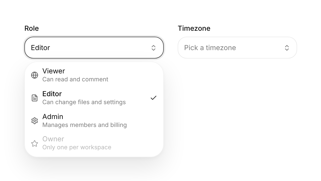
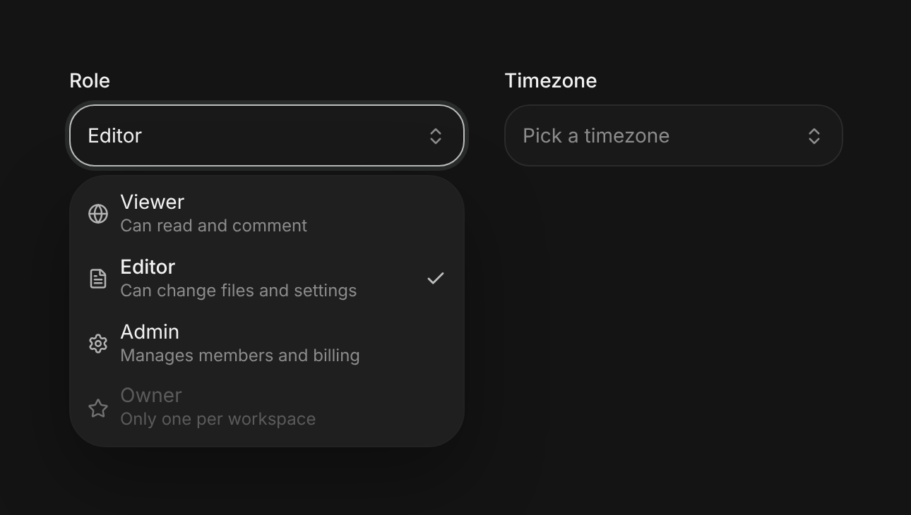
Usage
import { Select } from "@/registry/components/select/select";

<Select label="…" options={[/* … */]} />
Props
| Prop | Type | Default | Description |
|---|---|---|---|
label | string | Visible label; pressing it focuses the trigger like a native select | |
options | (SelectOption | SelectOptionGroup | string)[] | Plain strings, option objects, or labelled groups | |
value? | string | null | Controlled value; null means nothing chosen | |
defaultValue? | string | null | Starting value when uncontrolled | |
onValueChange? | (value: string | null) => void | Called with the new value, or null when cleared | |
placeholder? | string | "Select…" | Shown in the trigger while nothing is chosen |
searchable? | boolean | false | Adds a search field above the list; matches are highlighted |
emptyText? | string | "No matches" | Text when the search finds nothing |
name? | string | Hidden input name, so the value submits with a form | |
required? | boolean | Blocks form submission until a value is chosen; shows an asterisk | |
disabled? | boolean | Not focusable, not submitted | |
size? | "sm" | "md" | "lg" | "md" | Trigger height: 32, 40 or 48px |
defaultOpen? | boolean | Opens the list on mount (demos, onboarding) | |
width? | number | string | Sets the trigger width; the popup is at least as wide | |
className? | string | Class on the wrapping field |
When to use
- Picking one value from a list of about 5 to 200 options in a form or settings row: role, region, plan, timezone
- Long lists where people know what they want: turn on `searchable` to filter and highlight matches
- Options that need a second line or an icon
When not to use
Two to four always-visible choices (segmented-control); several values at once (filter-menu); a list of actions rather than a value (goo-dropdown or profile-menu); a command search across the app (command-palette).
Related
Text field · Filter menu · Segmented control · Goo dropdown · Settings panel